2005
Expo.02, Switzerland Swiss National
Exhibition
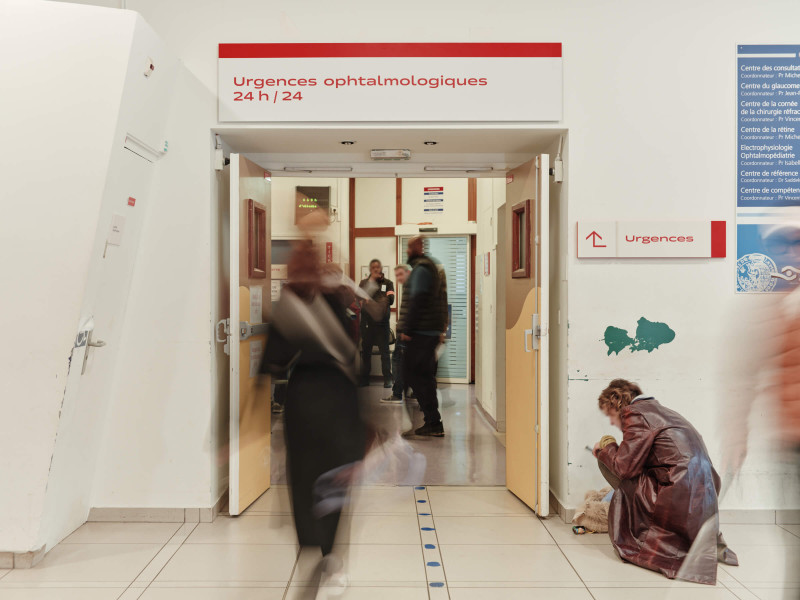
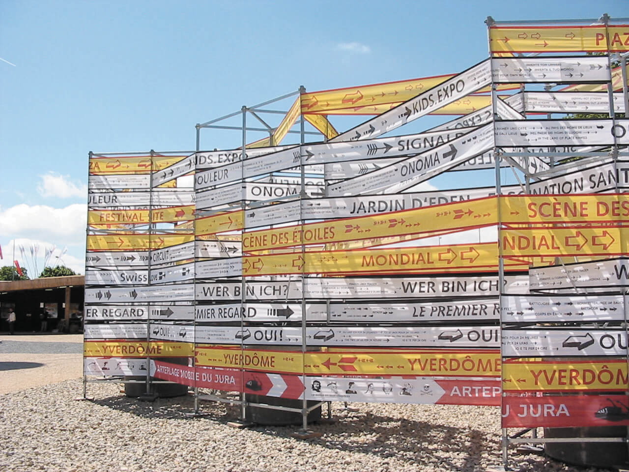
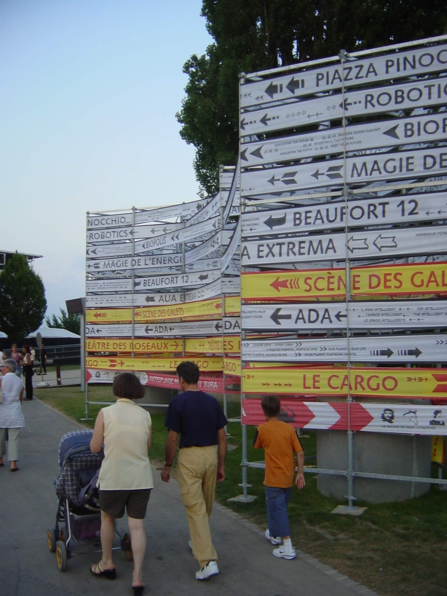
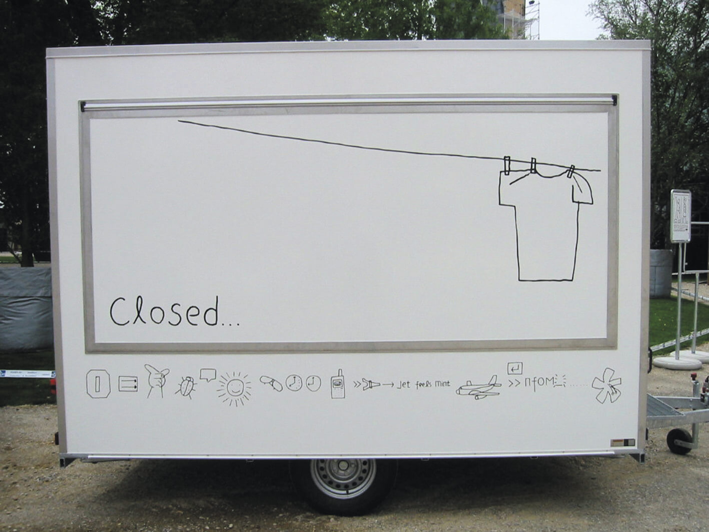
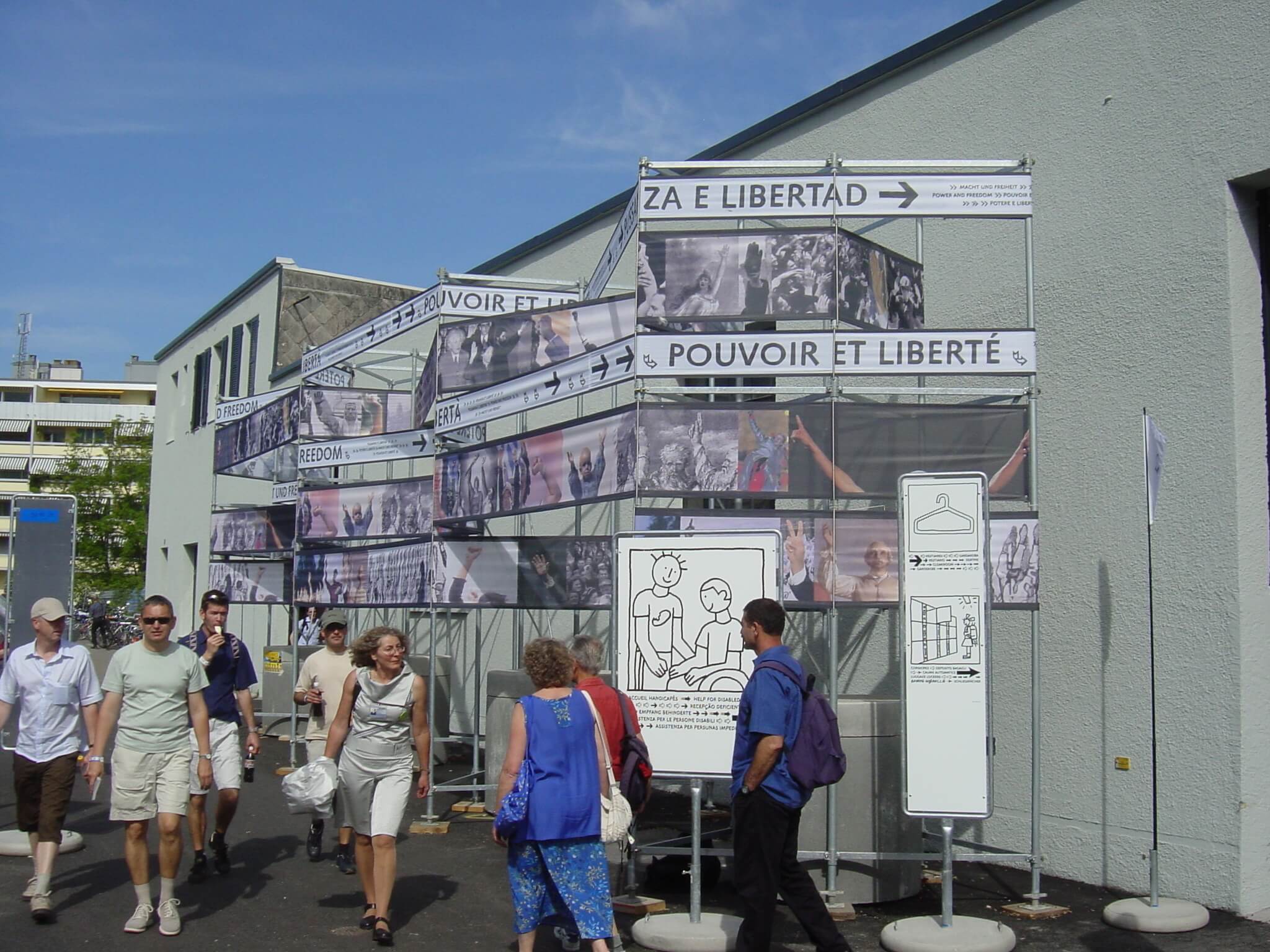
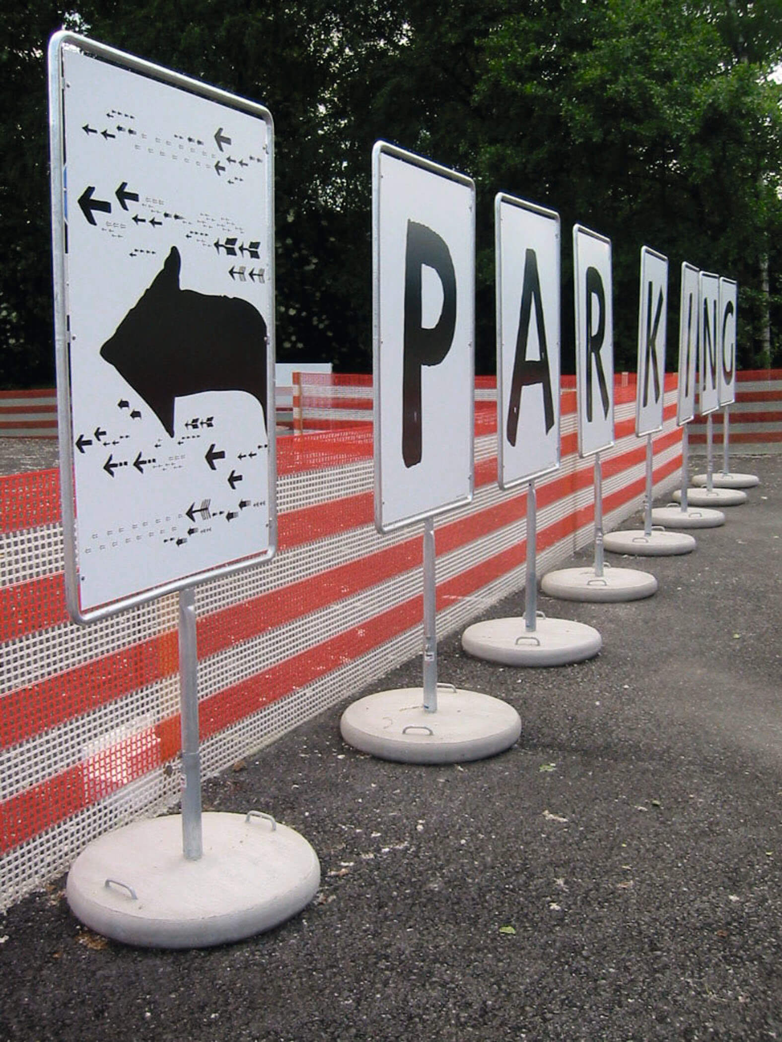
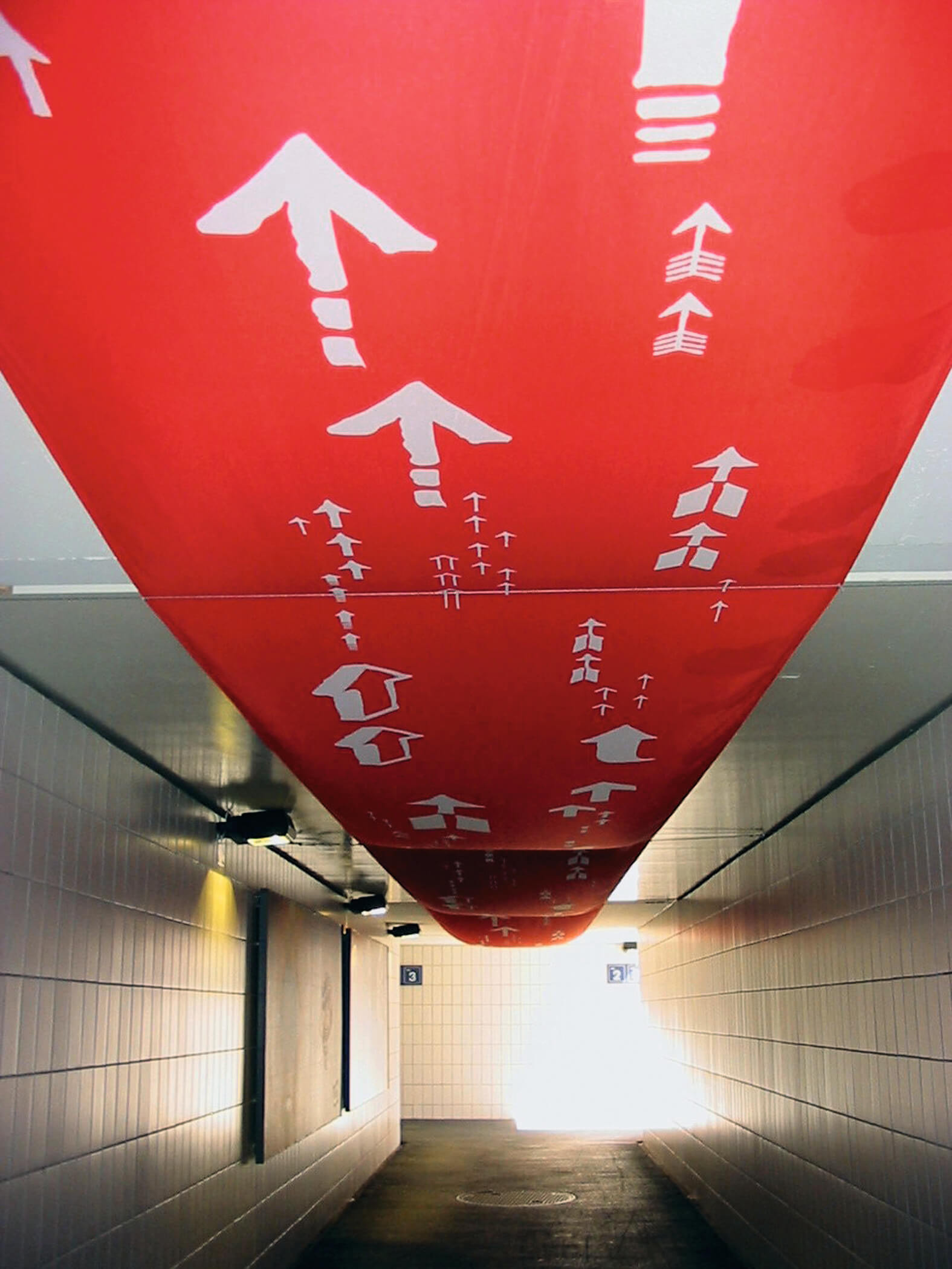
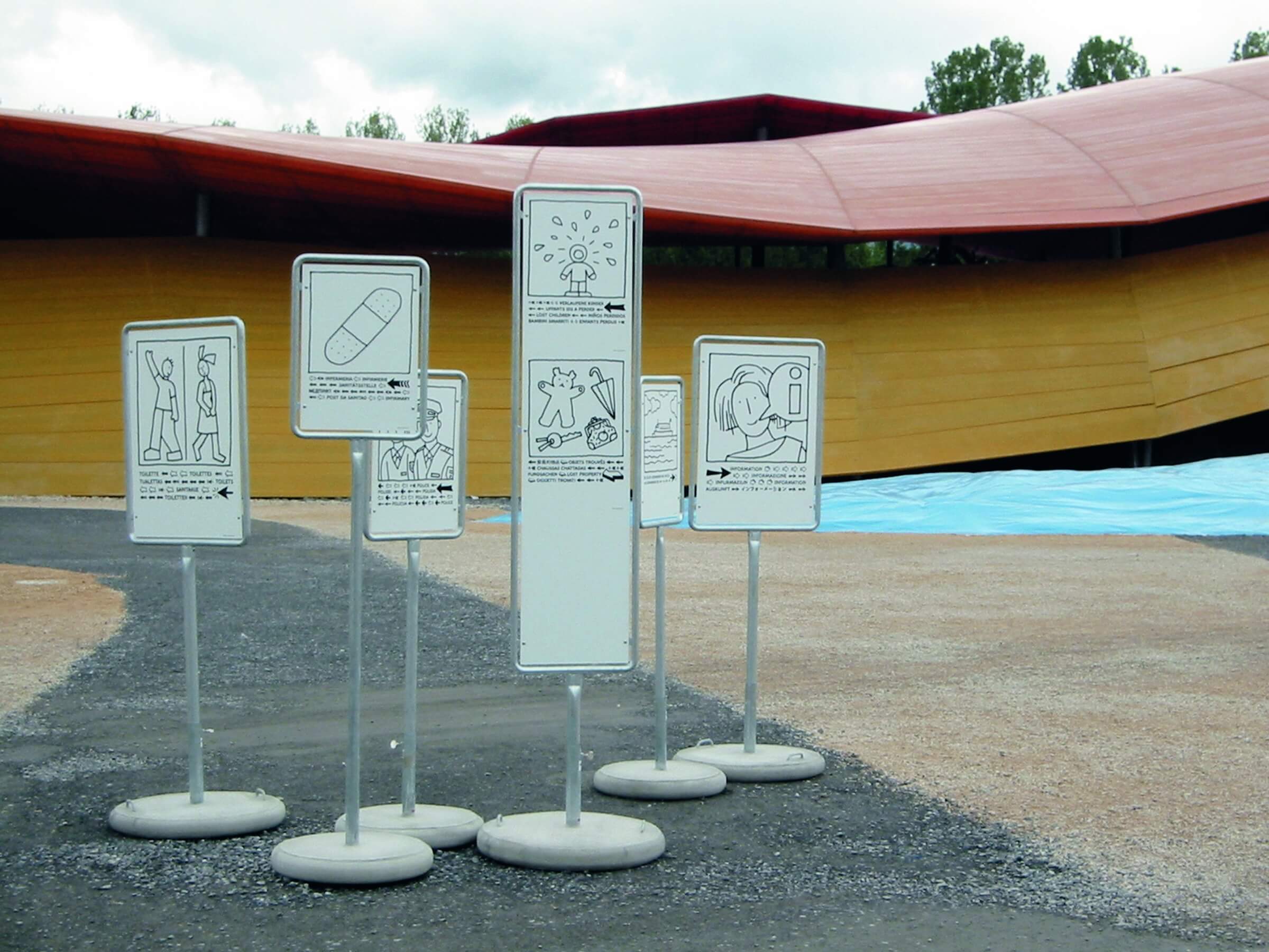
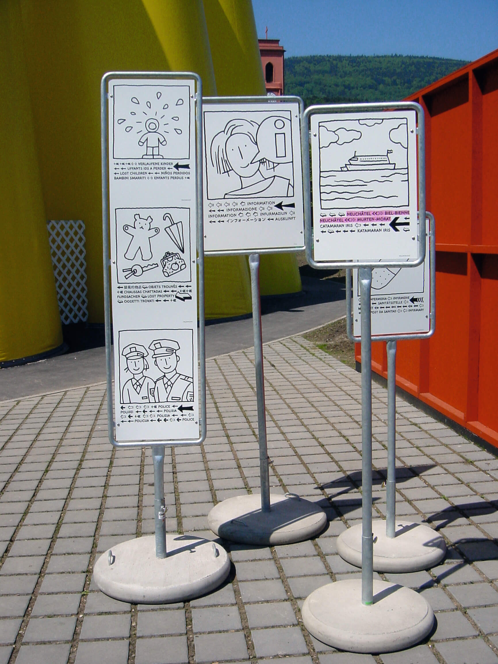
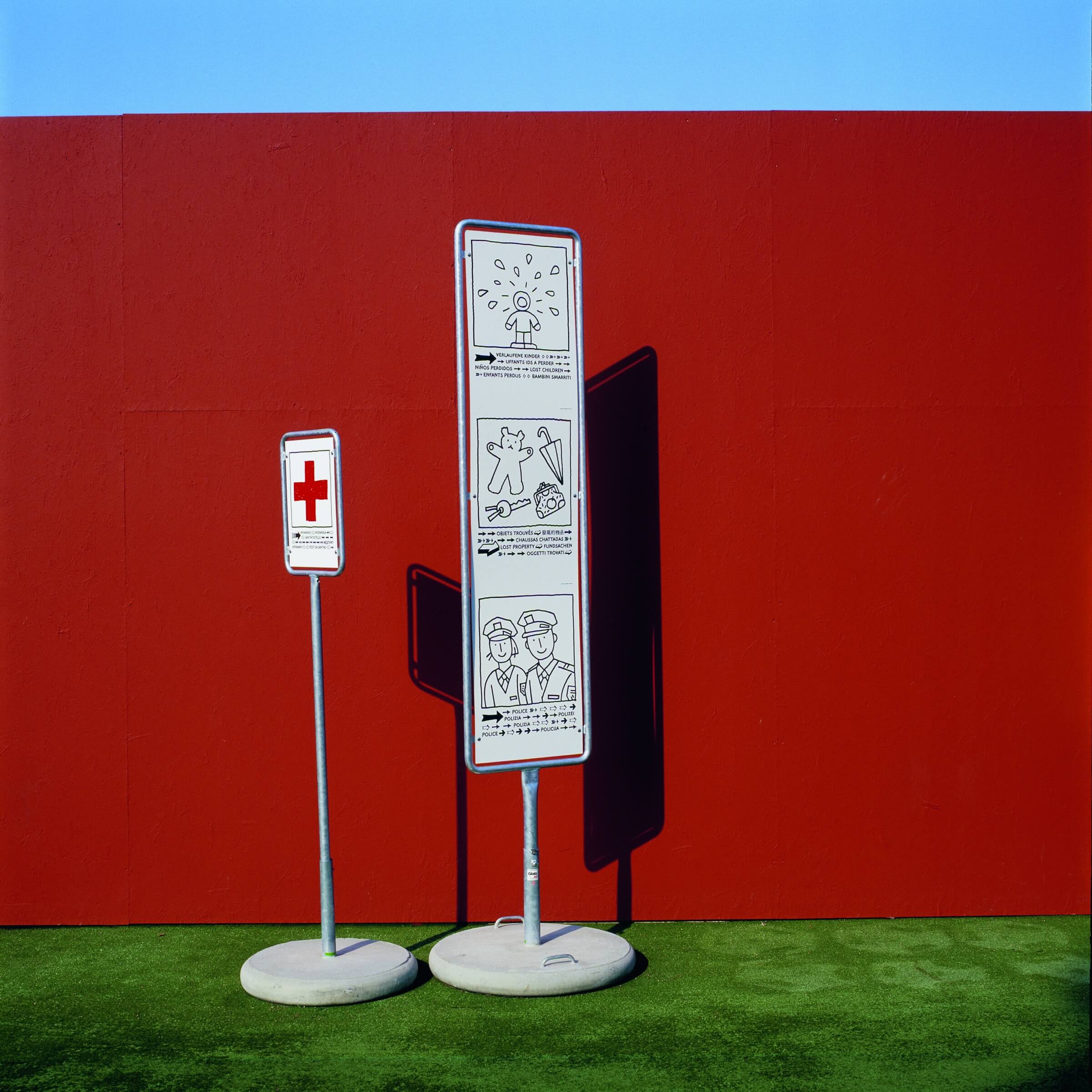
Responsive, temporary, event-based wayfinding: 10 million visitors, four very diverse sites, some forty exhibitions—almost all staged within structures designed specifically for the occasion—rail, road, and lake transportation links, daily events... For the six months of the exhibition, the wayfinding system had to guide, inform, and identify. Although we were tasked with the project less than ten months before the opening, the circulation patterns and architecture were already defined. We had to integrate into the existing framework and make it legible. The first conceptual choice was to develop not one, but four very different visual languages. This distinction between cultural information, structural operations, sponsor branding, and Expo.02 identification allowed us to greatly simplify each medium. Both the design and the graphics highlight the ephemeral nature of the project: repurposed everyday objects, sometimes diverted from their original function; “raw” design that does not seek to appeal through aesthetics; typography hand-drawn in the style chosen by the expo for its communications... While the cultural signage conveys abundance and a festive atmosphere, the exhibition’s user guide—particularly the language of pictograms—adopts an event-based, local, and contextual approach rather than a universal one. Through this family of symbols, Chinese illustrator Zhang Lu has thus created a portrait of everyday life in Switzerland, reinforced by the systematic use of multilingualism, extending beyond the country’s four official languages to incorporate those of immigrant minorities in a non-hierarchical manner.
Design team — Ruedi Baur, Eva Kubinyi, Simon Burkart, Martine Harlé, Nathalie Prost, Karim Sabano