since 2010
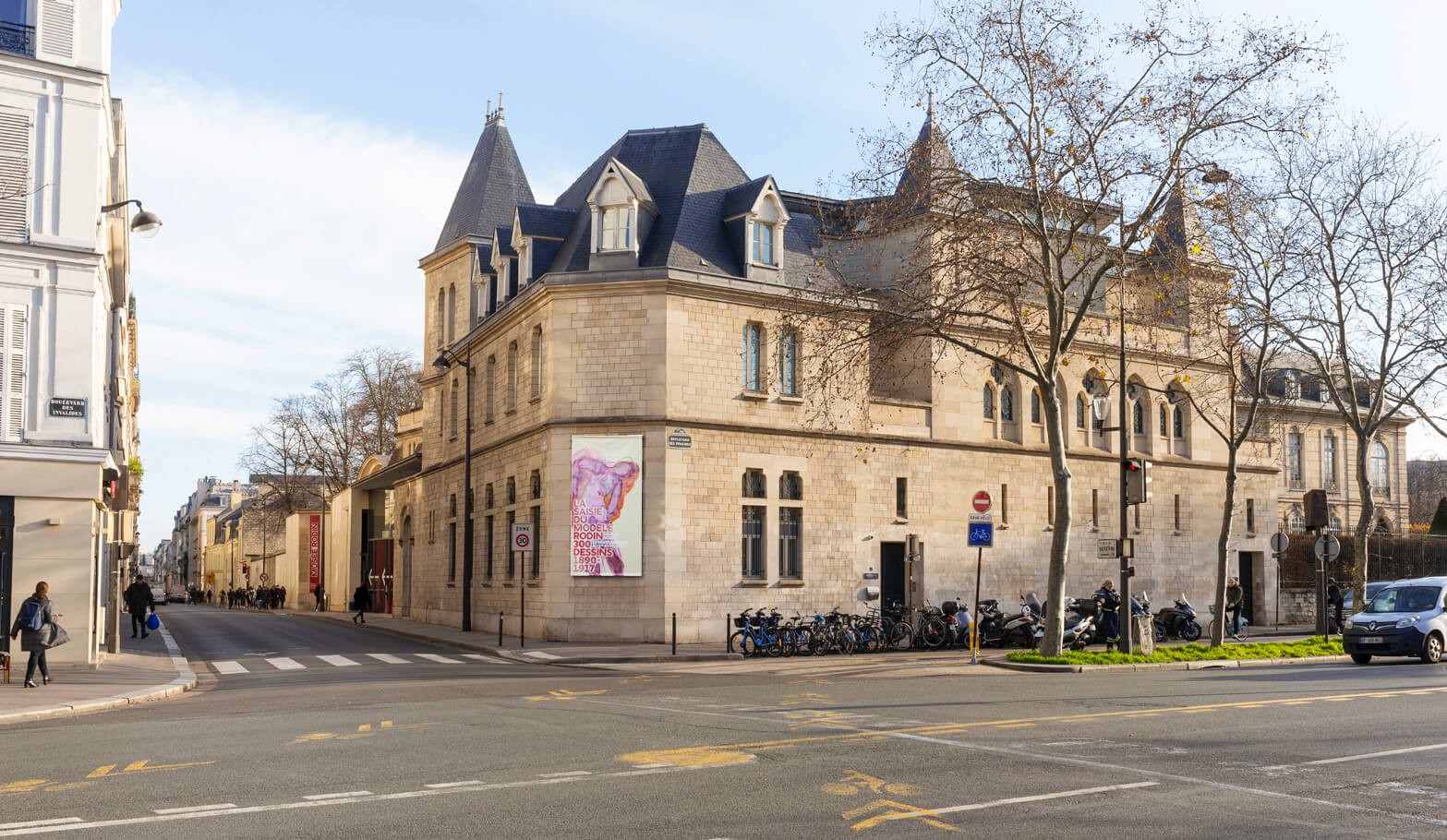
Rodin museum
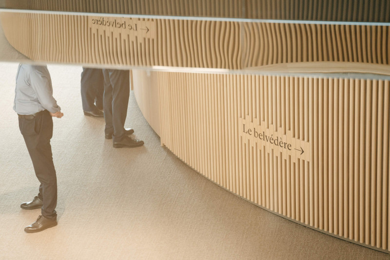
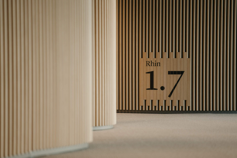
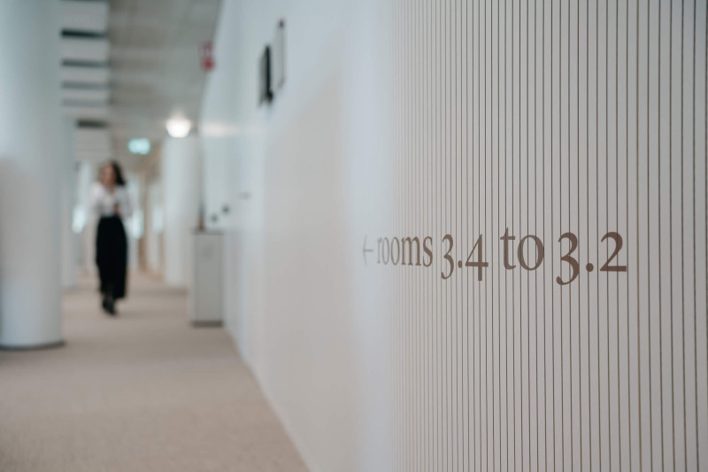
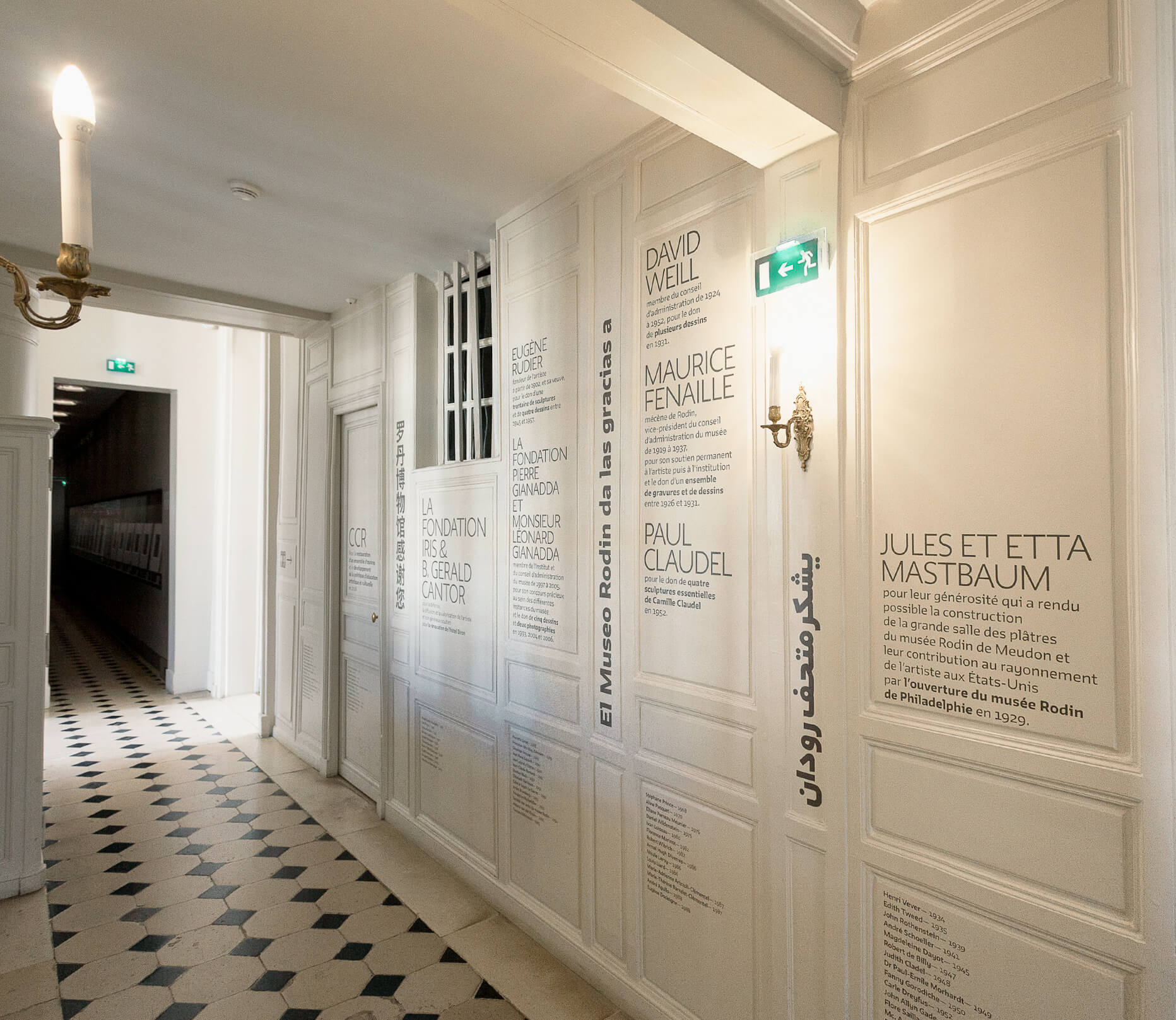
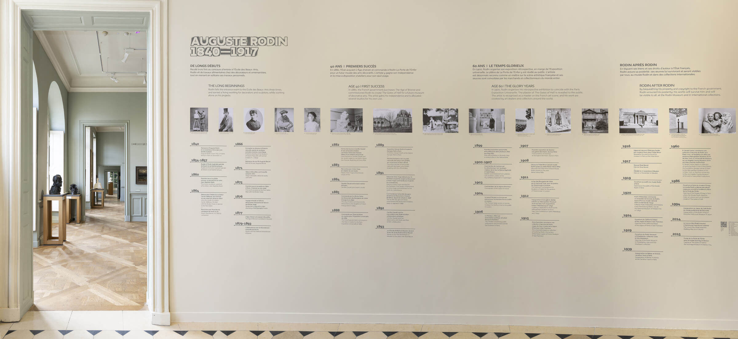
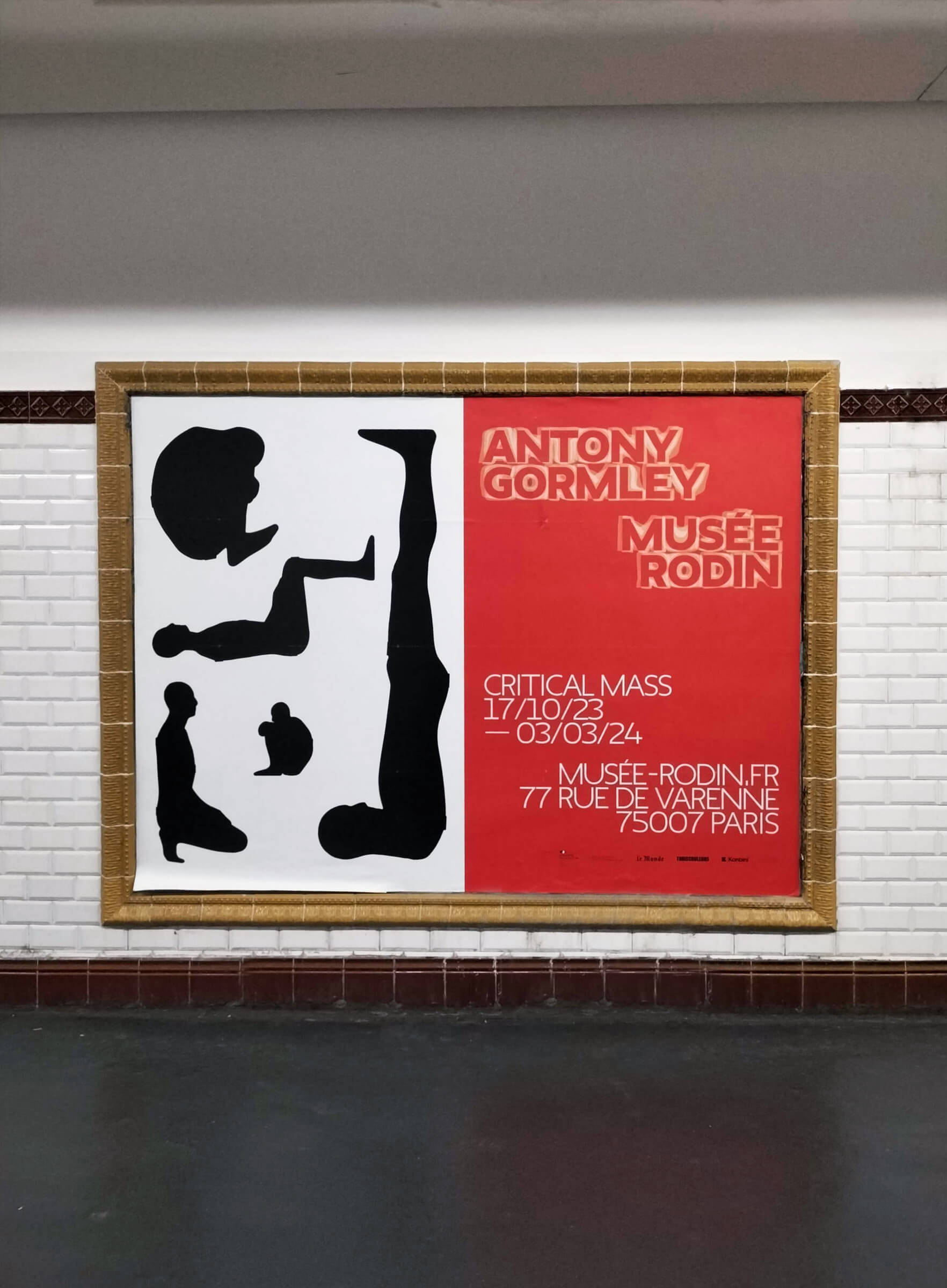
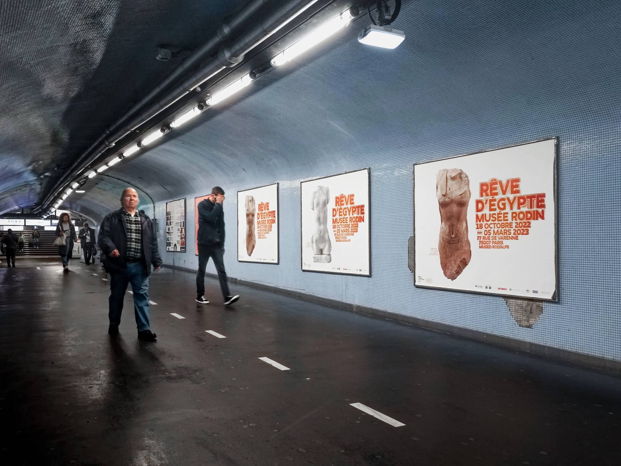
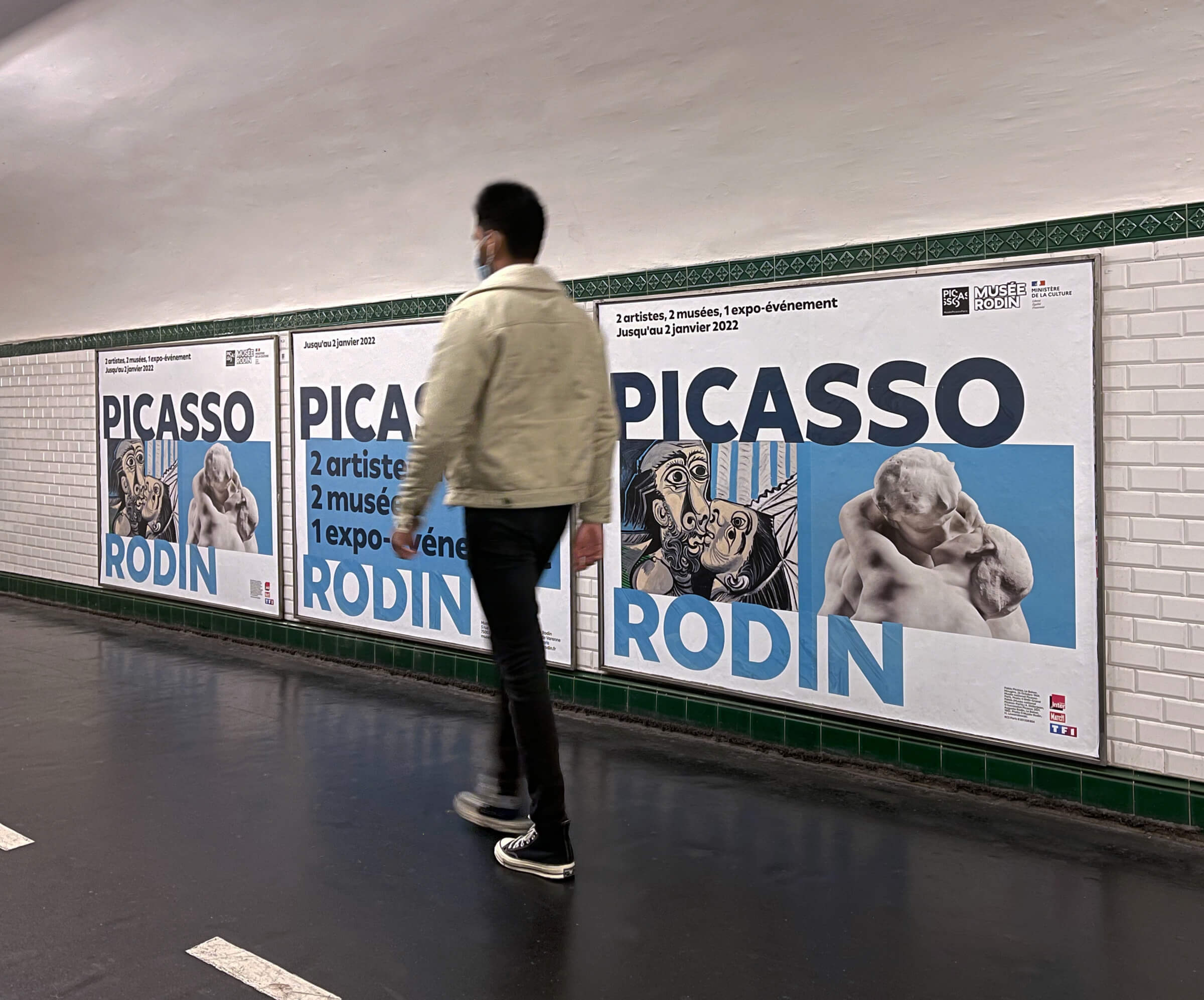
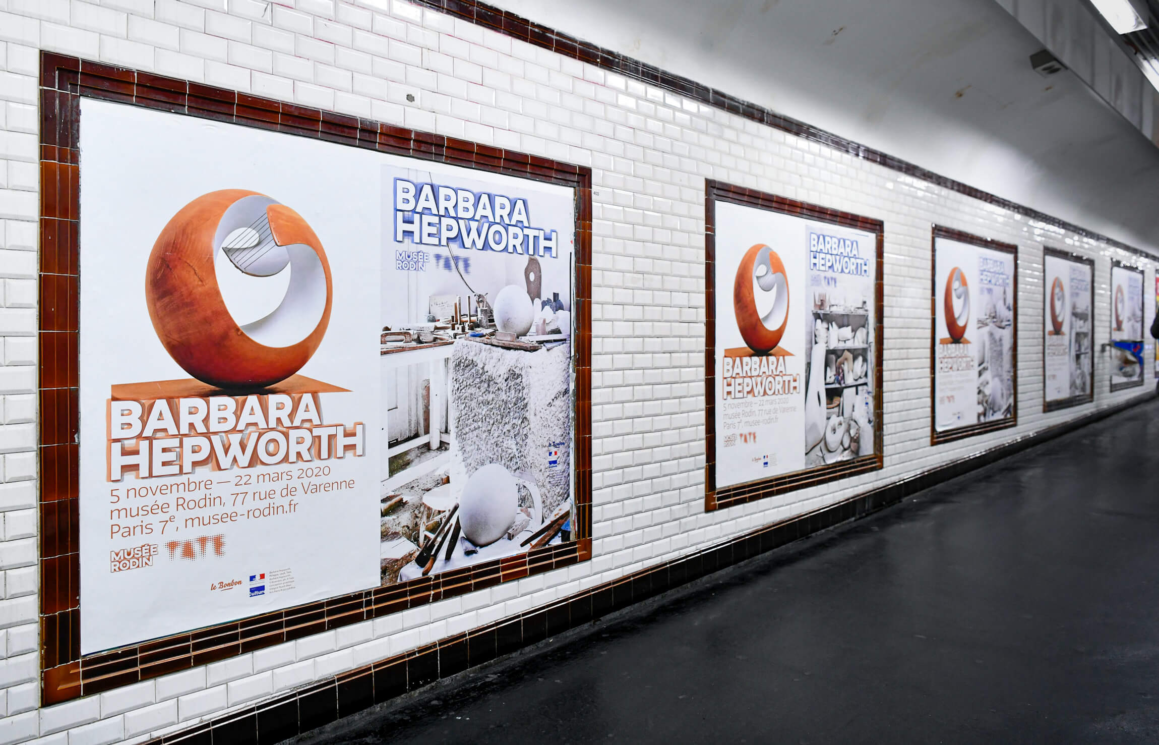
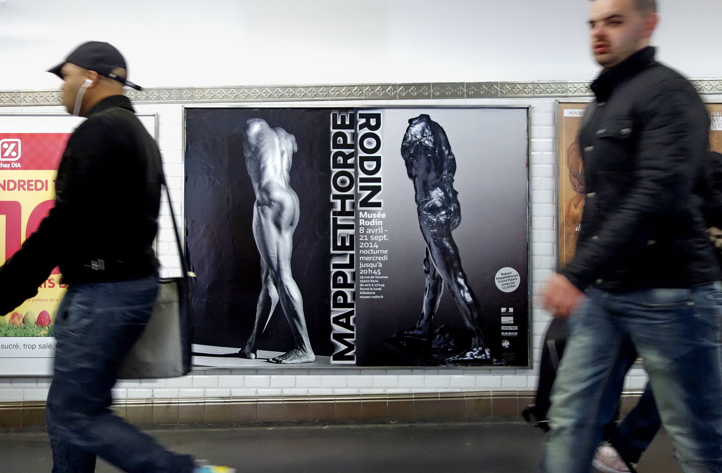
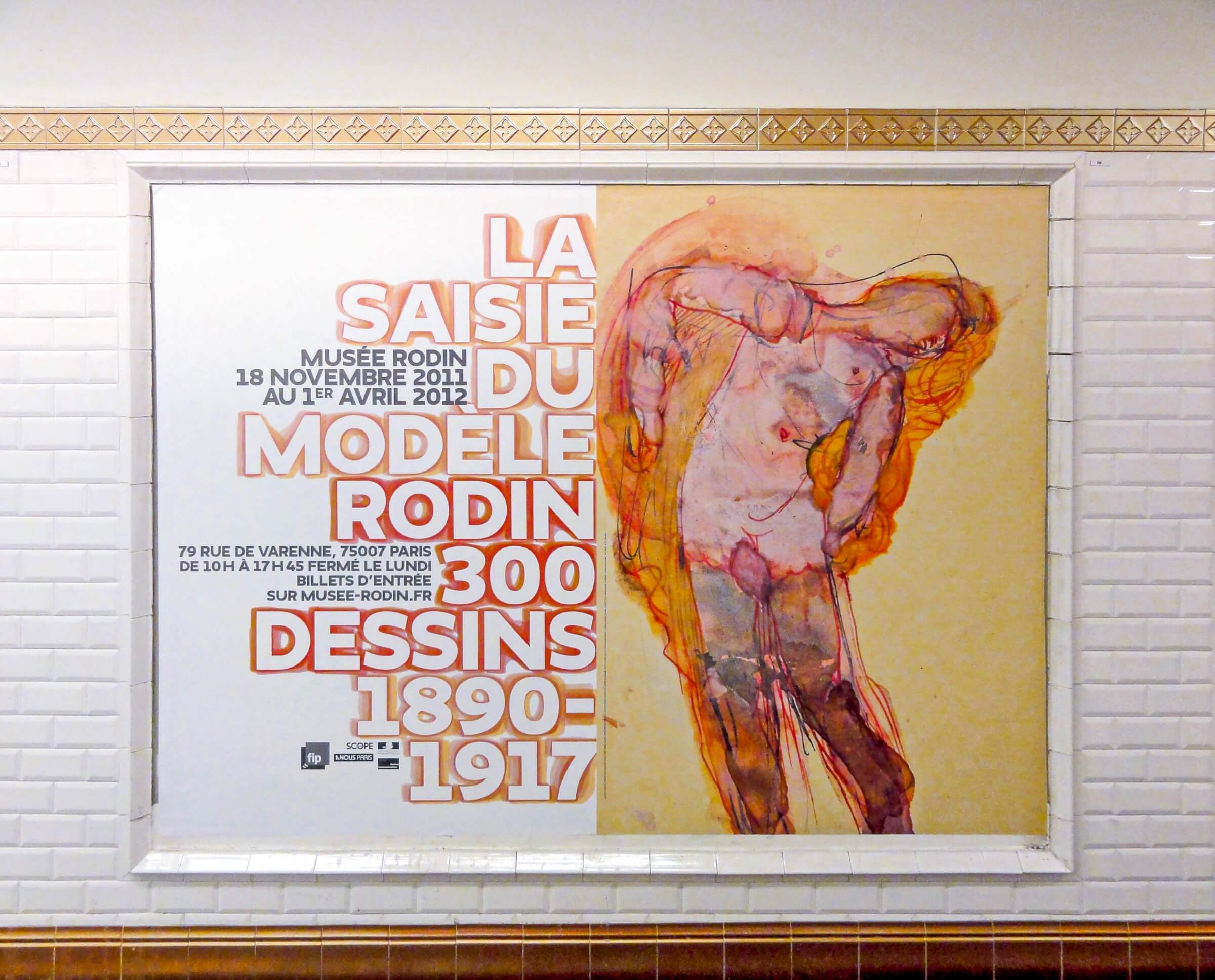
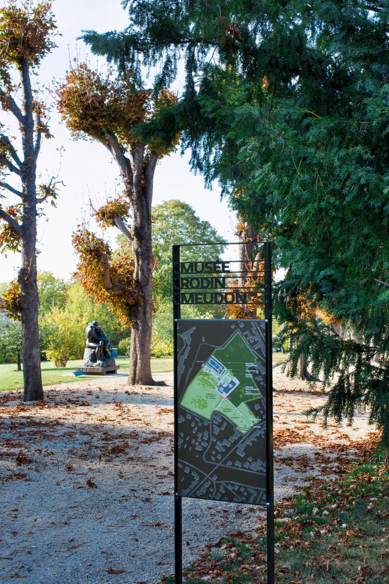
The brief was to give the museum, currently undergoing renovation, a new, cohesive identity—a fresh perspective on the artist’s work, the institution itself, and the exceptional surroundings of the museum. Typography is used as the primary tool for brand identity. The aim is to express, through a play on letters, the sculptor’s unique relationship with the material as he extracts a sensual form from a block of stone. A family of ten typefaces, built around the “Irma” typeface designed by typographer Peter Bilak, allows the letter to be gradually stripped away by extracting it from the form that surrounds it. Meticulous typographic design reflects the museum’s purpose, highlighting the sculptor’s work—from the block of raw material to the finished piece.
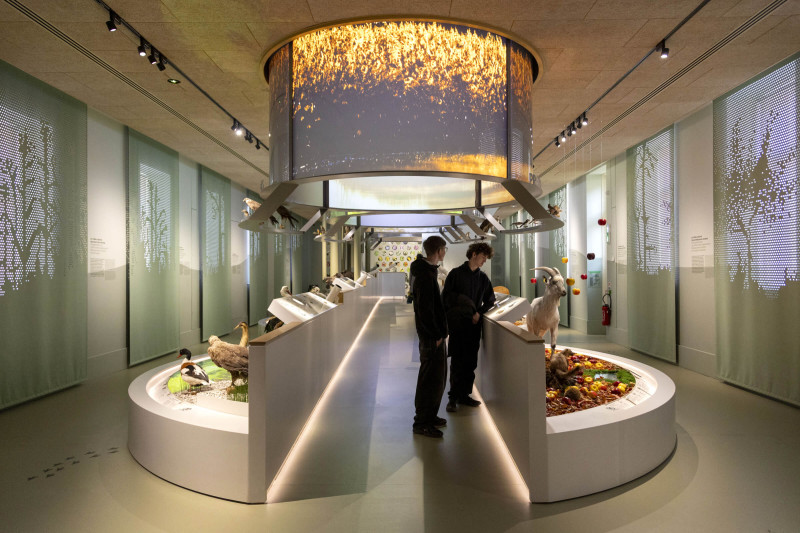
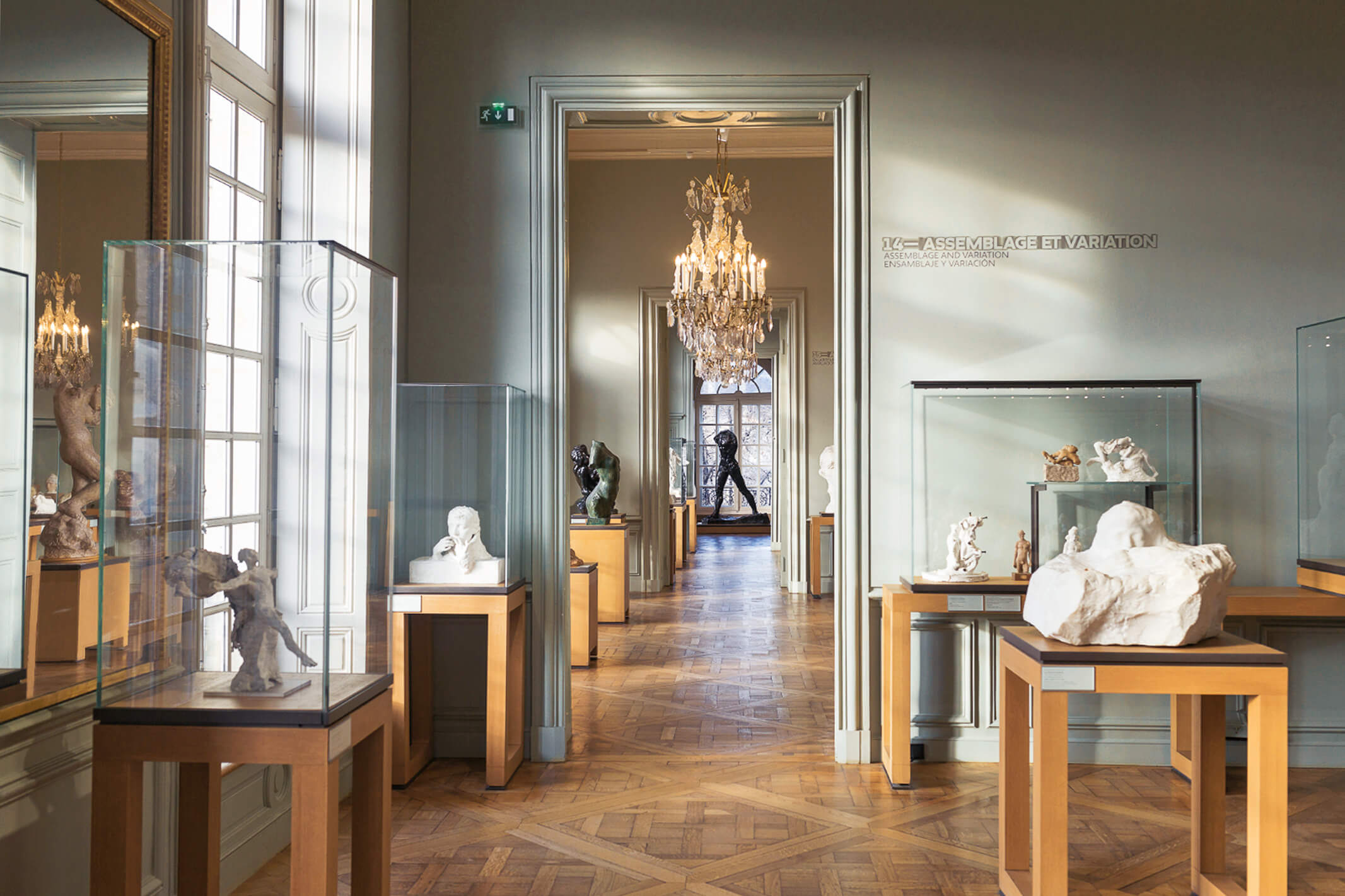
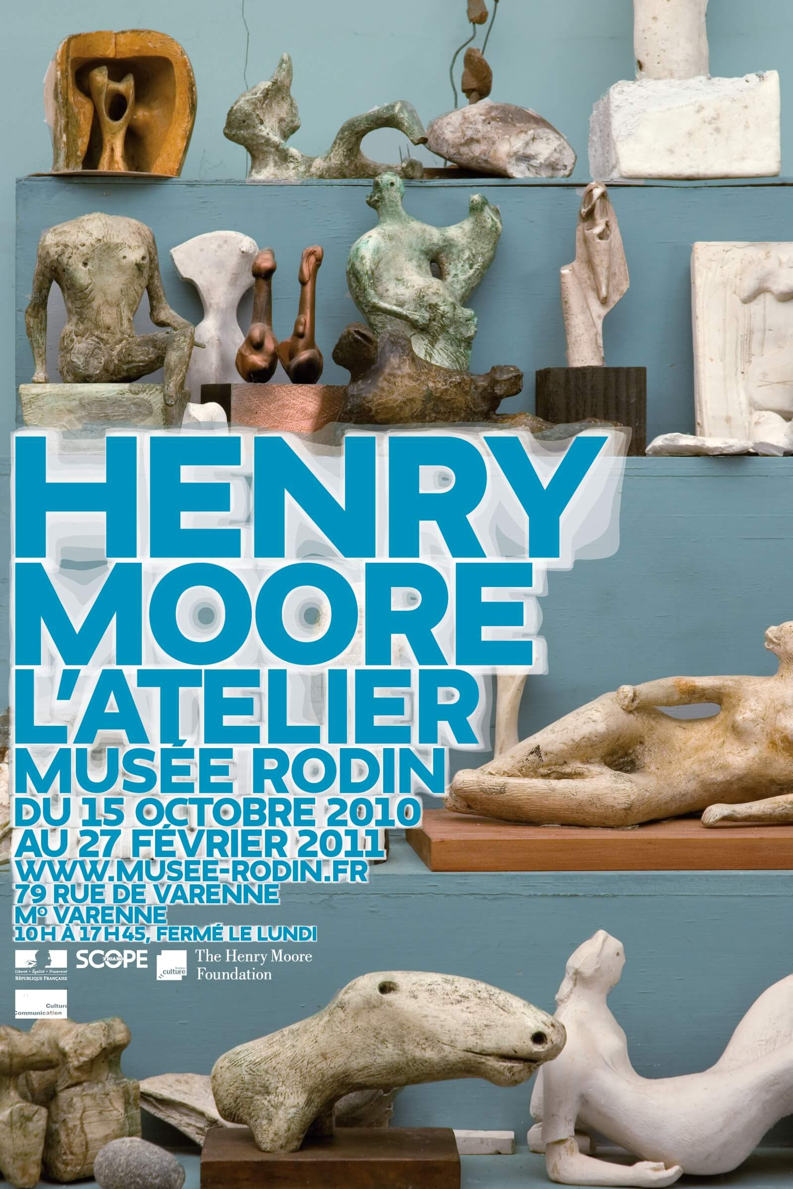
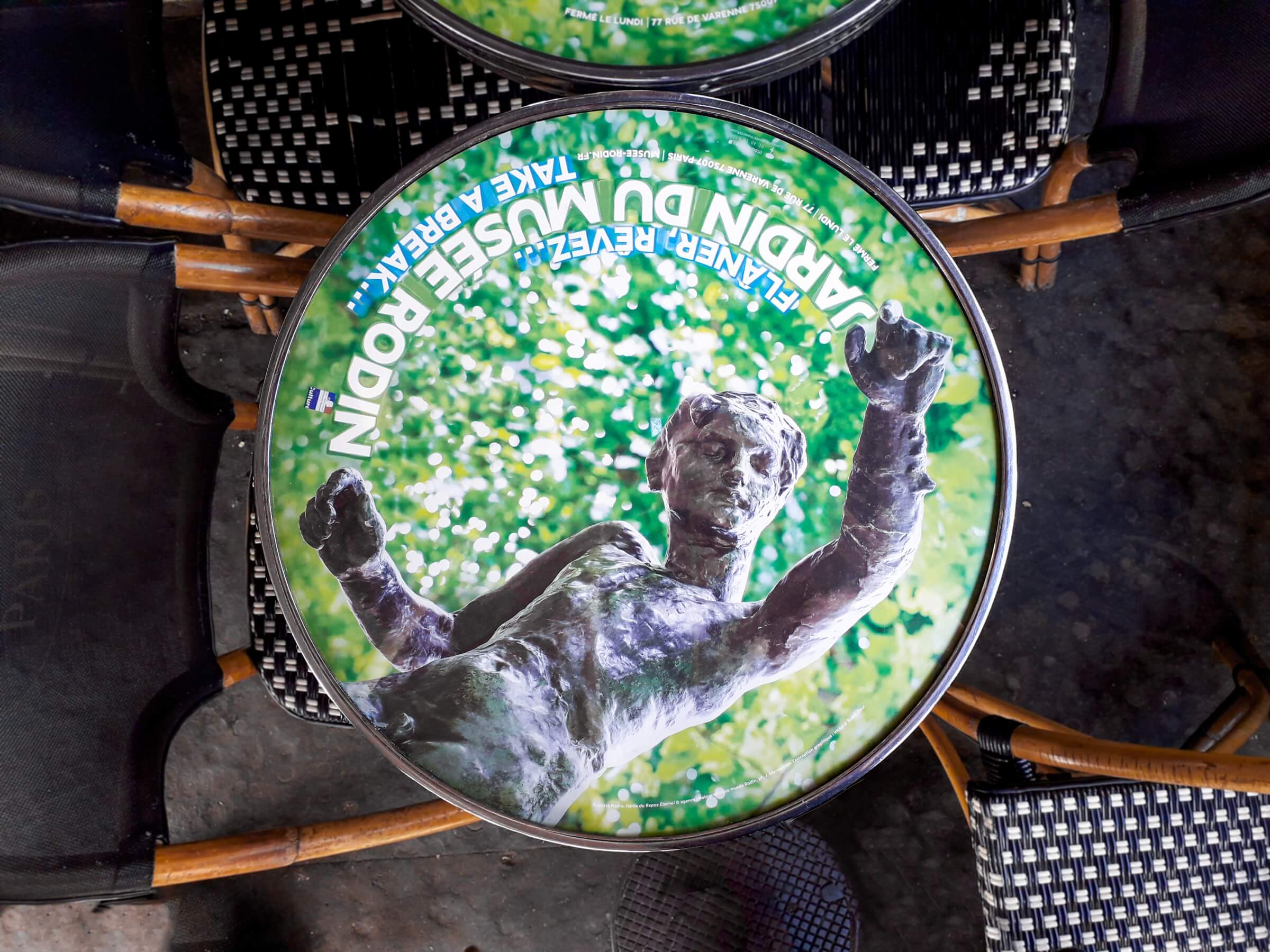
After creating the new visual language in 2010, we were able, over the years and through fruitful collaboration with the museum’s teams, to develop the system we had established. A coherent and easily identifiable system gradually emerged. Atmospheres have been created for various themes, and materials developed for all types of communication. The establishment of this distinctive visual identity among different audiences, and the visual consistency across all communication channels, have helped make the museum’s visual language uniquely recognizable. From simple flyers to stationery, brochures, and institutional, promotional, or program-related leaflets; activity reports; visuals and variations for all temporary exhibitions across print and digital media; and signage—the museum’s entire communication system is thus presented in a coherent and unified manner, while adapting the various messages to suit different audiences and media.
Design Team — Ruedi Baur, Chantal Grossen, and Denis Coueignoux