2021
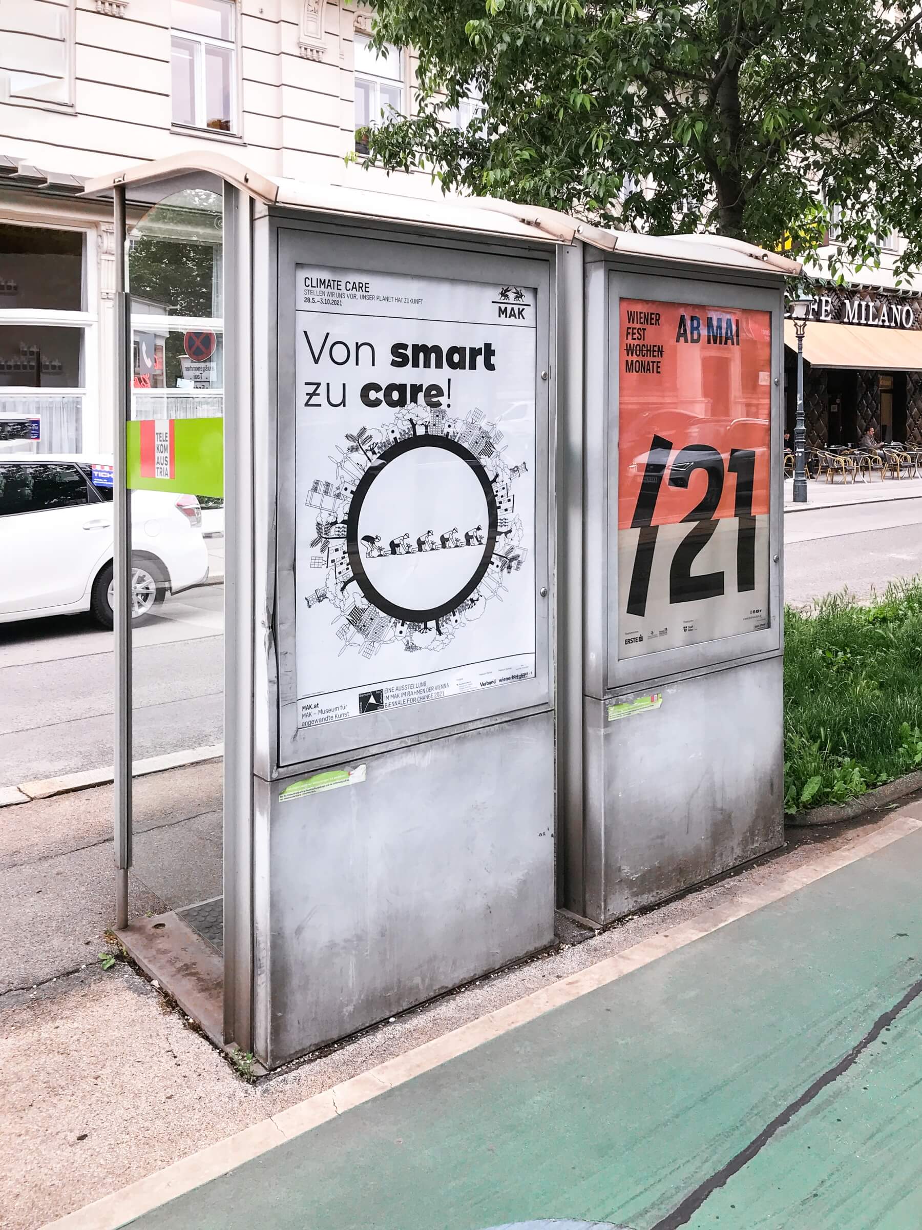
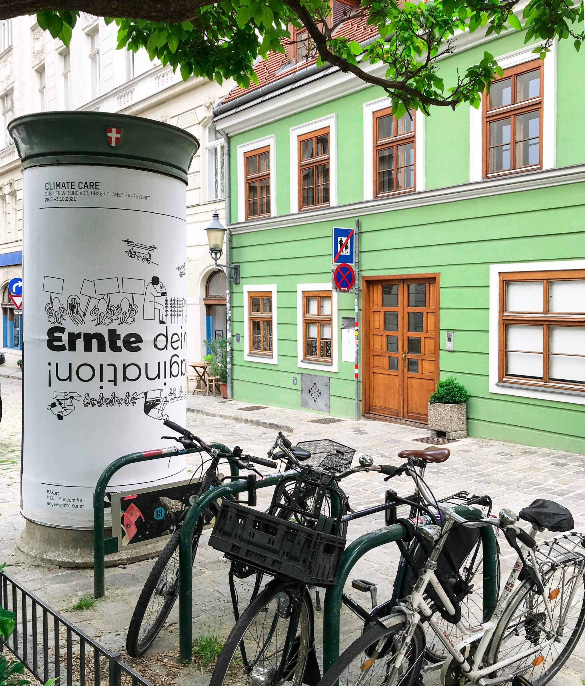
Climate Care — Vienna Biennial for Change, MAK Vienna
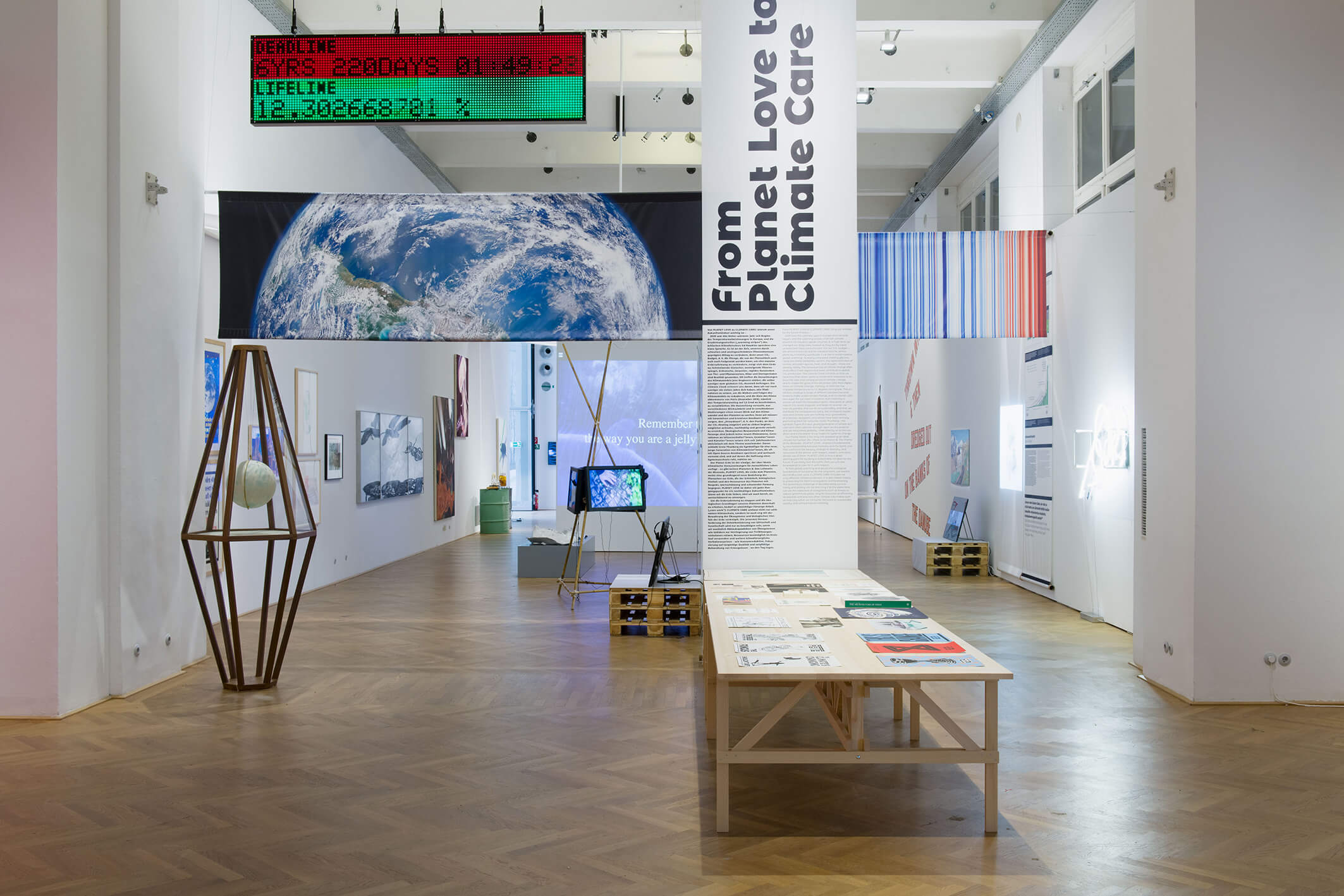
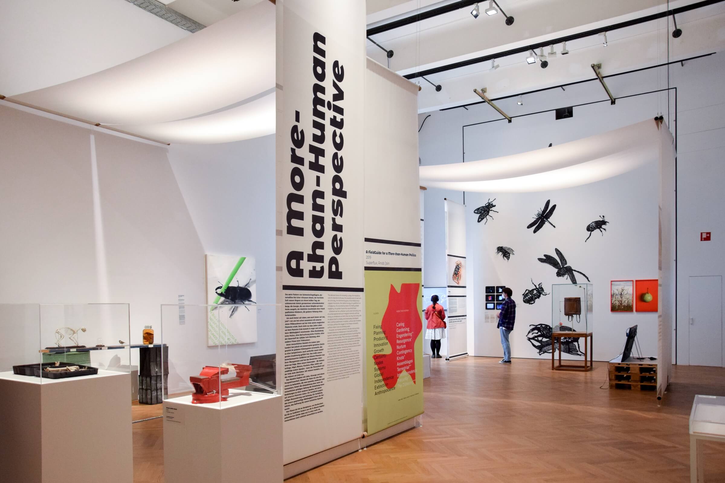
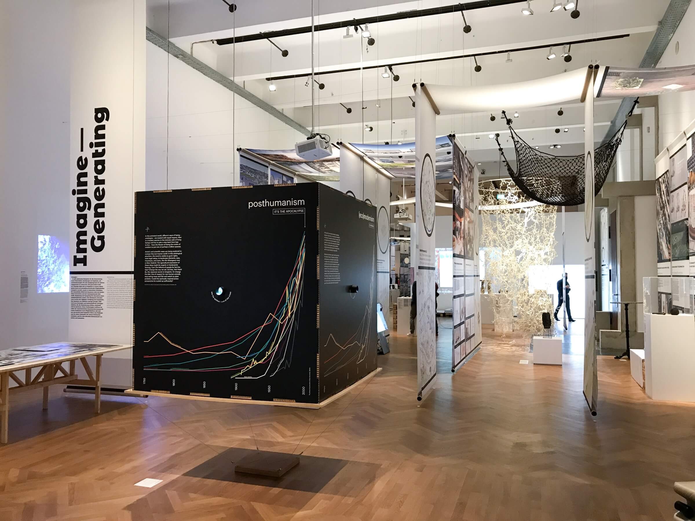
The exhibition *Climate Care — Reimagining Shared Planetary Futures* recognizes and explores climate care as a key concept. It reaffirms a vision of a world in which humans share equitably and sustainably with other species and future generations. Through a wide range of art, design, and architecture projects, it demonstrates how artists and creative minds can play a central role in shaping an ecologically and socially sustainable climate-conscious modernity. The exhibition takes visitors on a journey to discover ideas, processes, and narratives related to key areas of life and human activity, including food and care, life, movement, production, cooperation, and the mobilization of active hope.
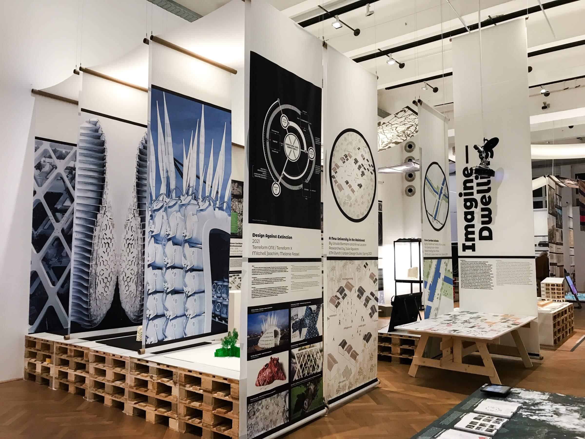
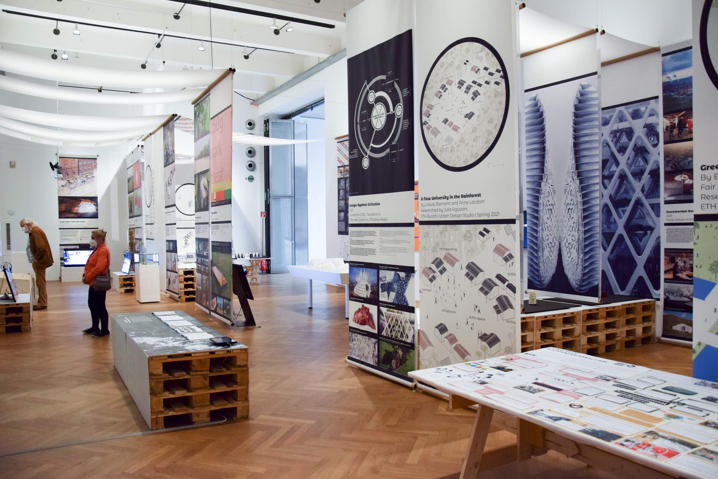
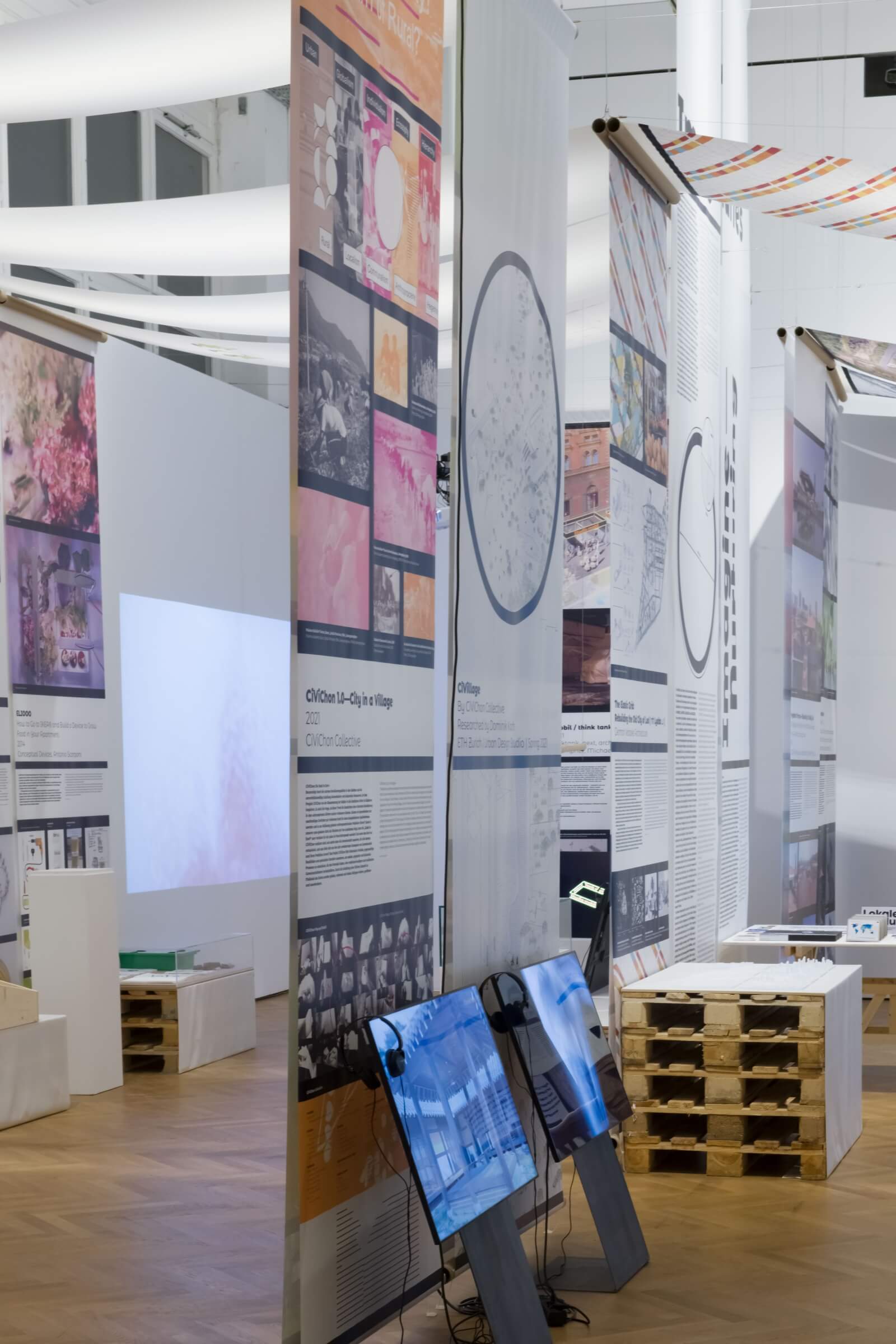
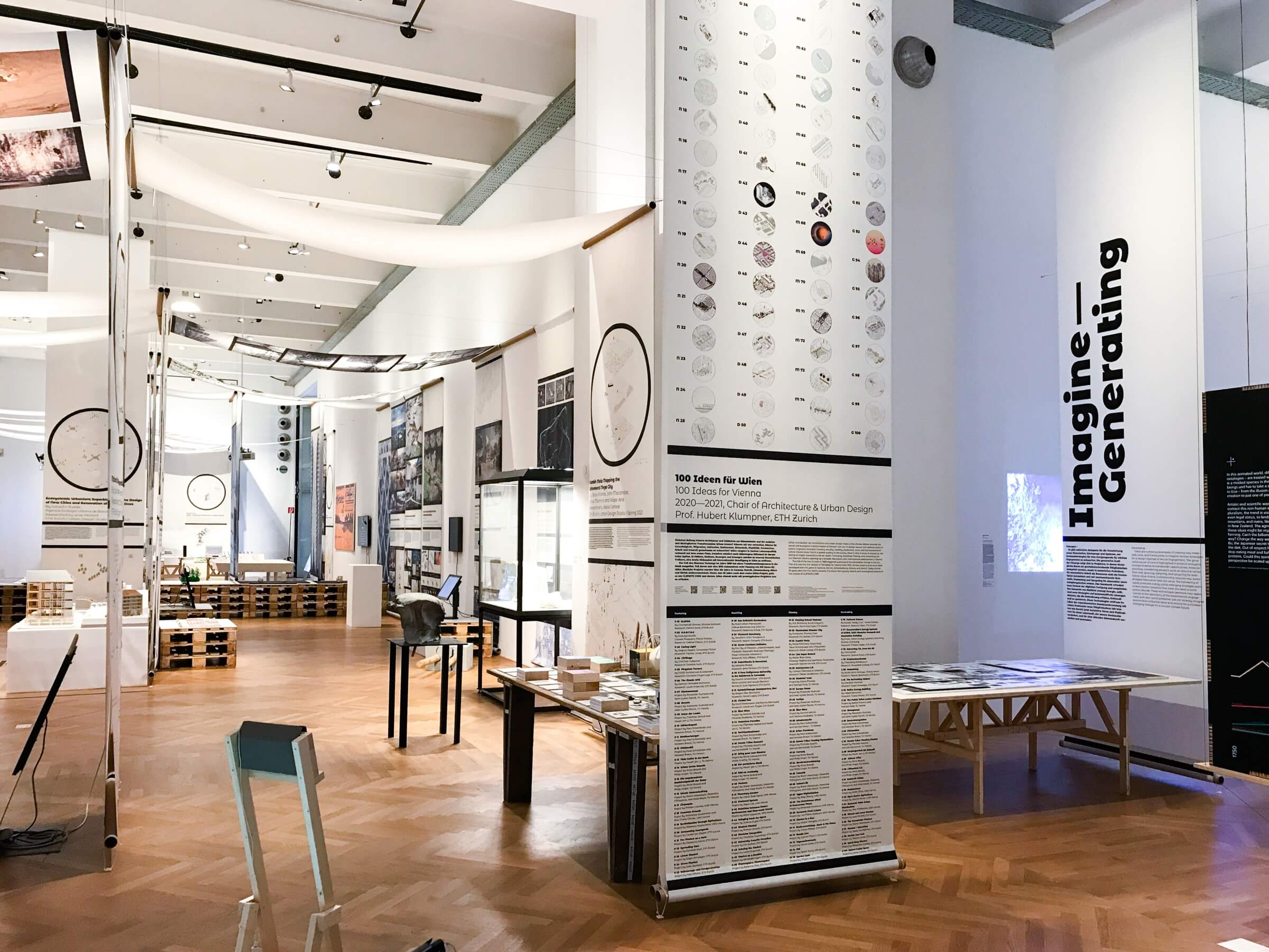
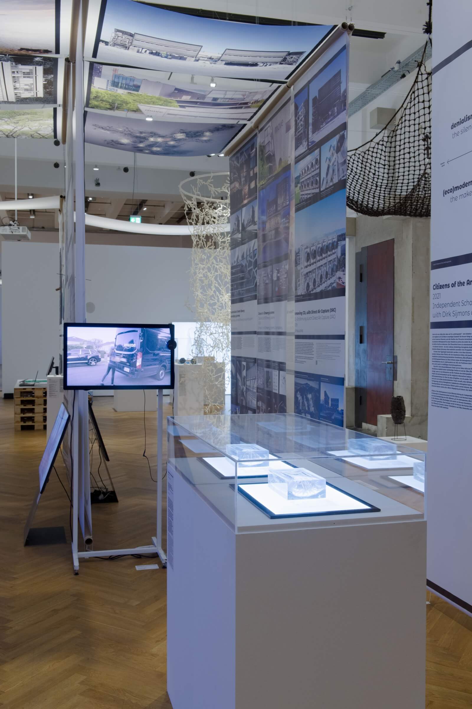
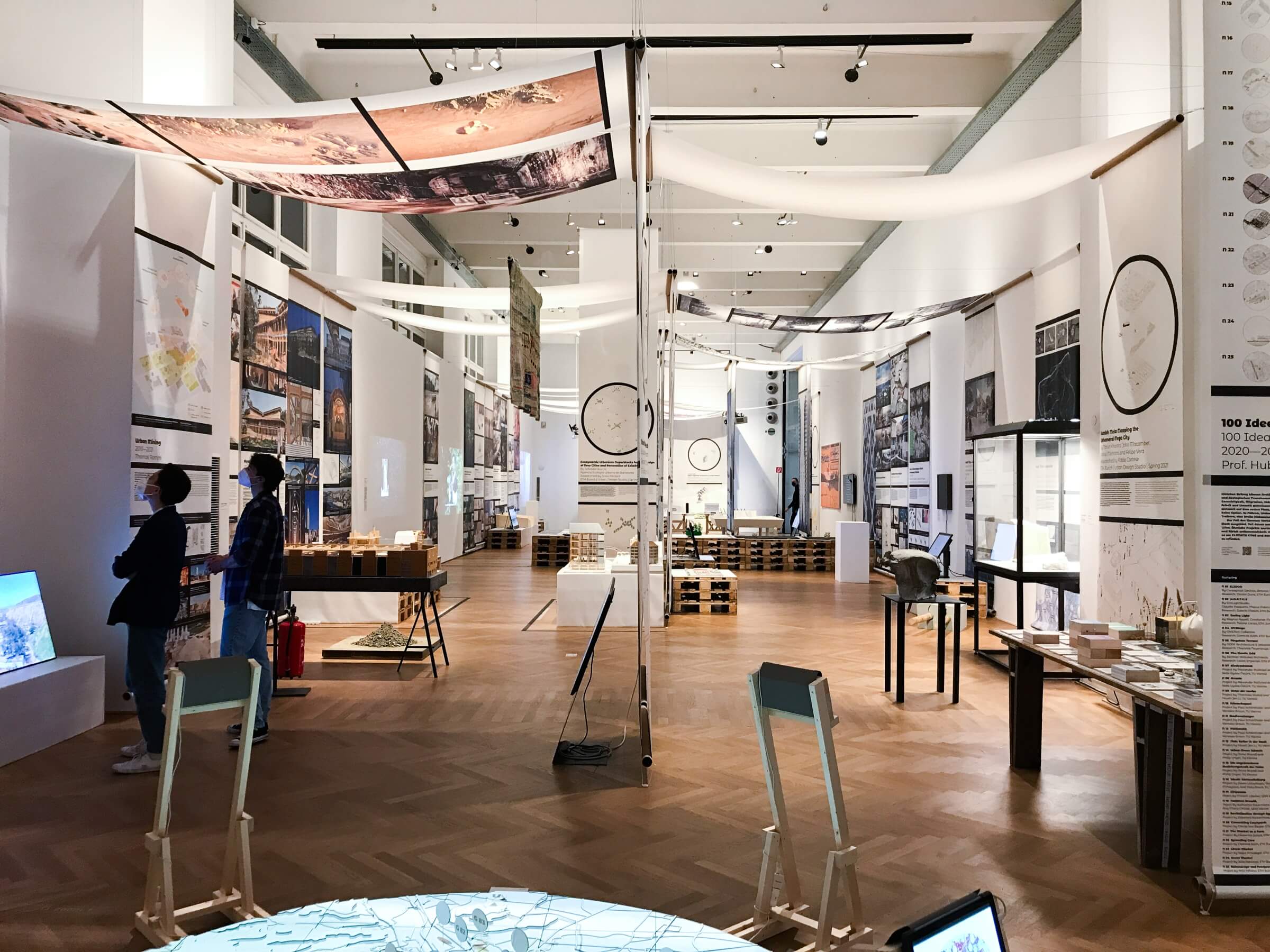
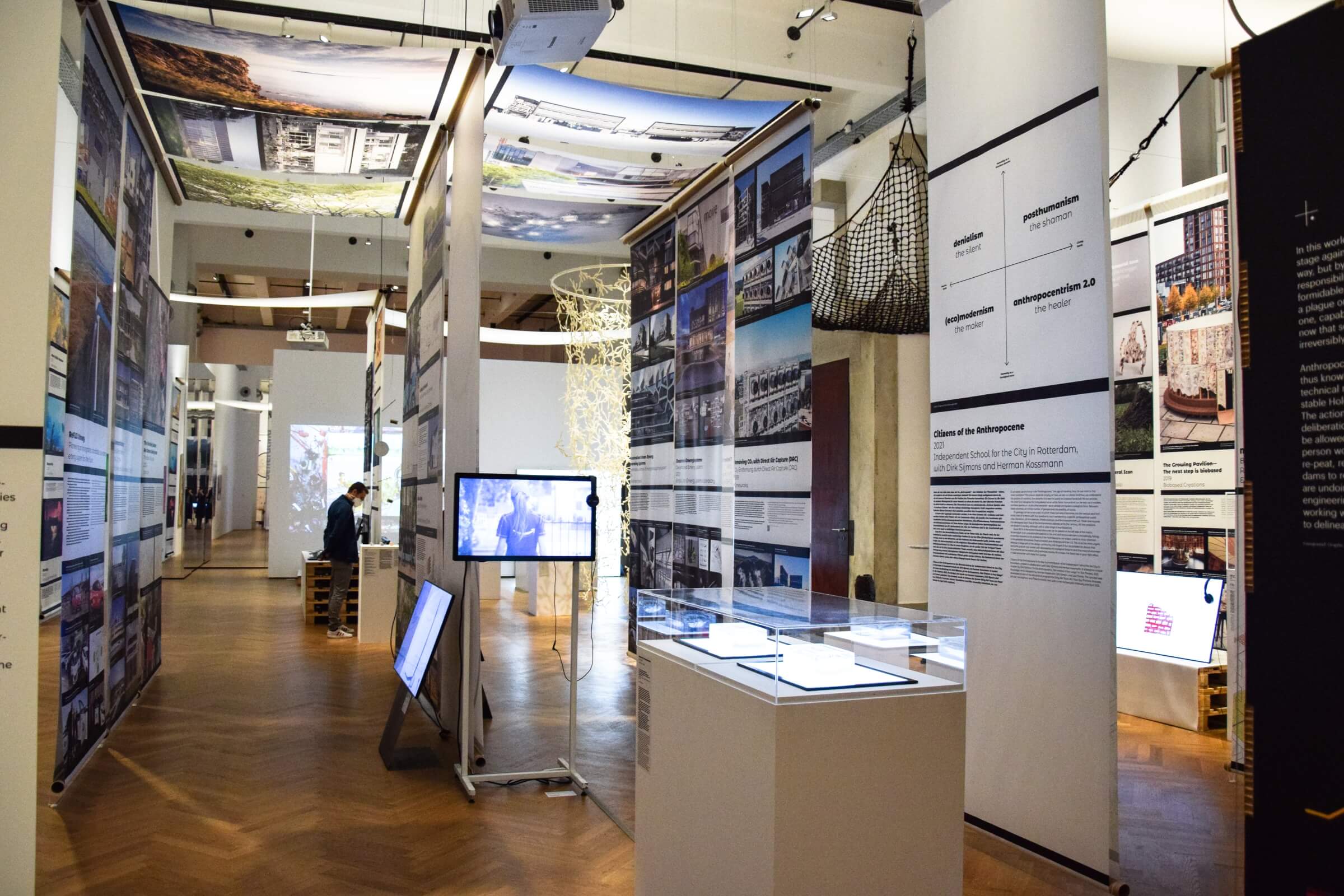
These ideas are embodied in a scenography that references the souk—the place where one finds provisions to survive in the desert. Its spatial layout draws inspiration from the organization of this market to present the exhibition’s diverse objects and projects. The visitor’s journey takes place through a succession of tunnels, formed by canvases suspended above visitors and long vertical side strips, like market stalls.
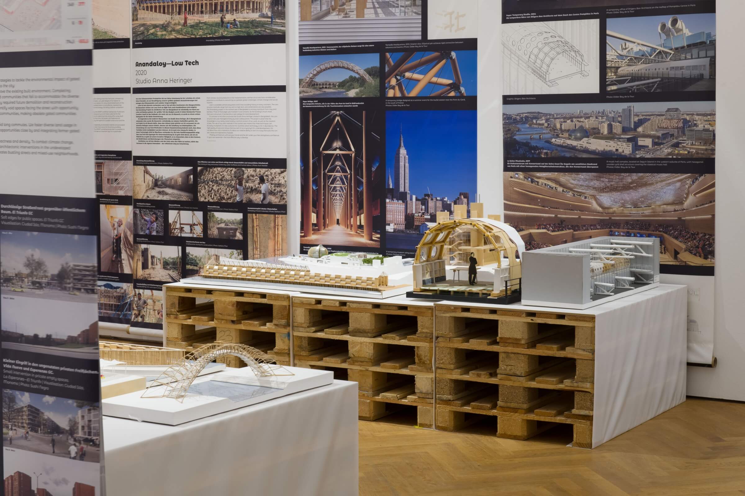
The interconnection of the presented projects is highlighted by these continuous strips that make up the entire suspended structure. Using recycled pallets and cardboard tubes, actual shelters are formed to house objects, texts, and images.
To reflect the richness and eclecticism of the body of works and narratives presented, the graphic design complements the scenography in a restrained and structured manner, based on a few simple principles. To create the visual harmony and stability necessary for understanding the content, all panels combining text and images are composed using the same template. On these white panels, the text is consistently set in black for a simple, classic contrast. As for the Montserrat Alternates typeface, it was chosen for its unique set of glyphs as well as for the rounded forms that characterize it. This dual quality echoes the richness of the elements that make up the exhibition and their distinctiveness, while also serving as a unifying element. Finally, the black line is used as the primary graphic element. It accentuates a visual horizontal line connecting the projects within the space and is integrated into the text and image compositions to structure the information.
Design team (integral designers ʃ and dix—milliards—humains) — Ruedi & Vera Baur, Maren Hollmann
Curators (MAK Vienna | ETH Zurich | Superflux) — Marlies Wirth, Christoph Thun-Hohenstein, Antje Prisker | Hubert Klumpner, Melanie Fessel | Anab Jain