
2009
Paris school of Fine Arts
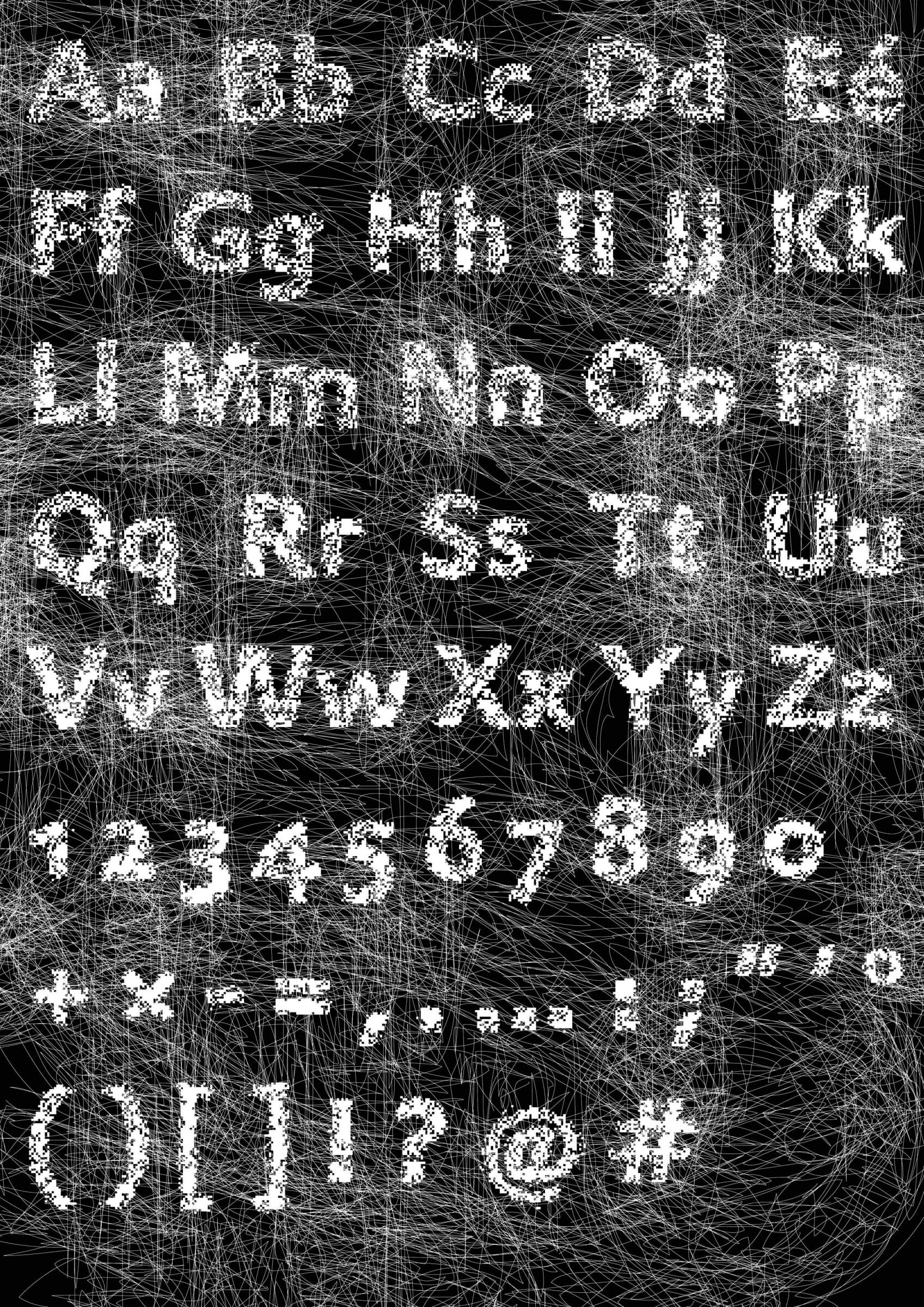
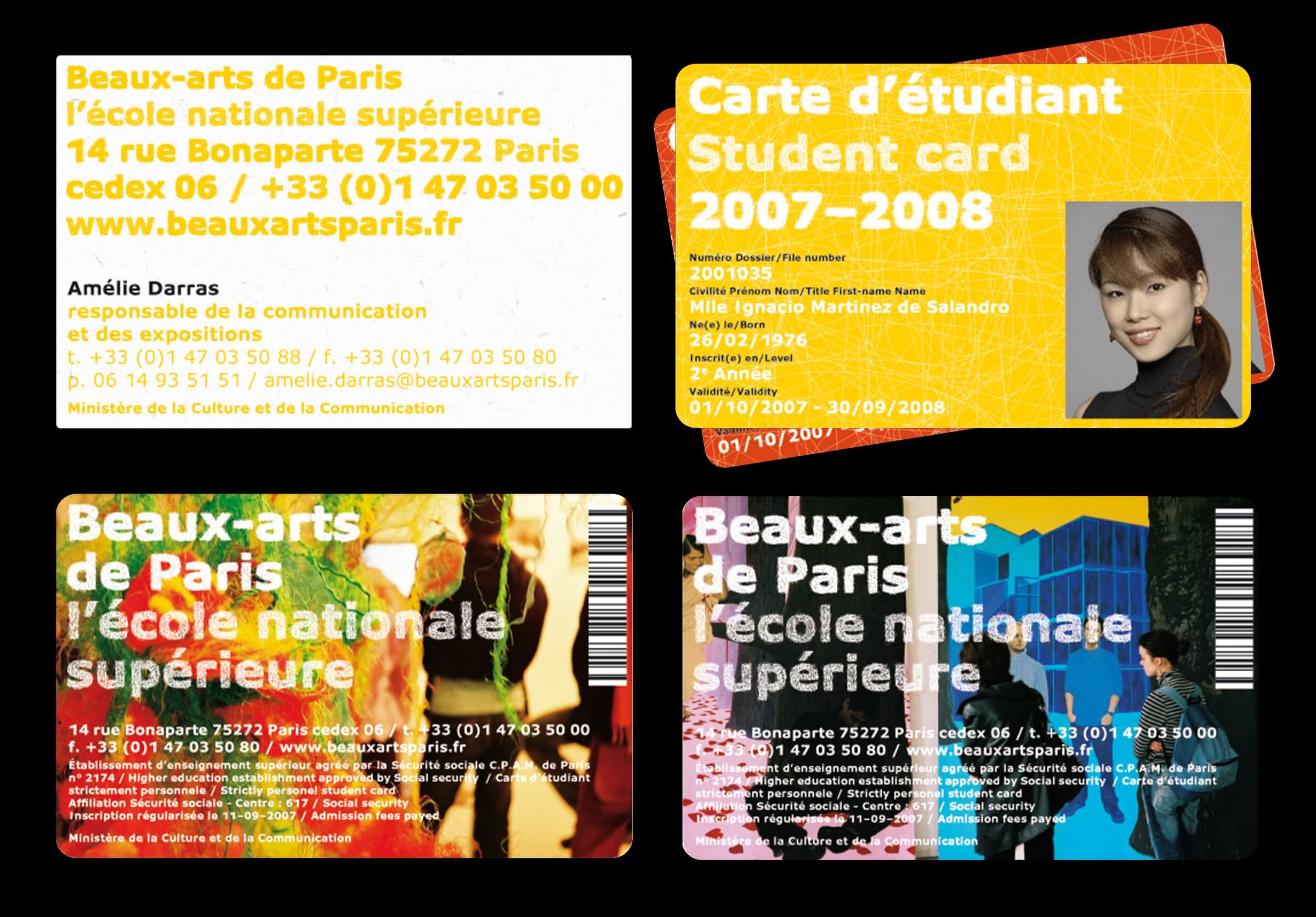
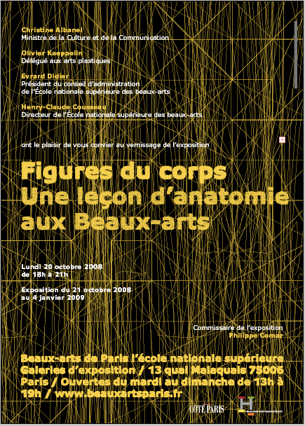
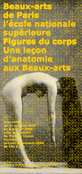
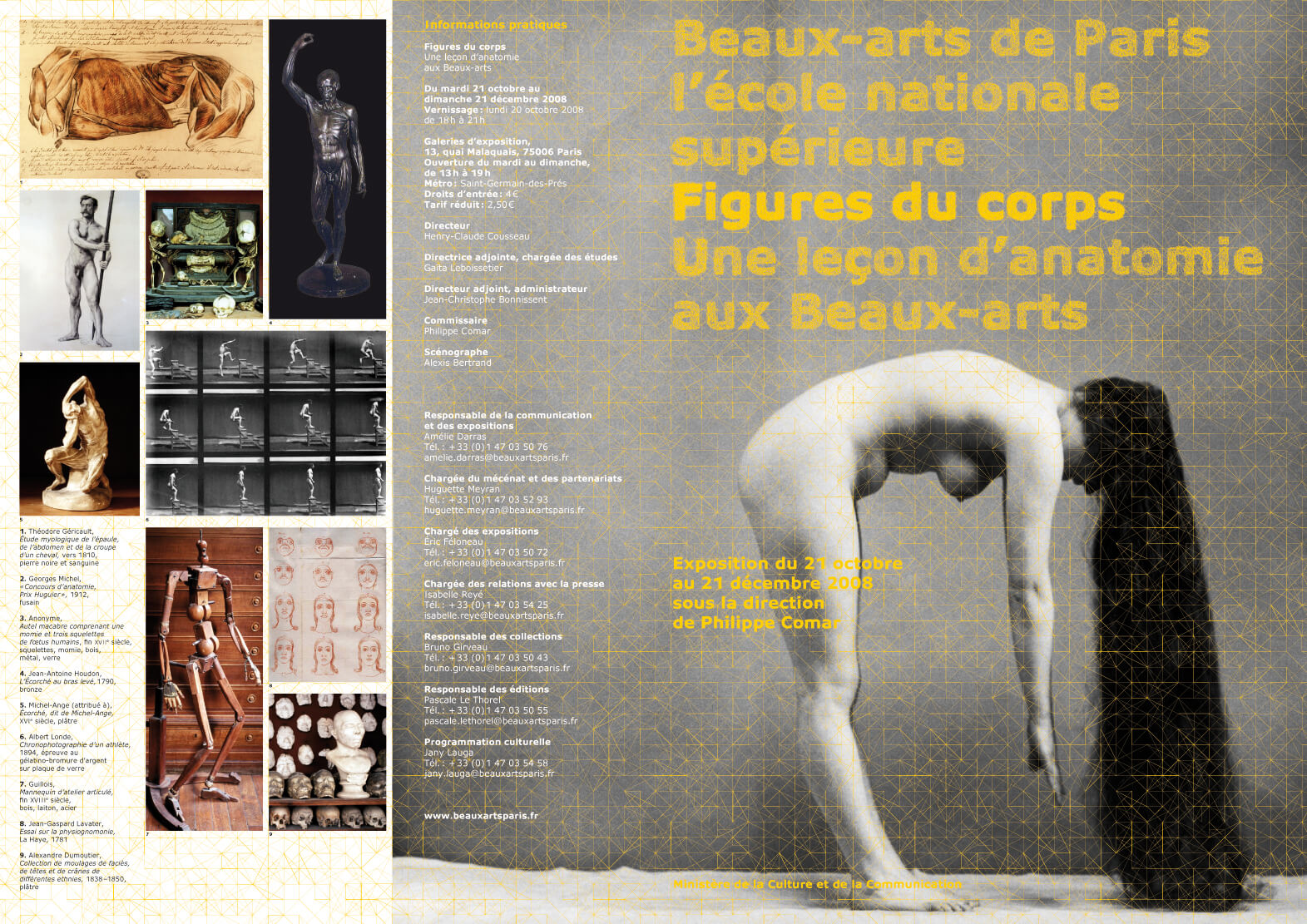
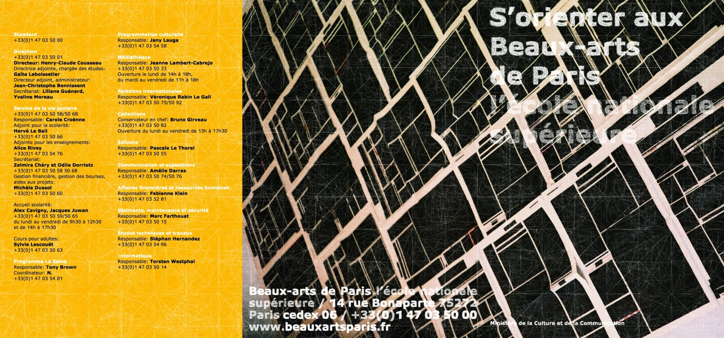
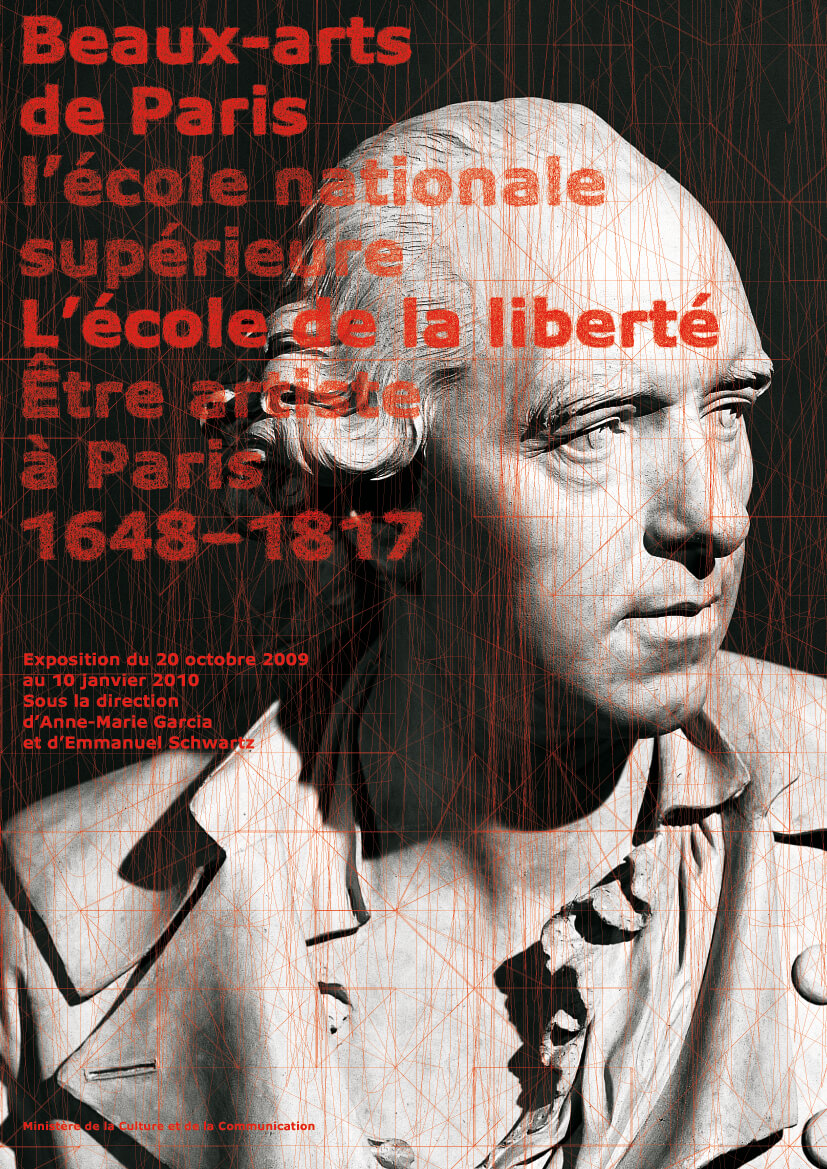
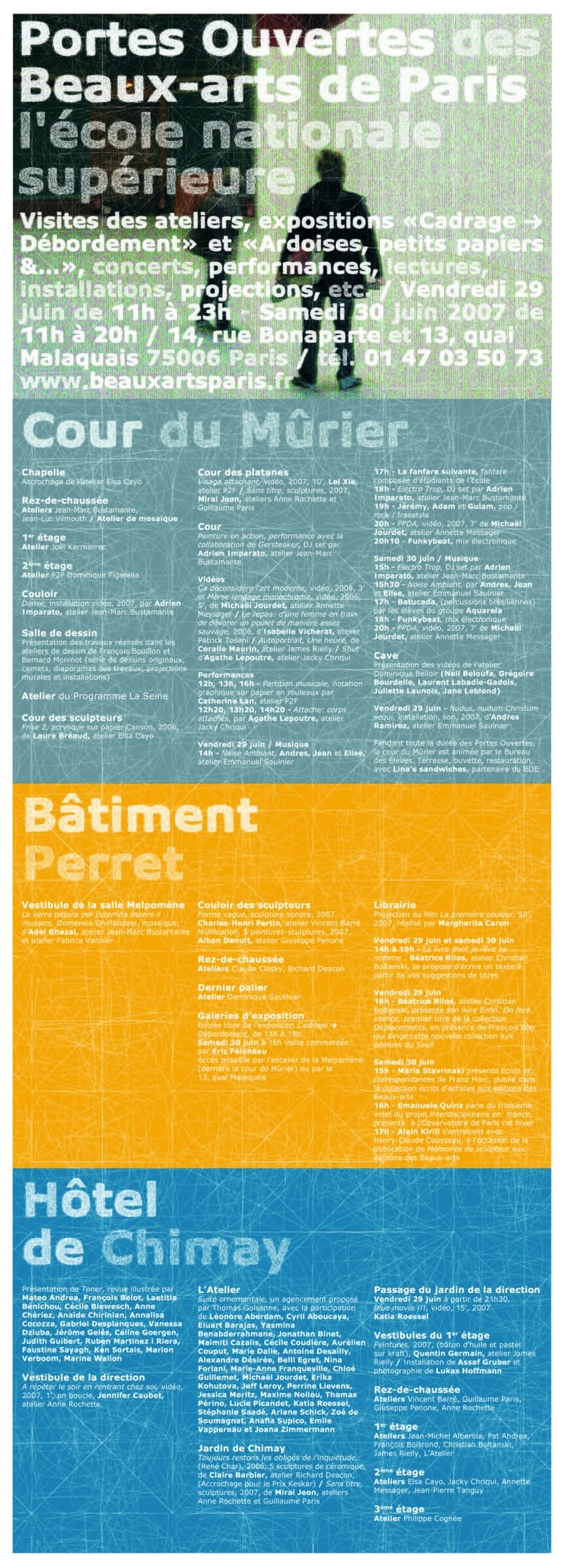
The visual language is centered around a typeface specifically designed for the Beaux-Arts de Paris, based on Verdana. This typeface comes in bold, regular, and regular italic styles and is complemented by two highly distinctive supplementary alphabets. These alphabets, known as “dense handwritten” and “light handwritten,” consist of hand-drawn characters used for captions and titles. The two densities of hand-drawn characters allow for the creation of different levels of readability. Background patterns, composed of extremely light lines similar to those in the hand-drawn alphabets, enrich the typographic system. These patterns can appear as white space against solid color blocks, or in color against a white background. The chosen color palette is deliberately very basic: yellow, red, green, blue, black, white, and gray. The visual identity of the Beaux-arts de Paris therefore does not include a logo; the school is identified through the composition of the title “Beaux-arts de Paris l’école nationale supérieure” using hand-drawn alphabets. This title almost never appears on its own; whenever possible, it must be integrated into the titles of the documents produced. Throughout the documents, these typographic compositions, combined with patterns and colors, create the school’s new identity.
Design Team — Ruedi Baur and Olivier Duzelier