
2009
National Archives, Paris, Fontainebleau, Pierrefitte-sur-Seine
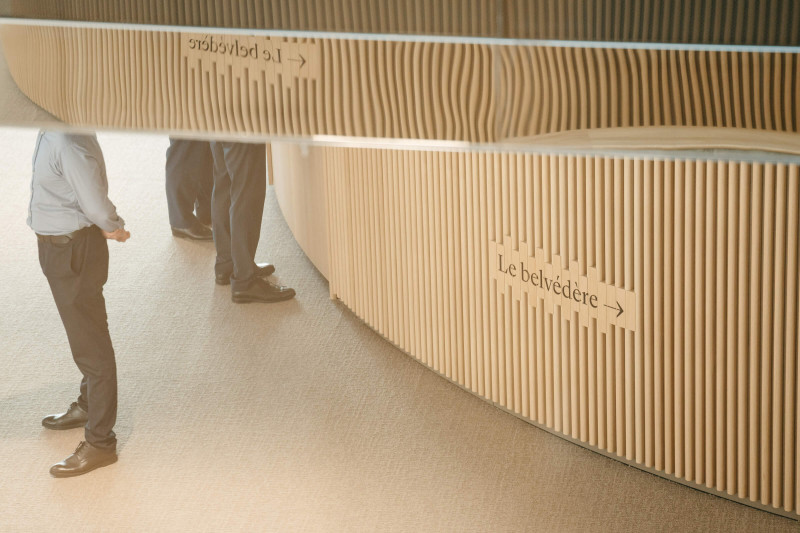
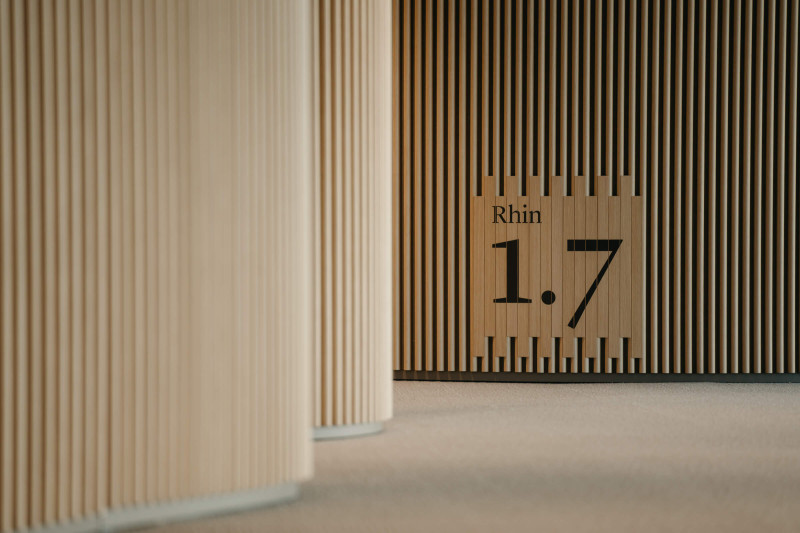
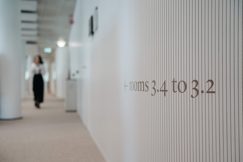
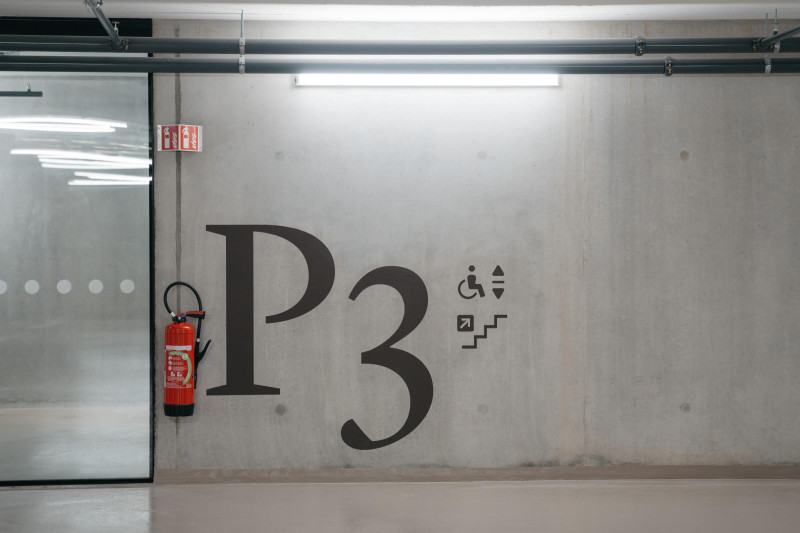
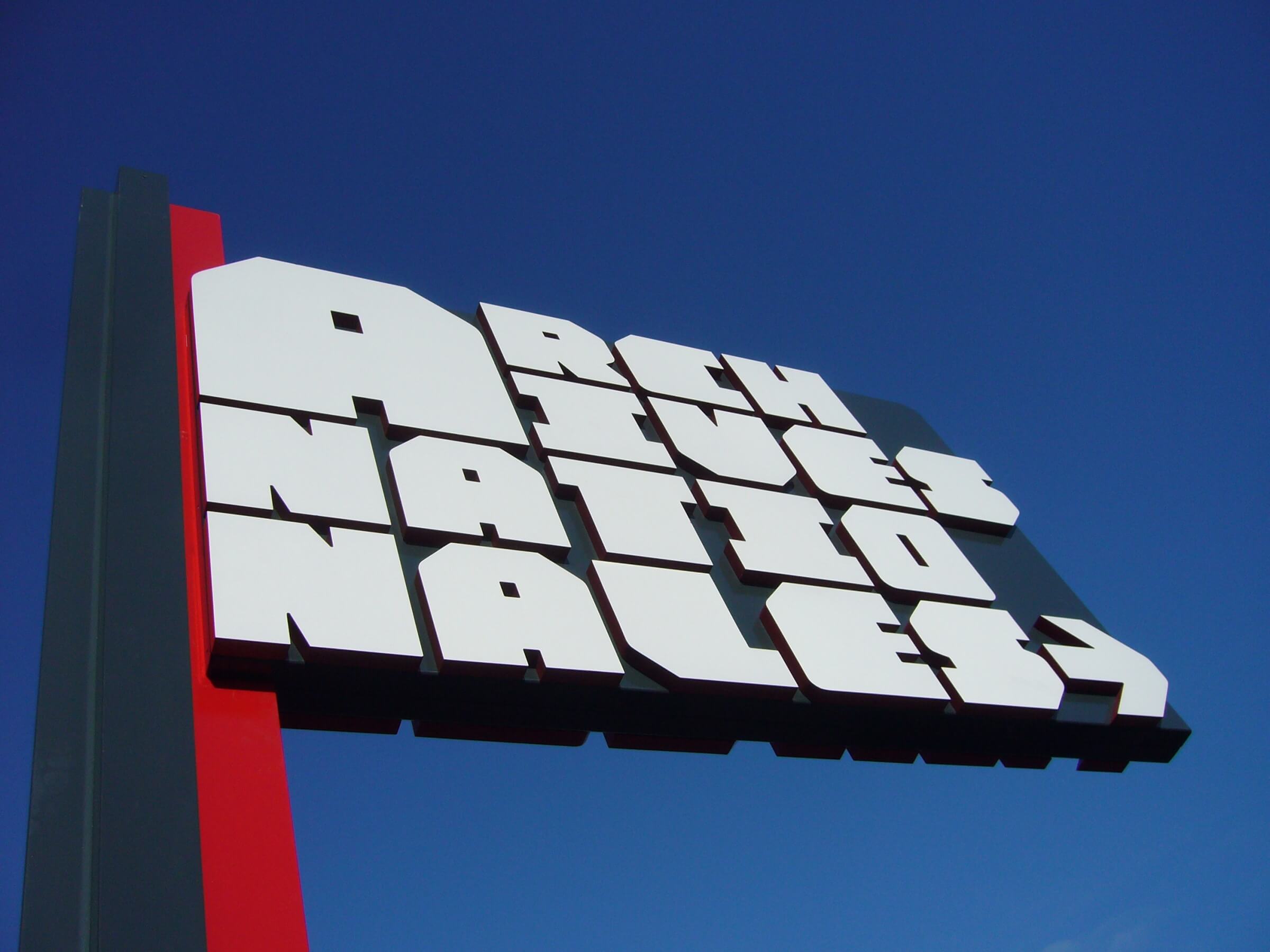
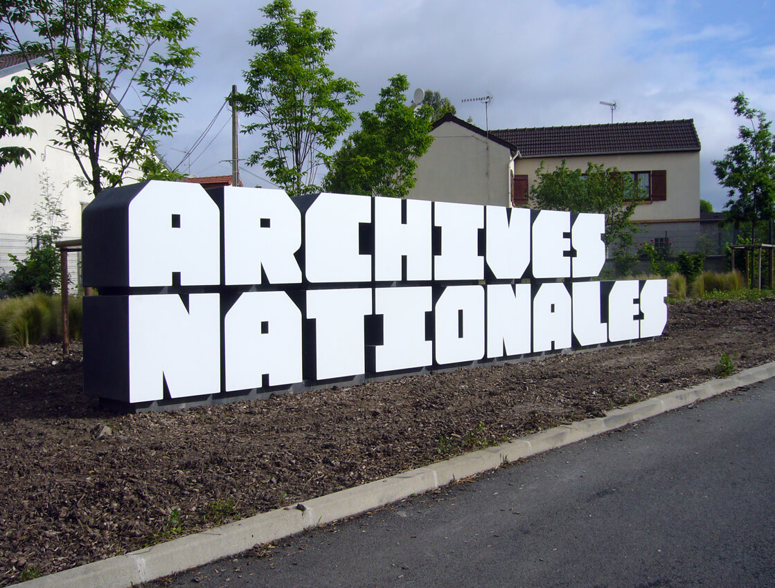
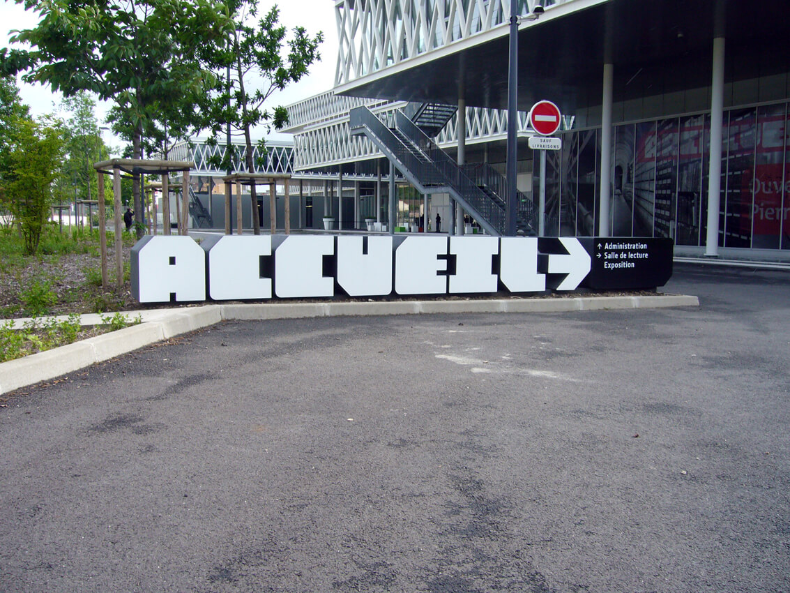
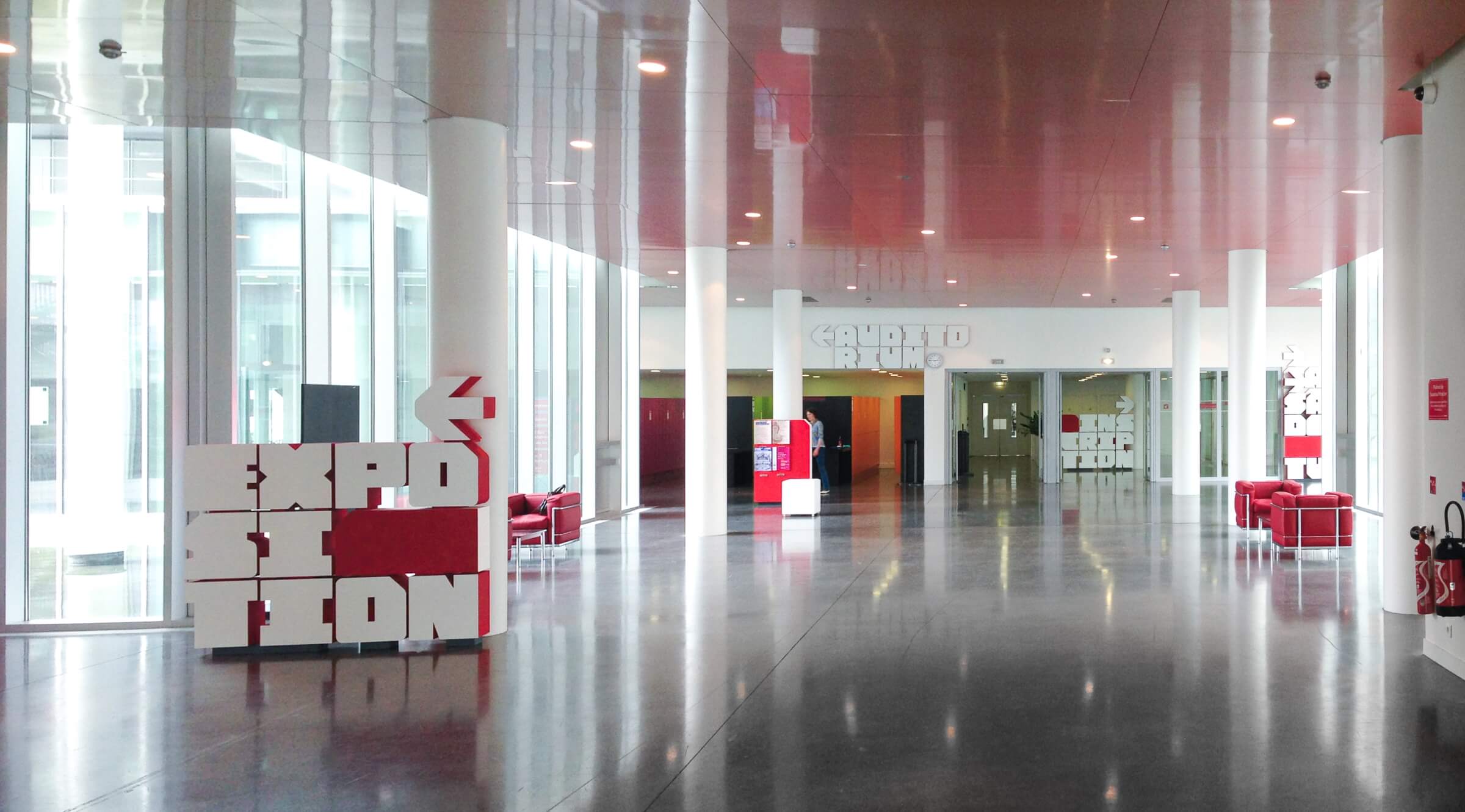
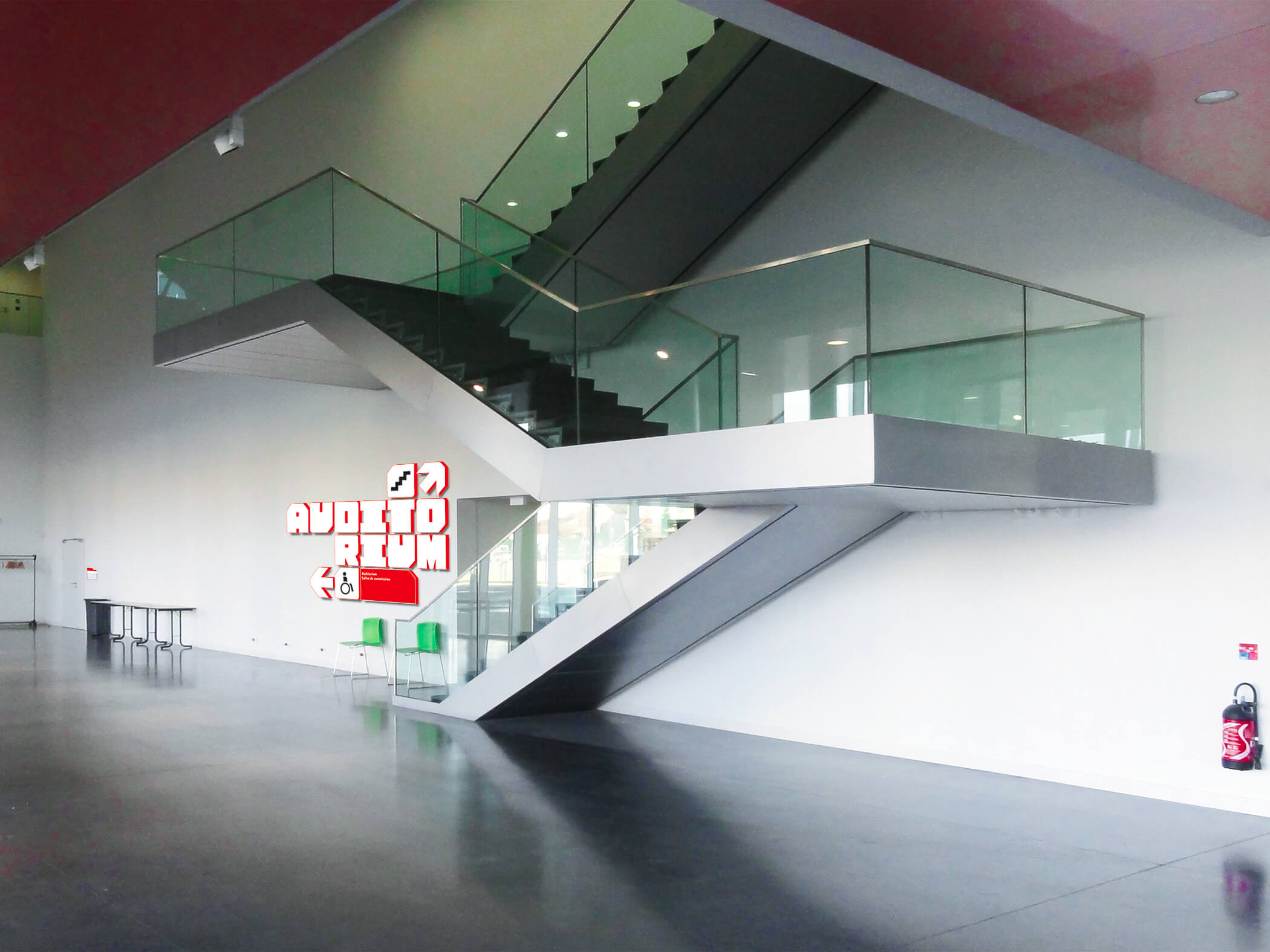
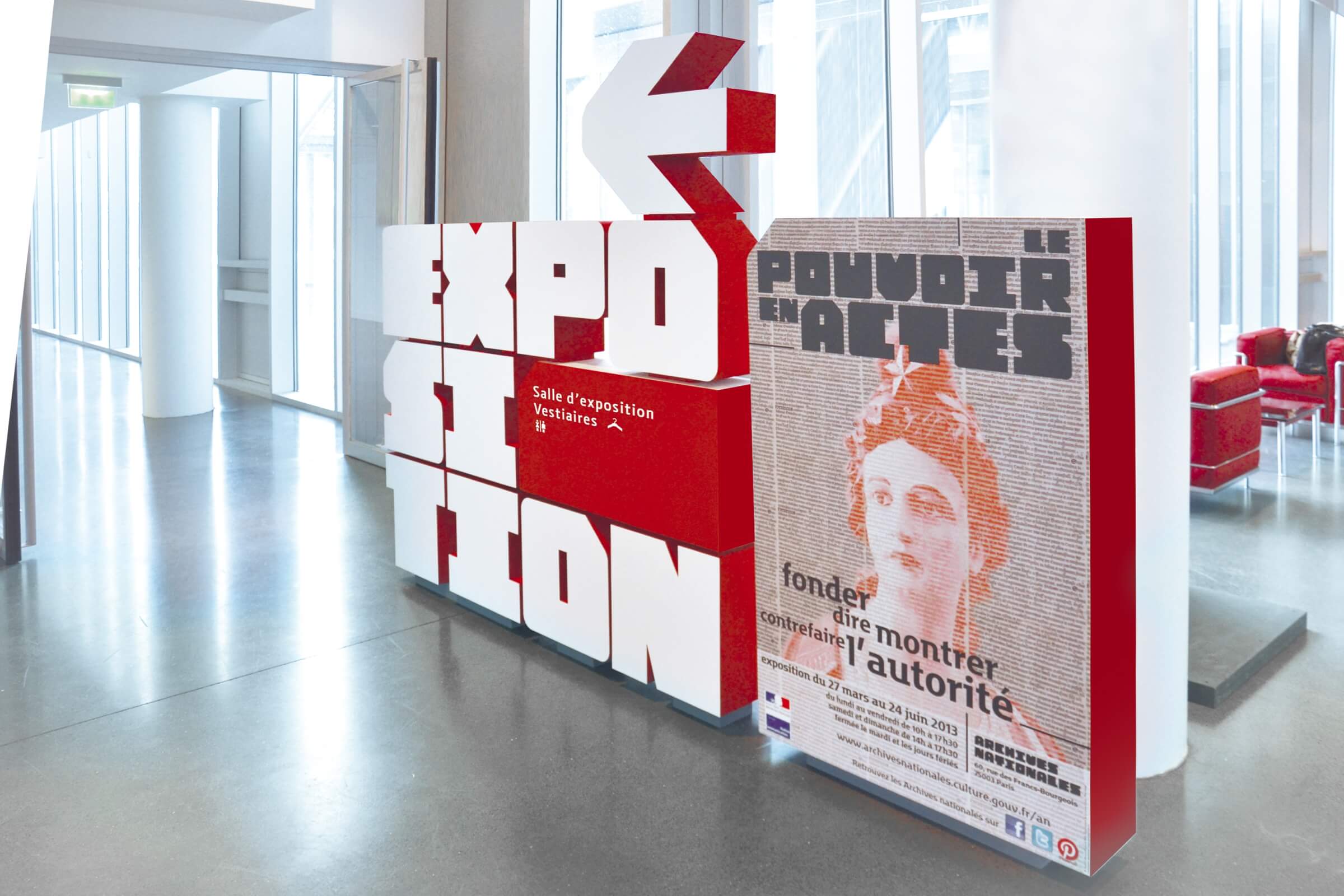
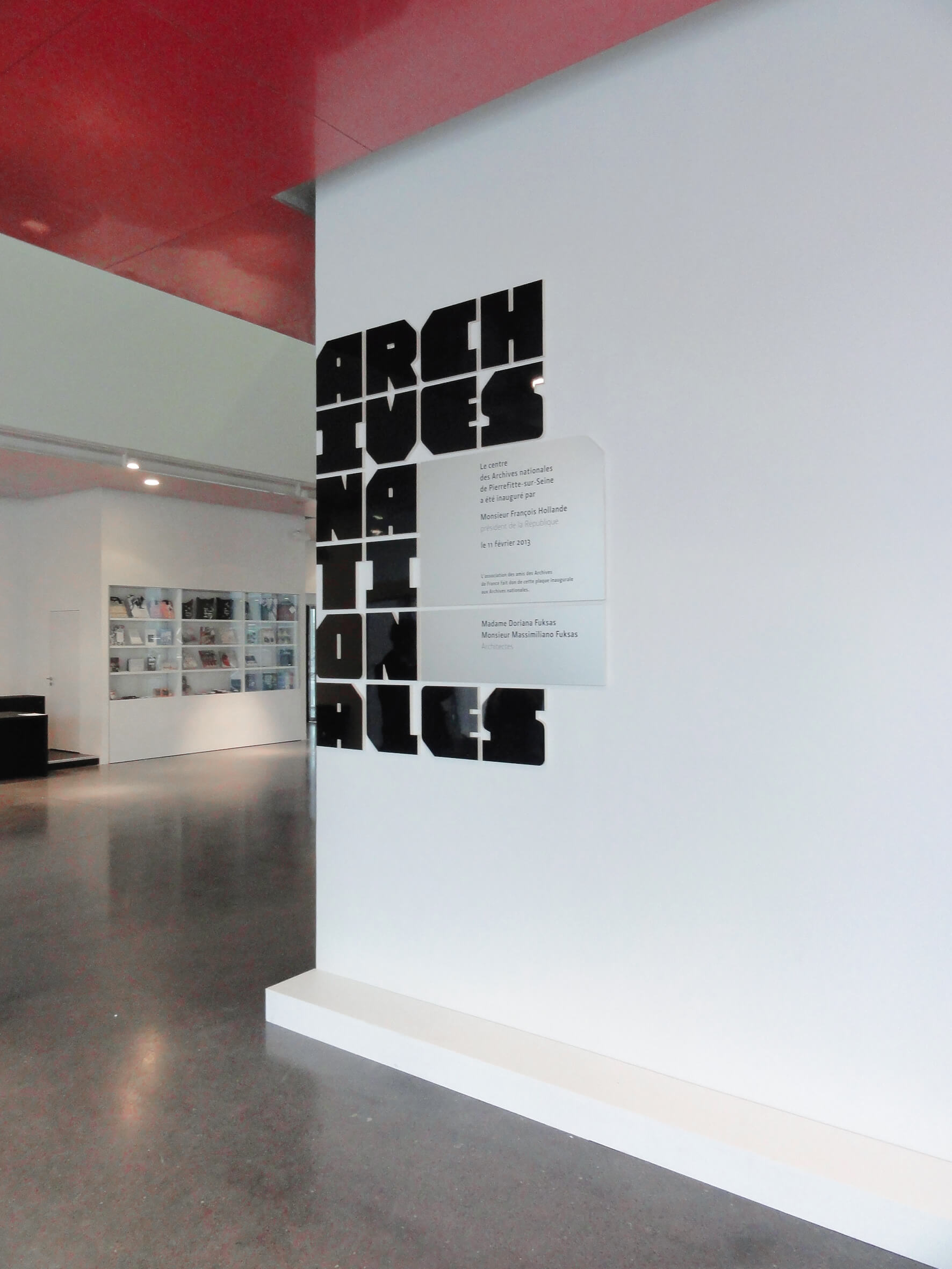
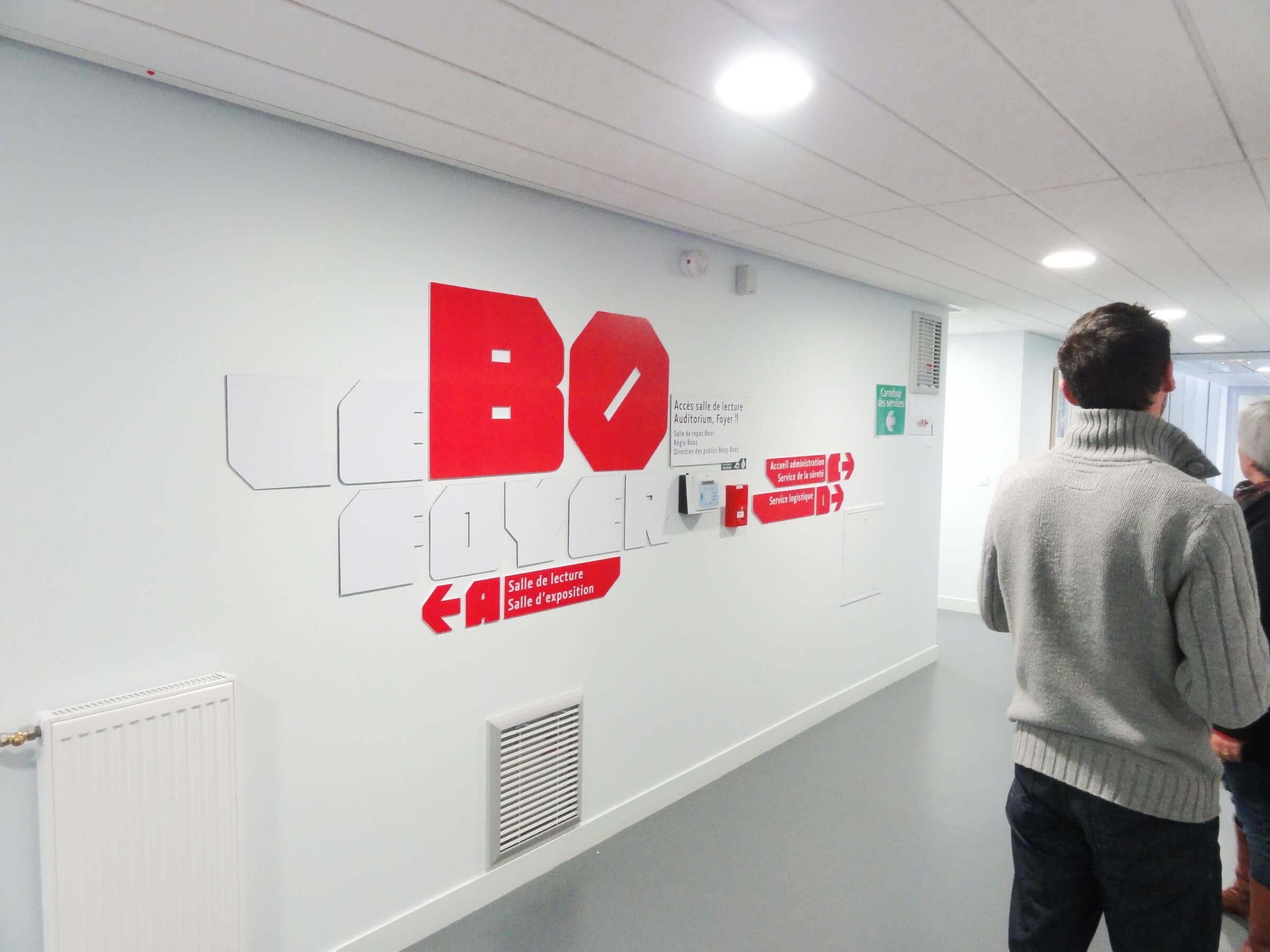
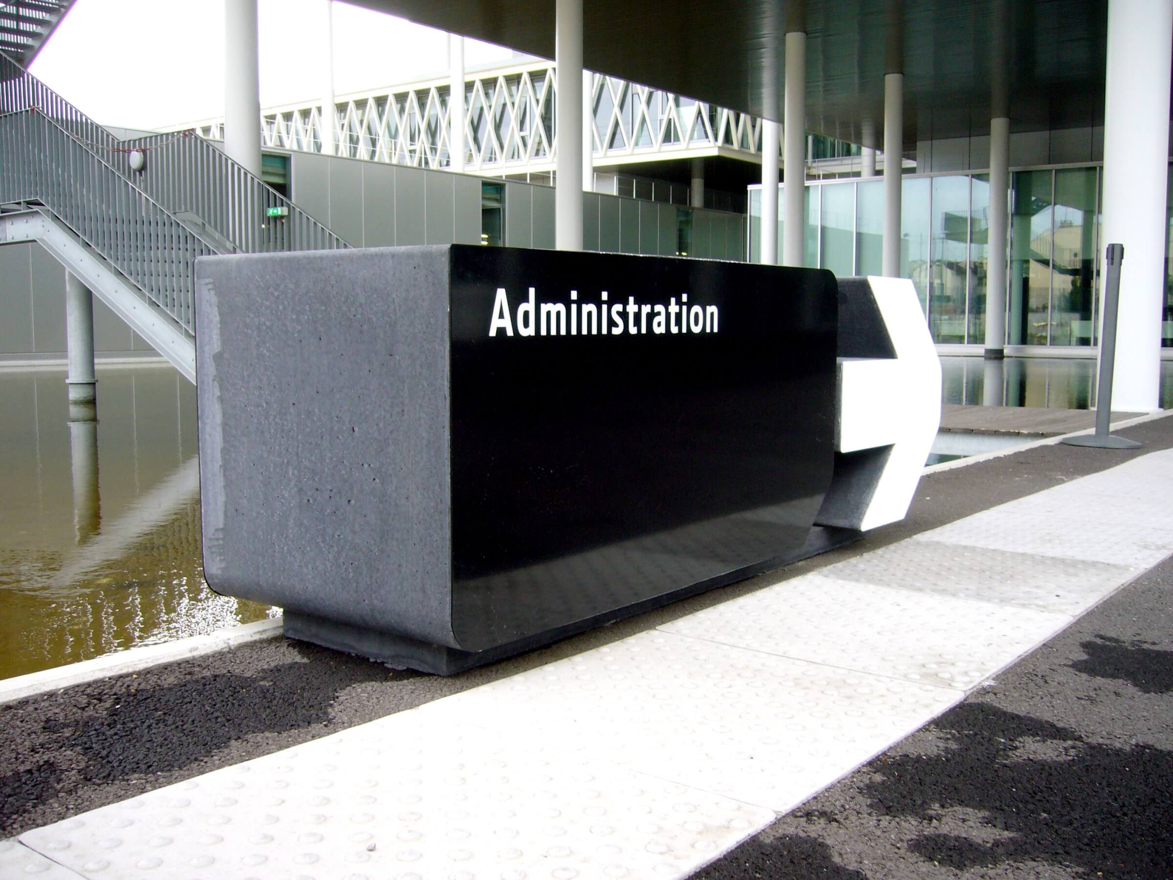
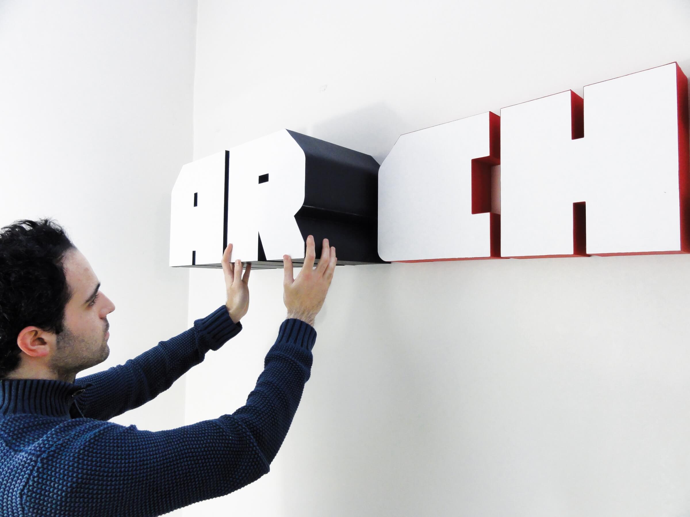
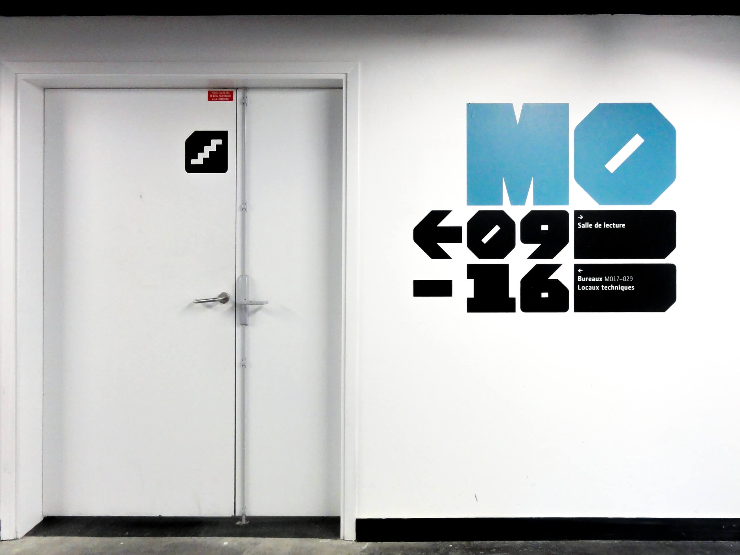
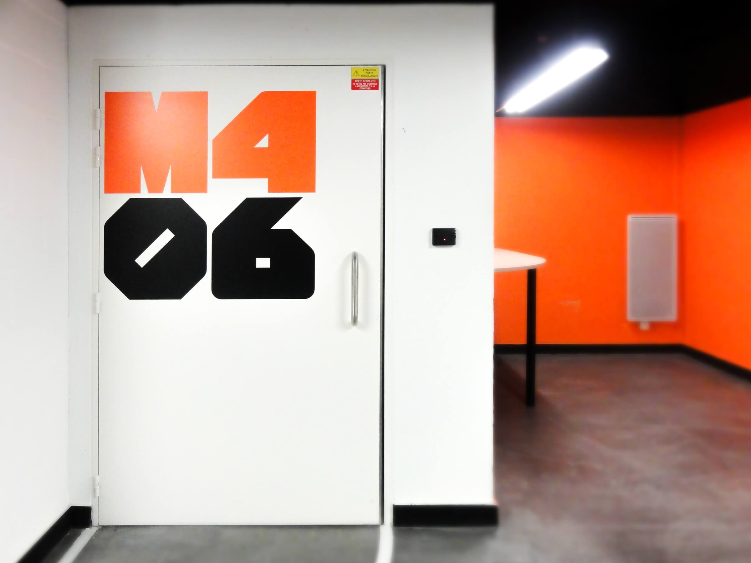
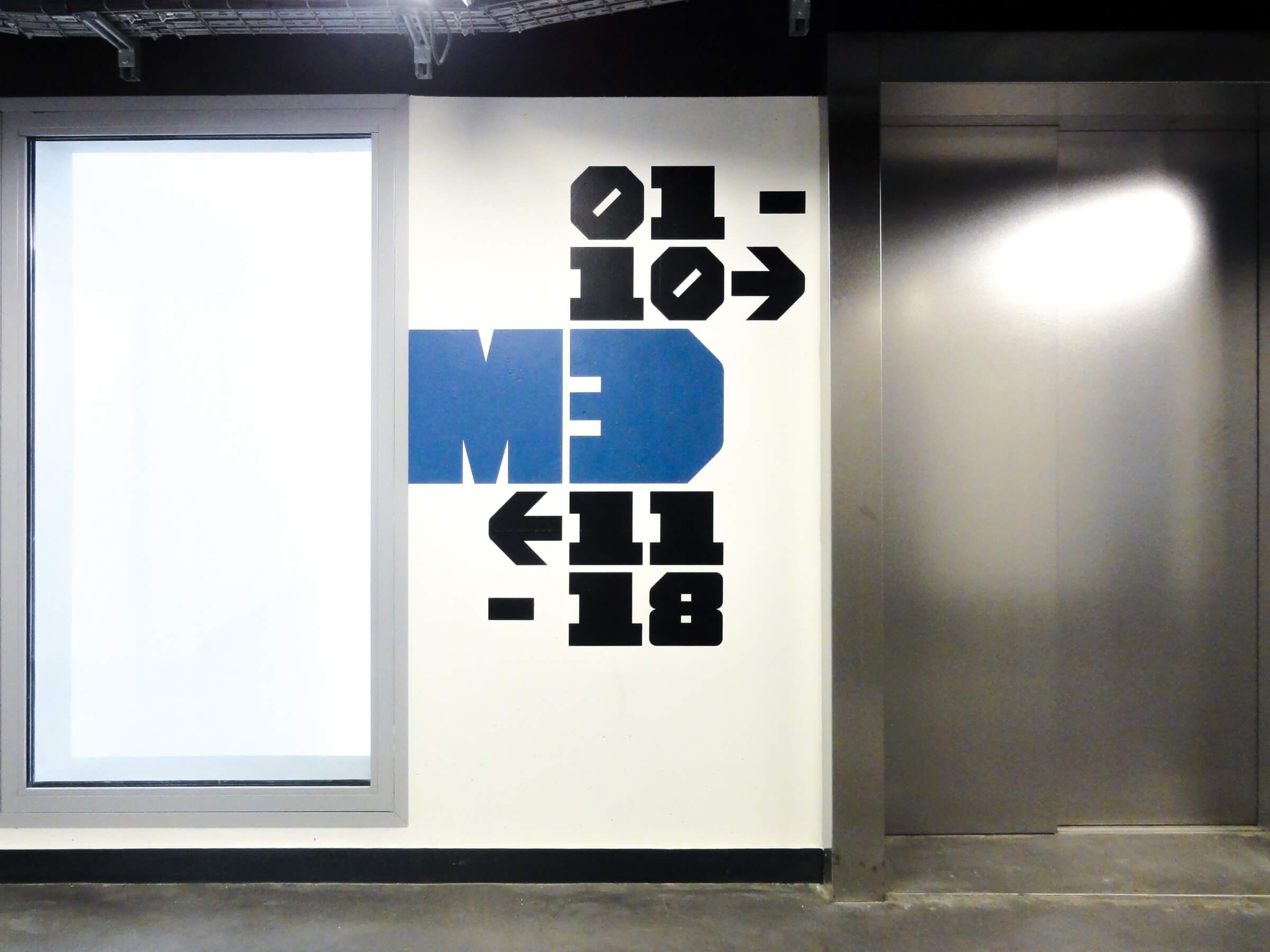
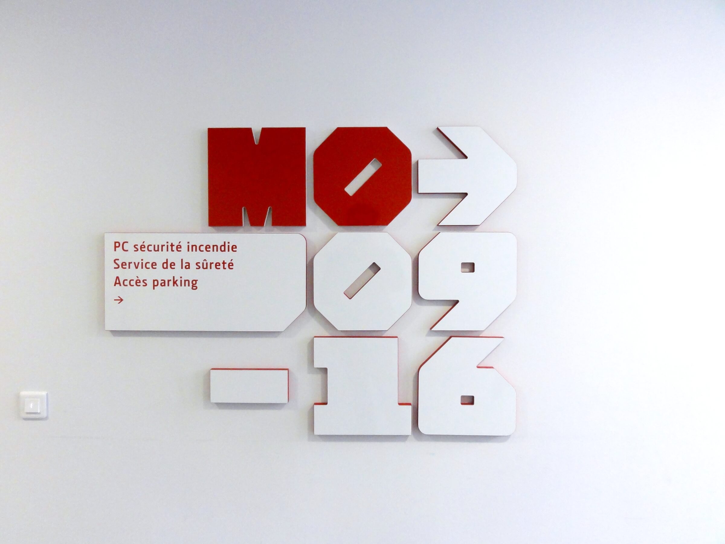
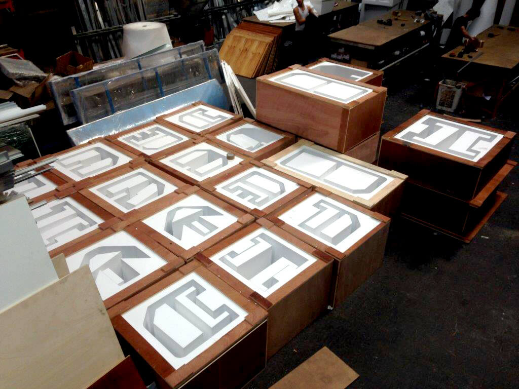
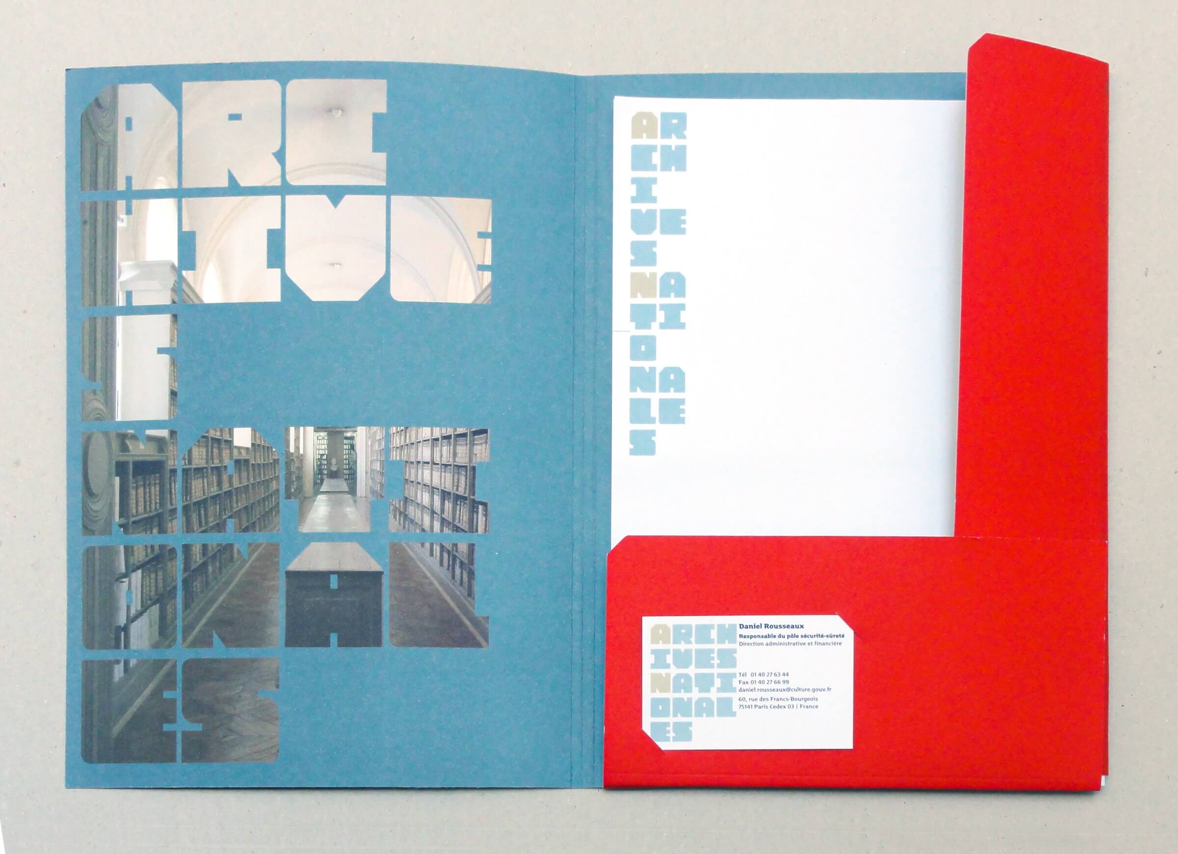
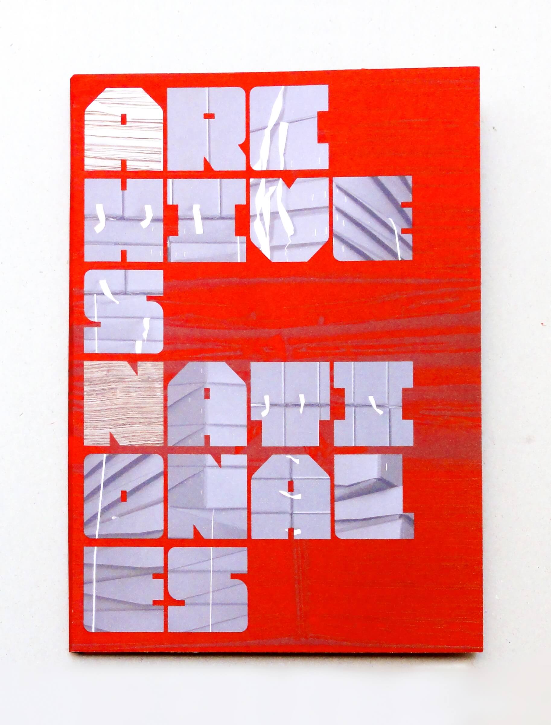
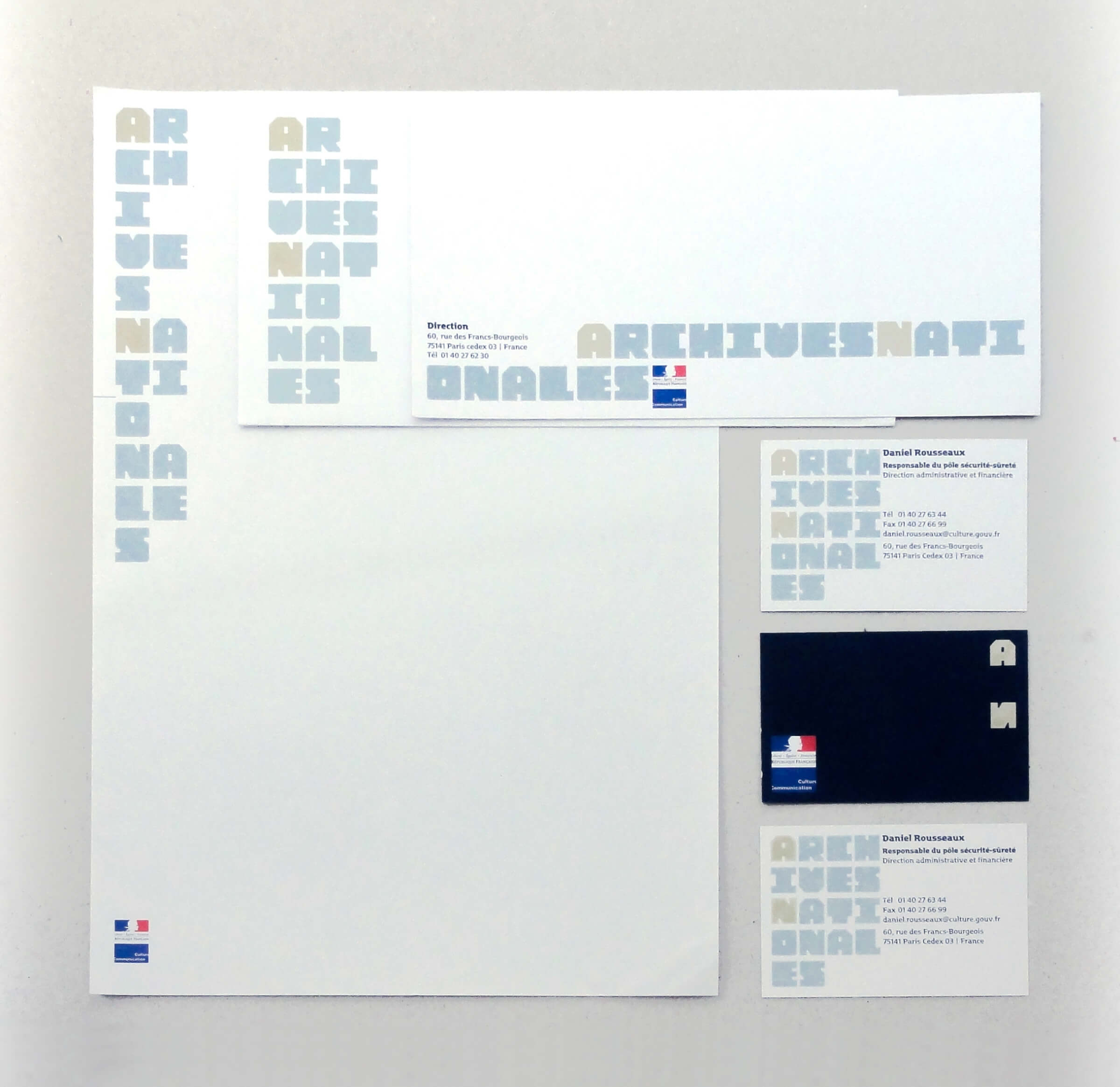
The typeface we designed as part of the development of the National Archives’ visual identity is based on the concepts of accumulation and organization. Created to suit both two- and three-dimensional applications, it is used in the wayfinding system to identify the building’s structural functions. Designed around a square shape, the letters form the core of a virtual grid that enables the systematic arrangement of information and signage. Outside the building, the letters appear as freestanding cubes made of through-colored concrete. Inside, in the spaces accessible to the public, the depth of the letters is reduced to form freestanding identification and directional signs in the entrance hall. Their thickness decreases further on wall-mounted applications, until they lose all volume in the archive rooms, where they are painted directly onto the walls. Made of plywood, their glossy finish contrasts with the matte edges of the wood. Design
team — Ruedi Baur, Stéphanie Brabant, Simon Burkhart, Eva Kubinyi, David Thoumazeau