2019–2022
Identity guidelines for the harbors of Brittany
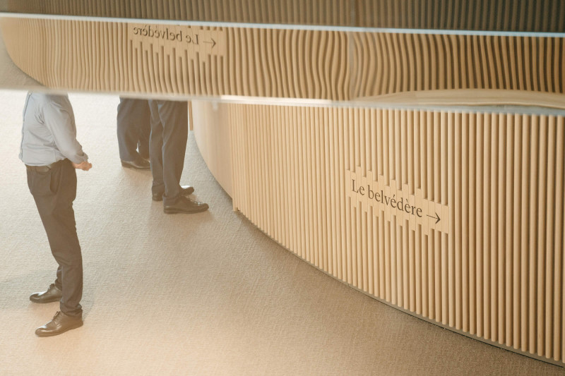
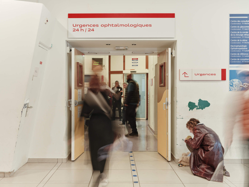
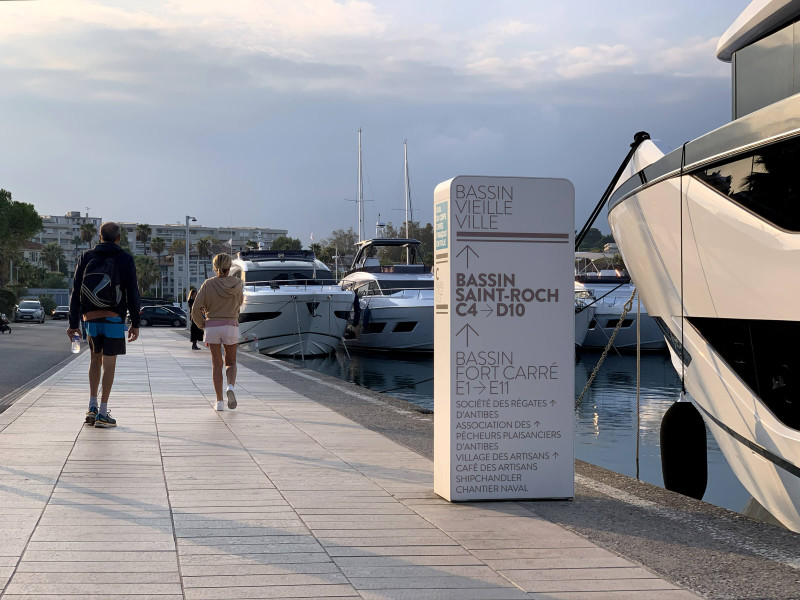
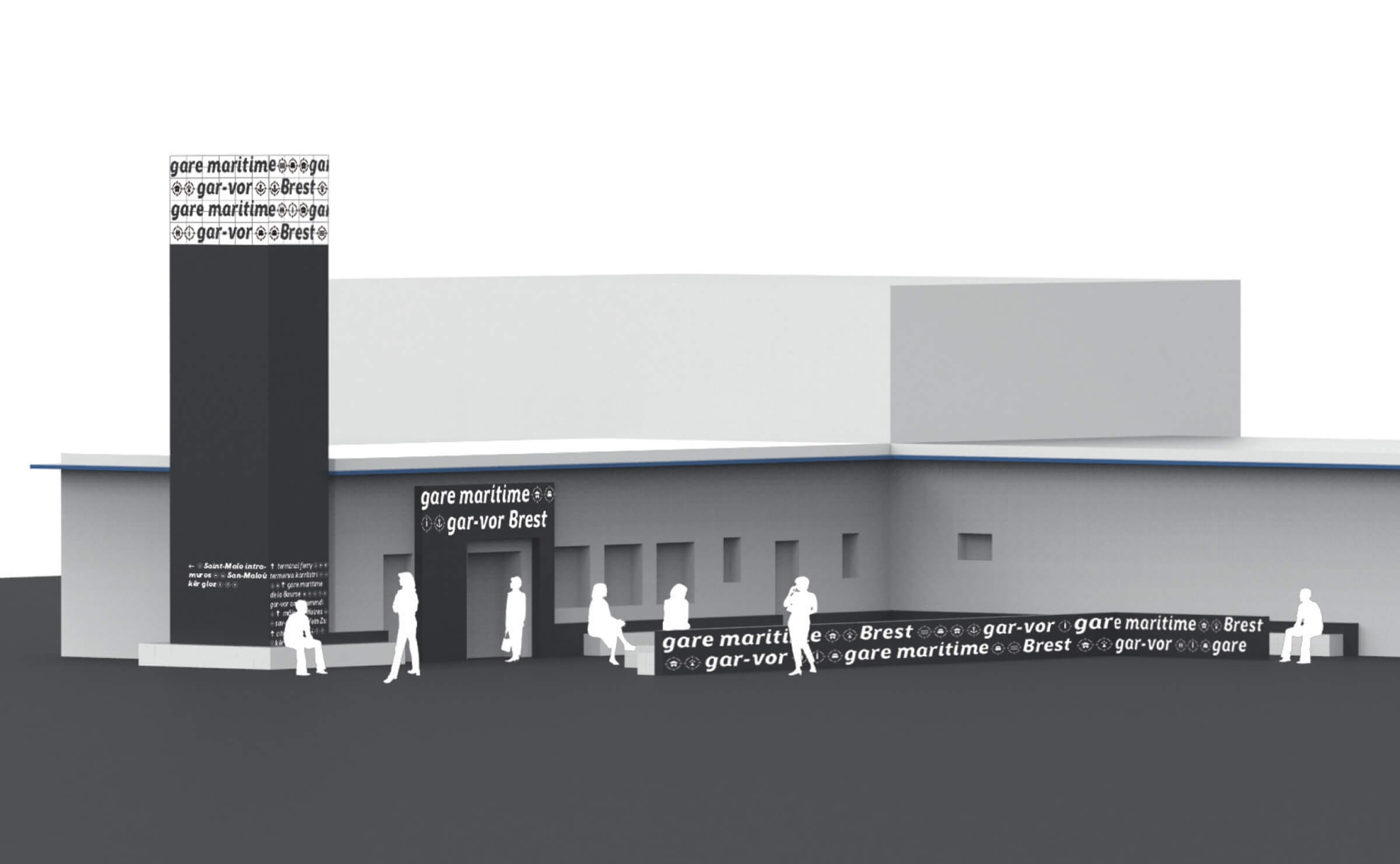
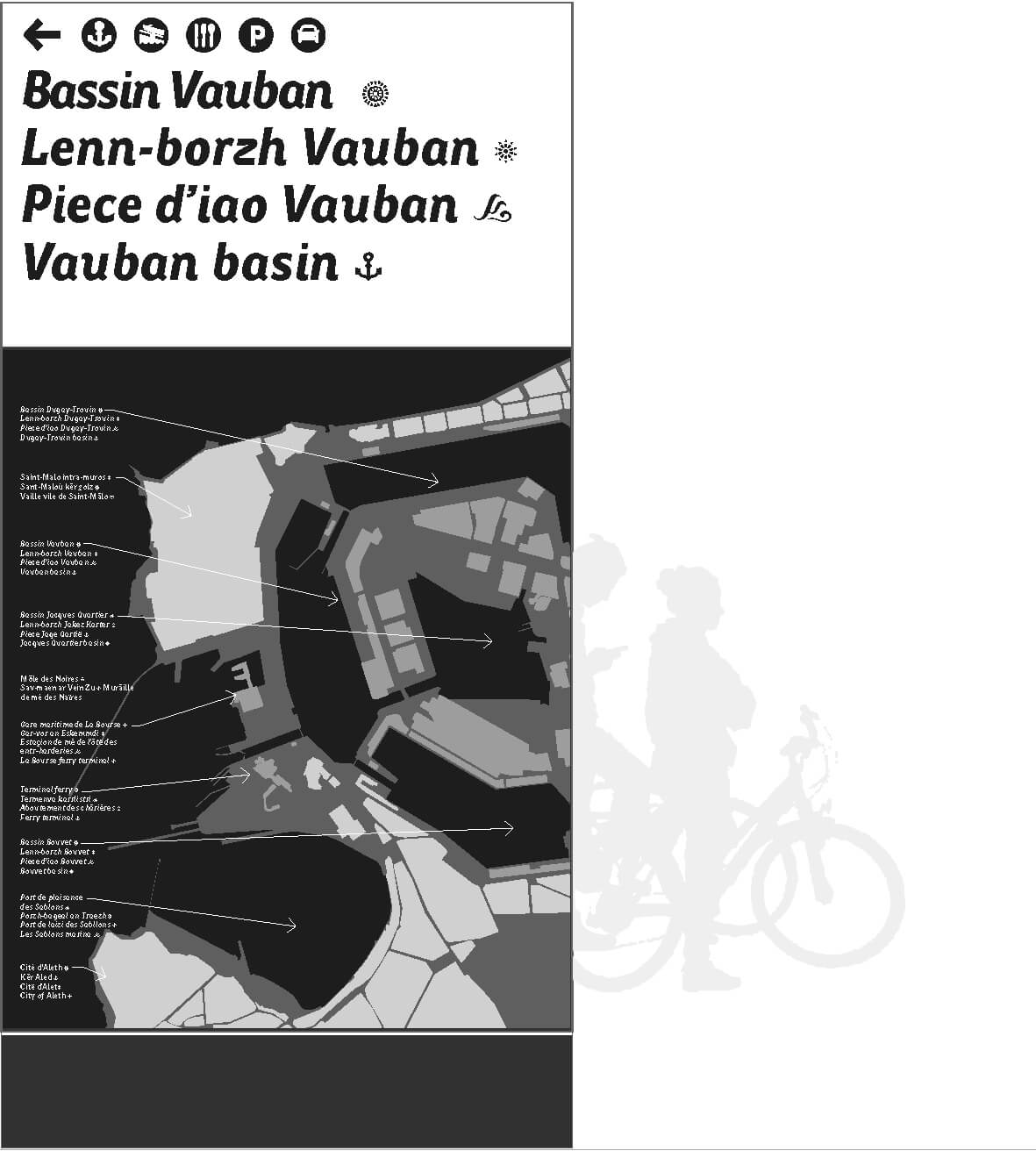
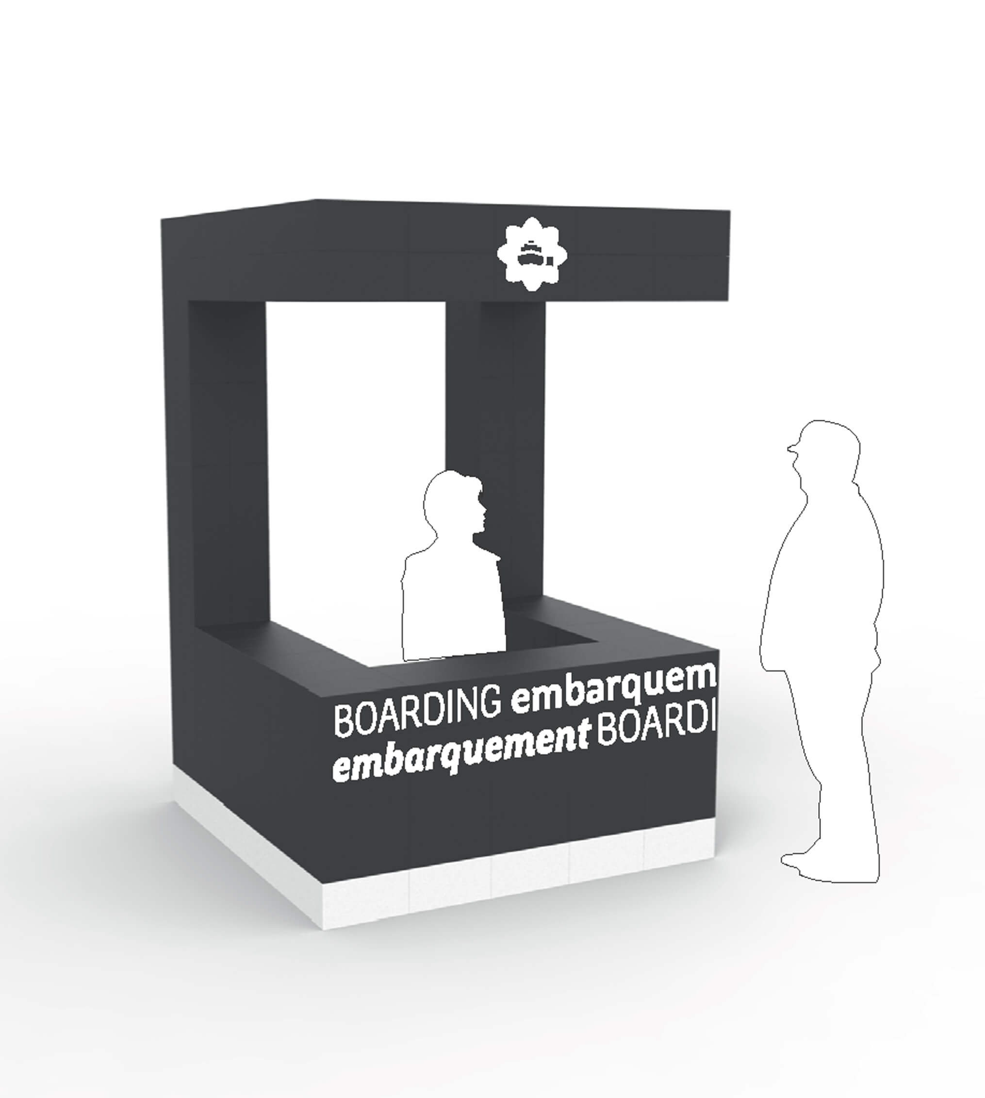
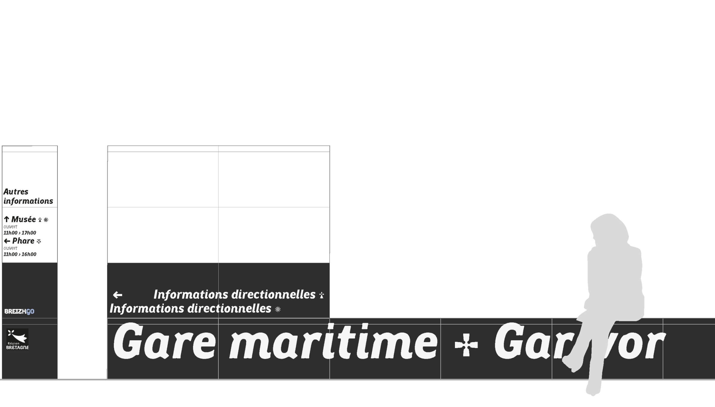
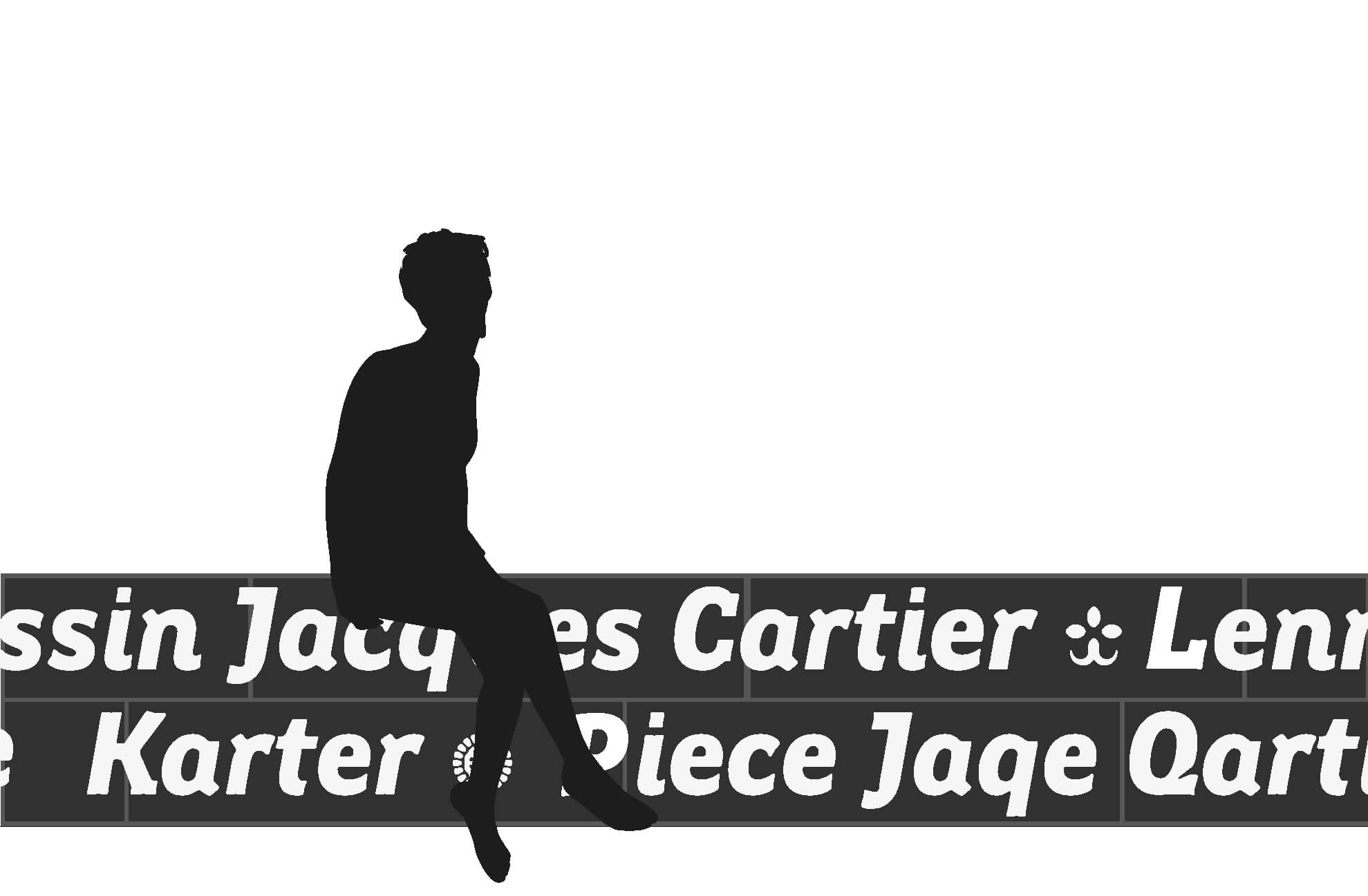
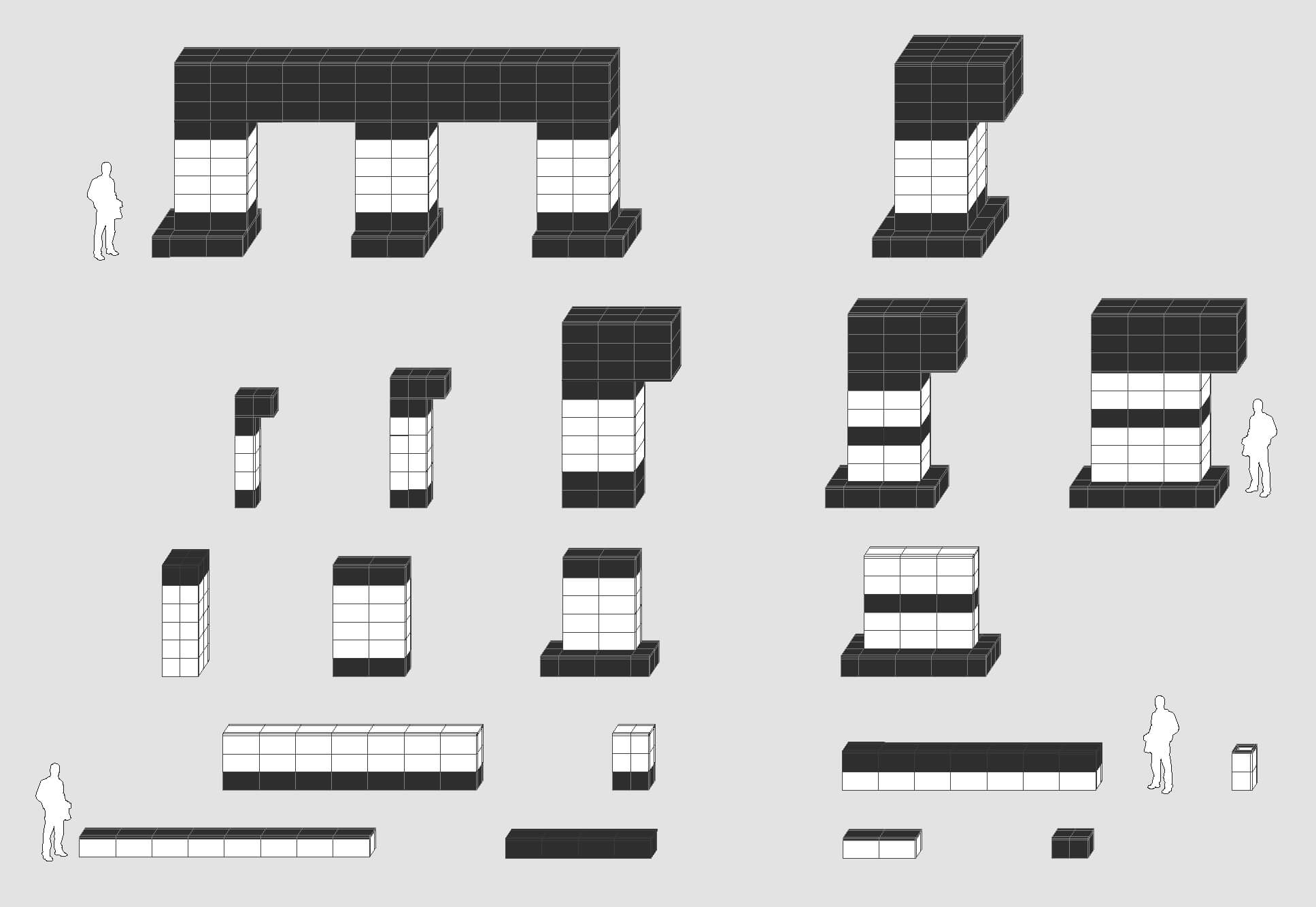
Just as a lighthouse visible from the open sea signals the entrance to a harbor, we have designed signage furniture for the new branding guidelines of the ports and ferry terminals in the Brittany Region that can also serve as a landmark within the port areas of coastal cities, blending seamlessly with the existing architecture. We drew inspiration from the black and white of the Gwenn ha du, focusing on the materiality of the structures and on construction principles that allow for easy installation. The design principle for these signage structures was conceived around two simple shapes—a square and a rectangle—creating two adaptable modules tailored to the specific needs of each port, whether in terms of length, height, or width. These signage structures are designed to adapt to each architectural context; they must blend seamlessly with it and adapt to existing elements. These structures are clad in black-and-white-stained fiber-reinforced concrete. The graphic design uses the Région Bretagne typeface created by Xavier Dupré, which is inspired by the handwritten inscriptions found on boat hulls in Brittany. It was important to us to retain this handwritten aspect of the typography for the signage. It is therefore executed using stencils or hand-painted letters.
Design team — Ruedi Baur, Simone Burth, Morgane Pontis, and Alexandre Moriceau