since 2022
Mulhouse Bike Network
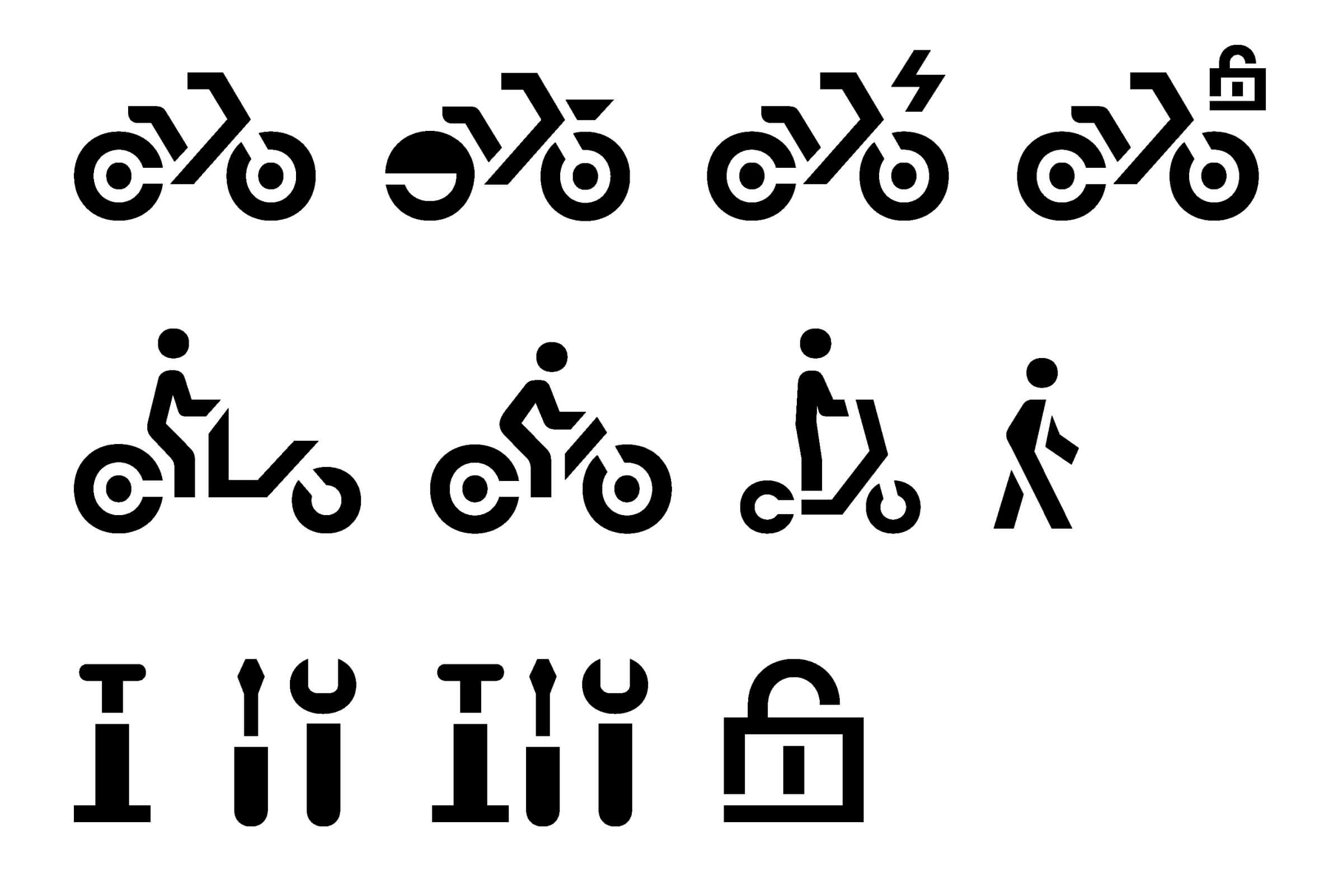
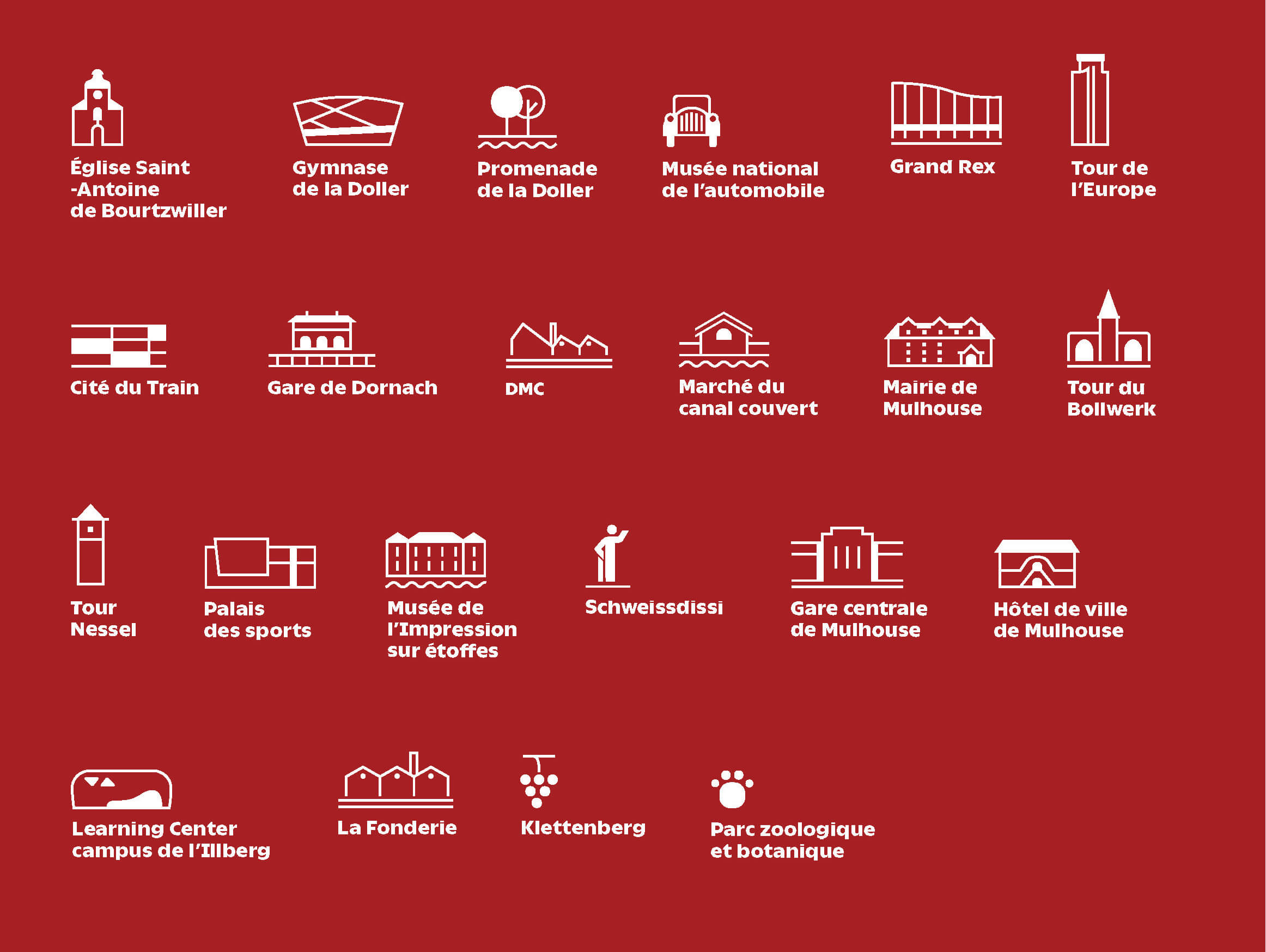
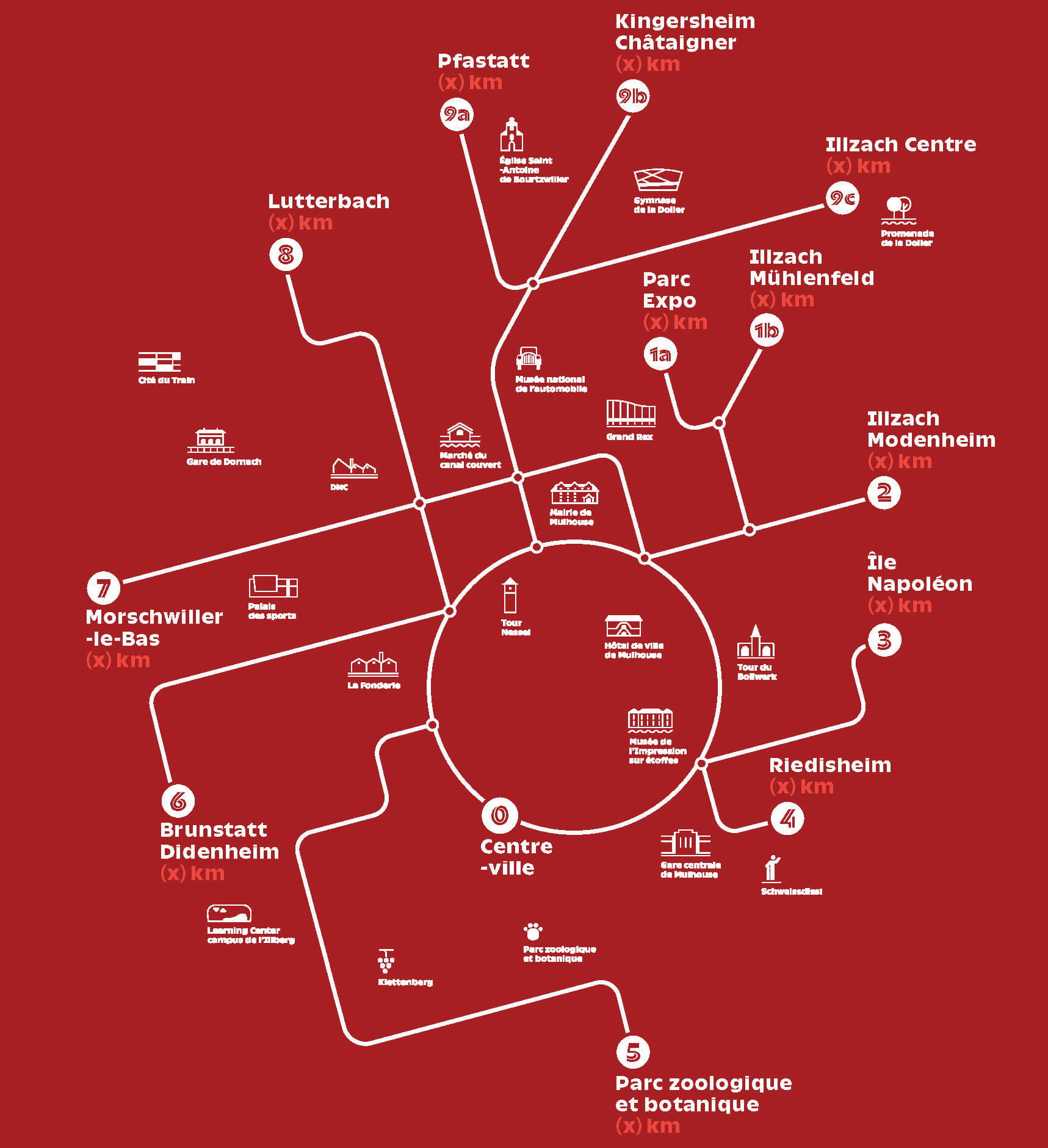
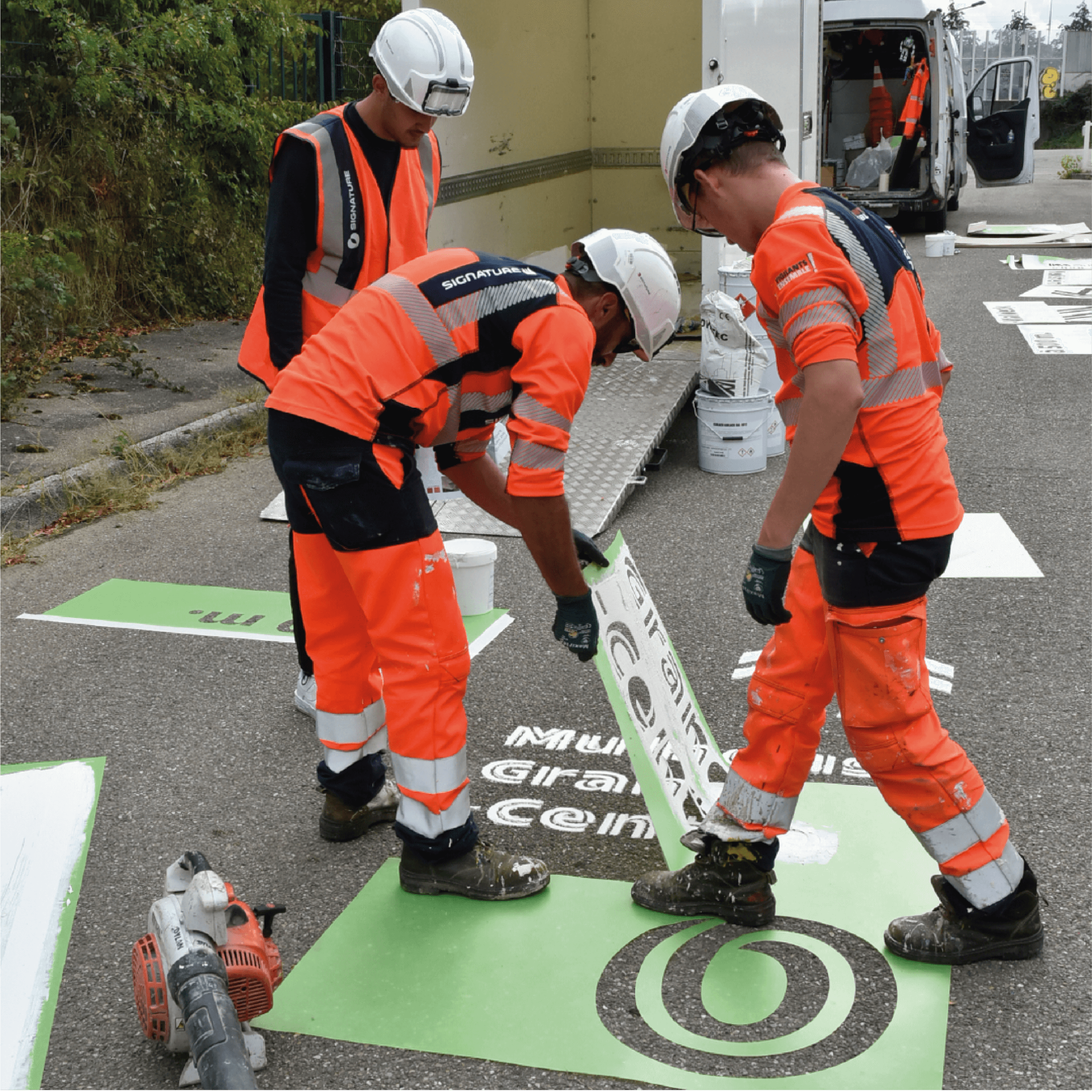
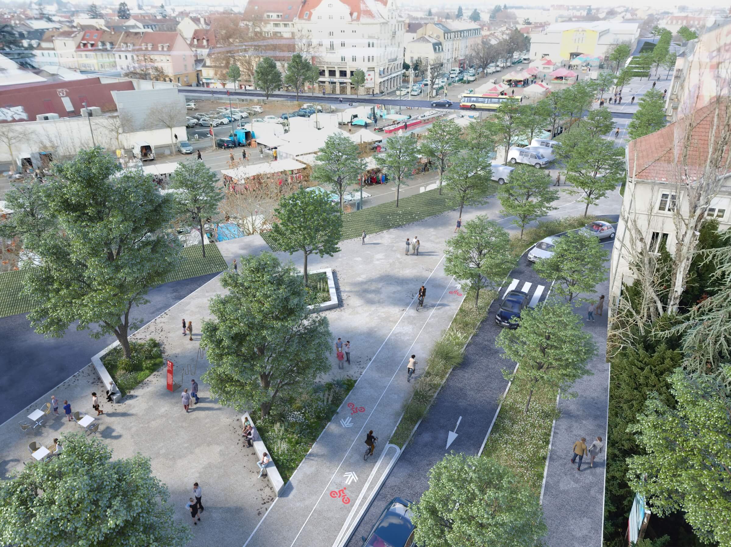
To connect the city’s various neighborhoods and provide easy navigation, information, and a pleasant experience for both pedestrians and cyclists, Mulhouse’s cycling network employs a comprehensive, custom-designed visual identity. This includes a typeface designed specifically for this project, a family of pictograms illustrating the city’s notable landmarks, orientation maps, and specialized wayfinding furniture deployed at stations offering various services to bike path users (tire inflation, repairs, etc.).
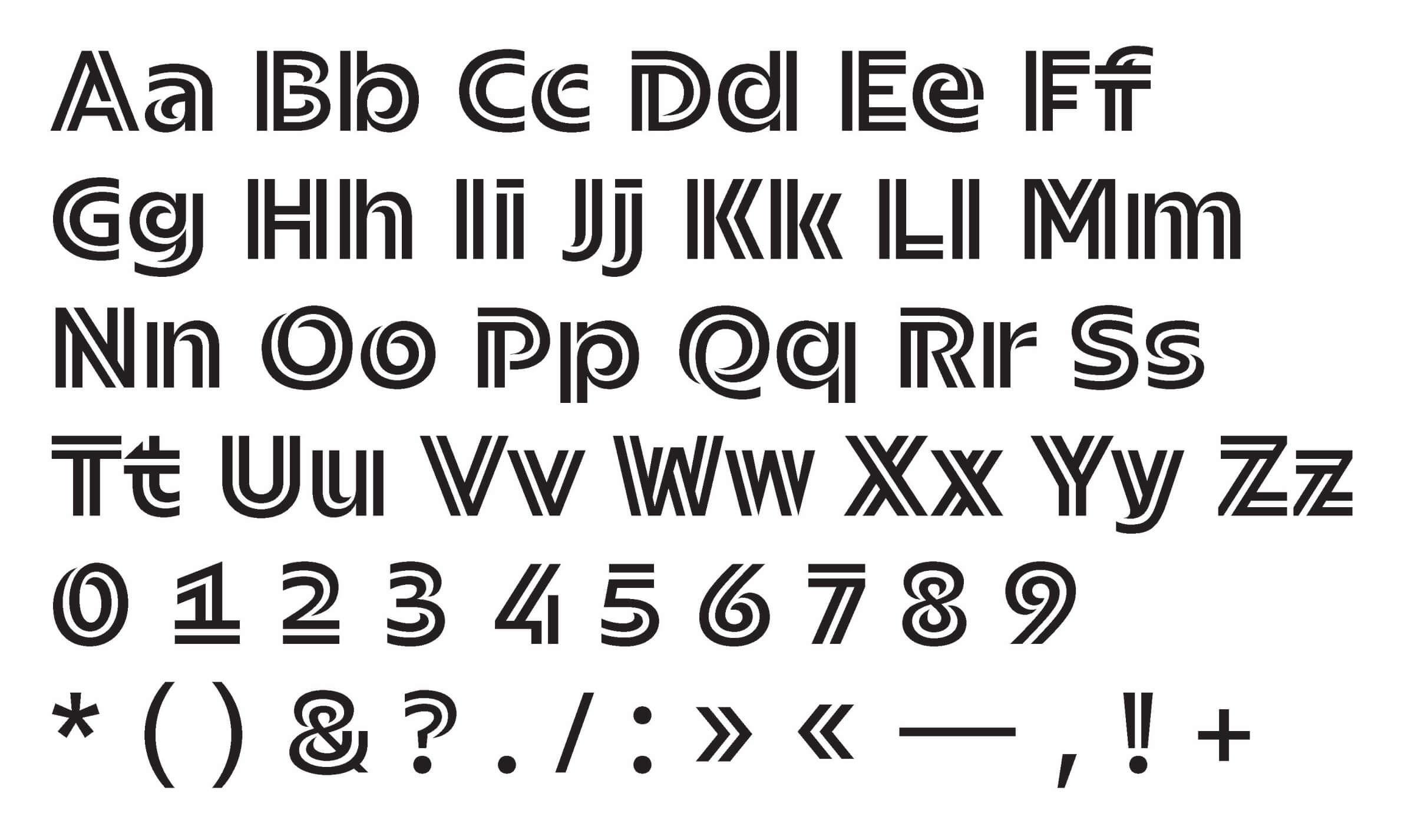
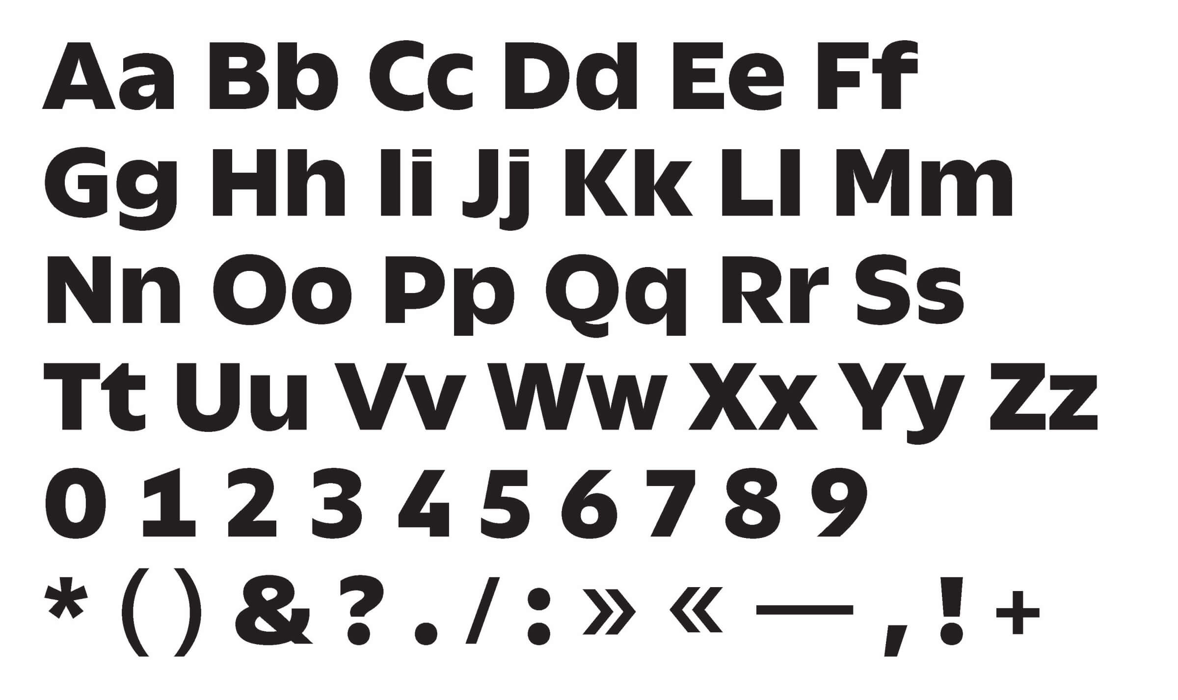
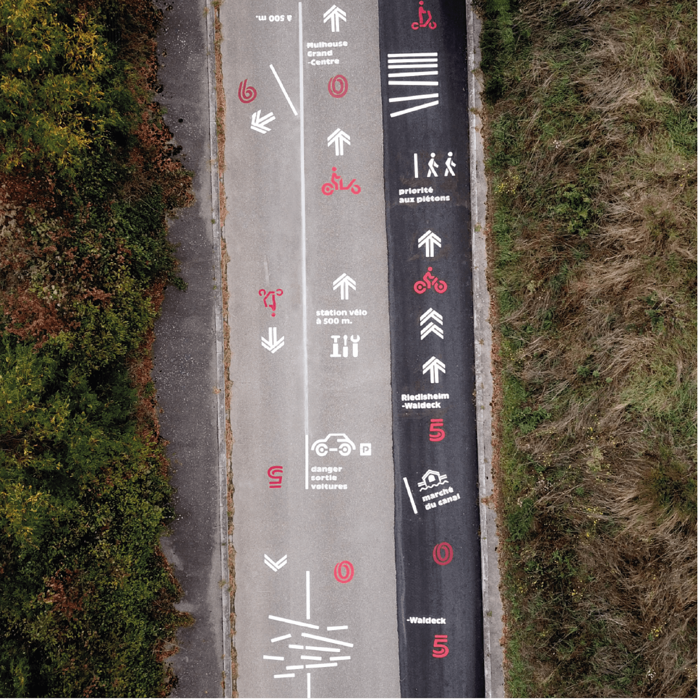
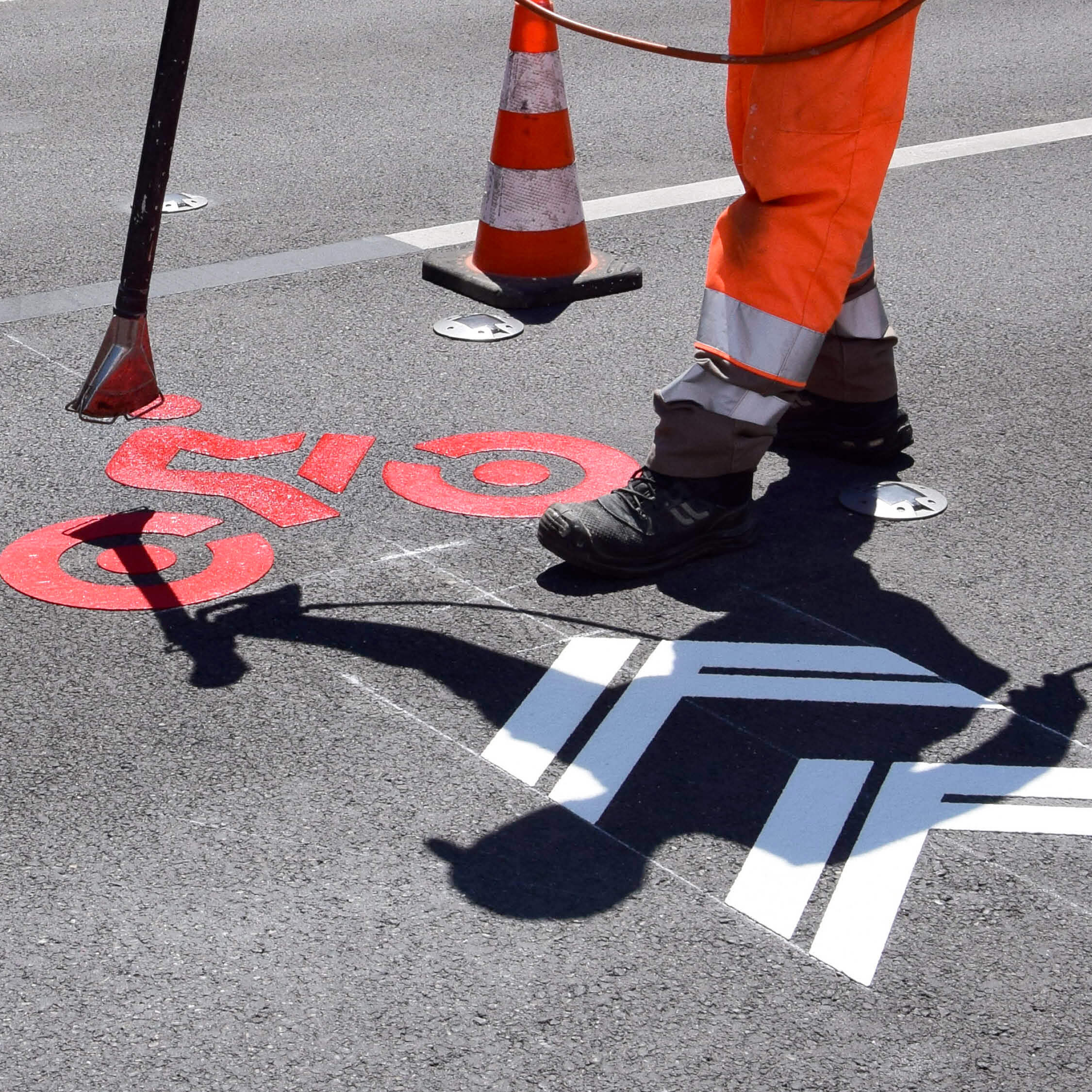
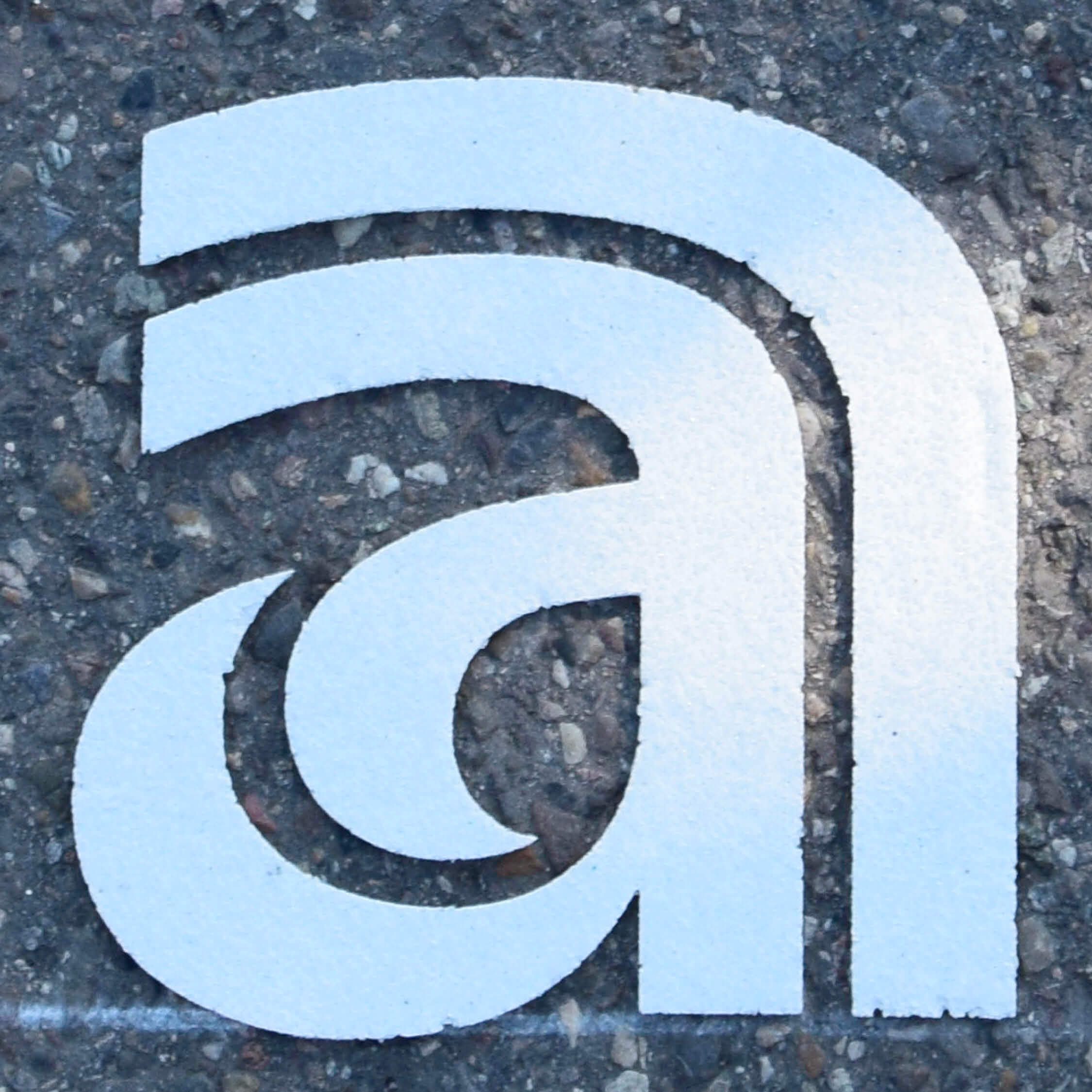
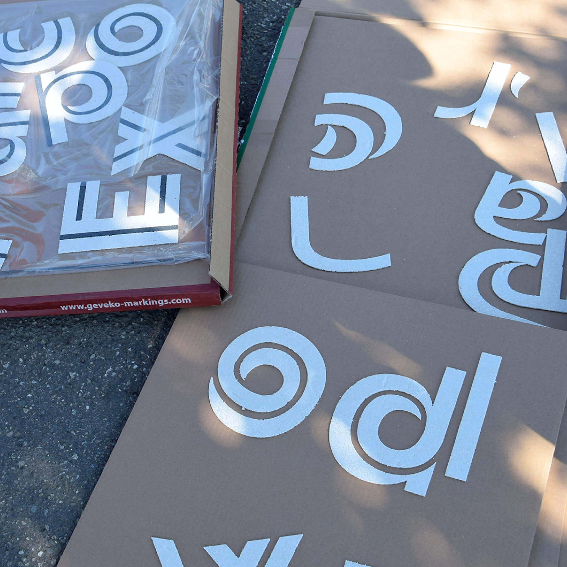
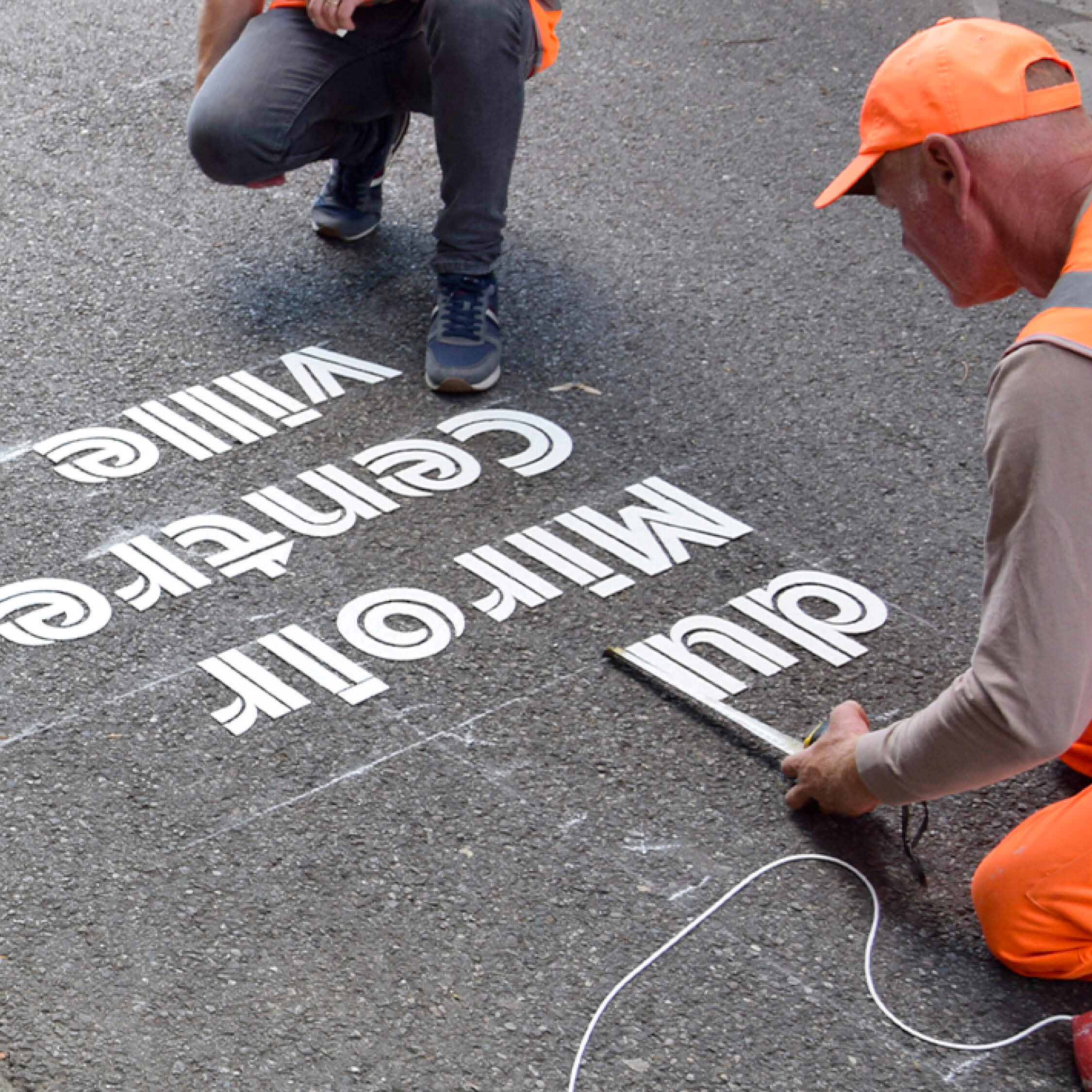
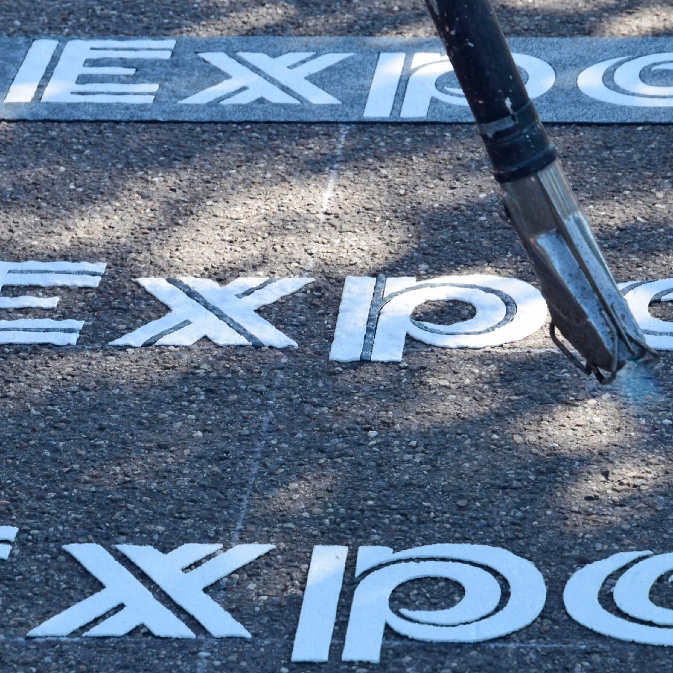
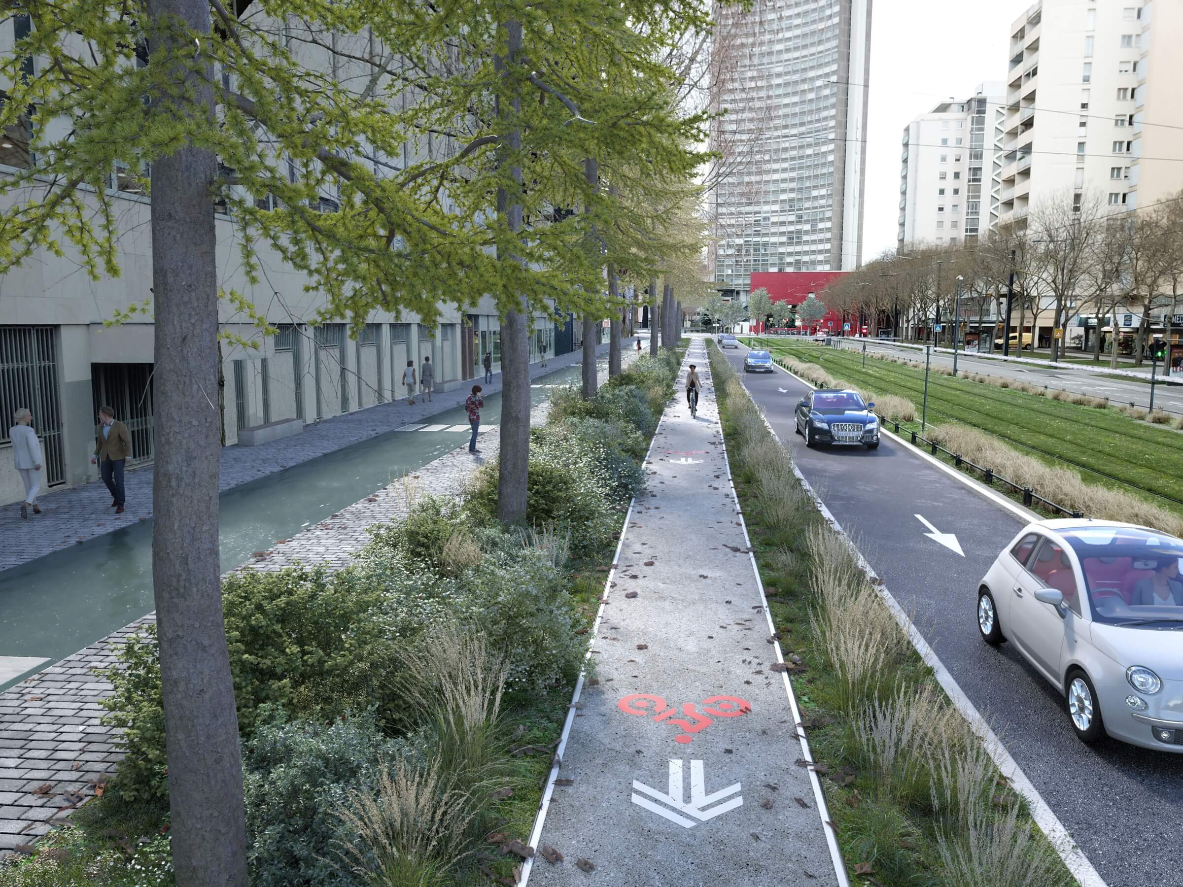
The Gallopin typeface (named after a renowned cyclist from Mulhouse), whose original design is built around a double line, draws inspiration from the lines painted on the bike paths. It conveys the fluidity of a route and its trajectories.
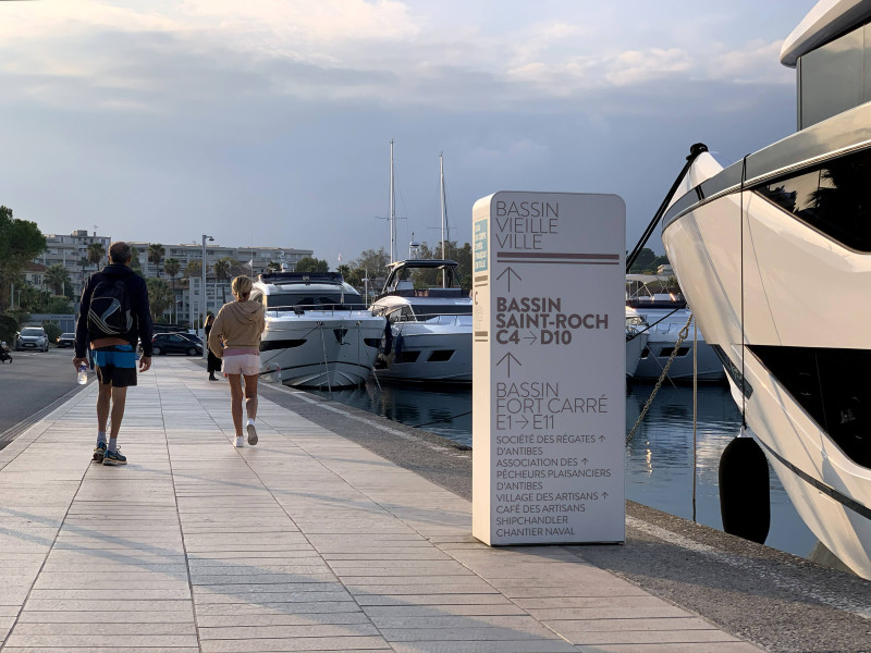
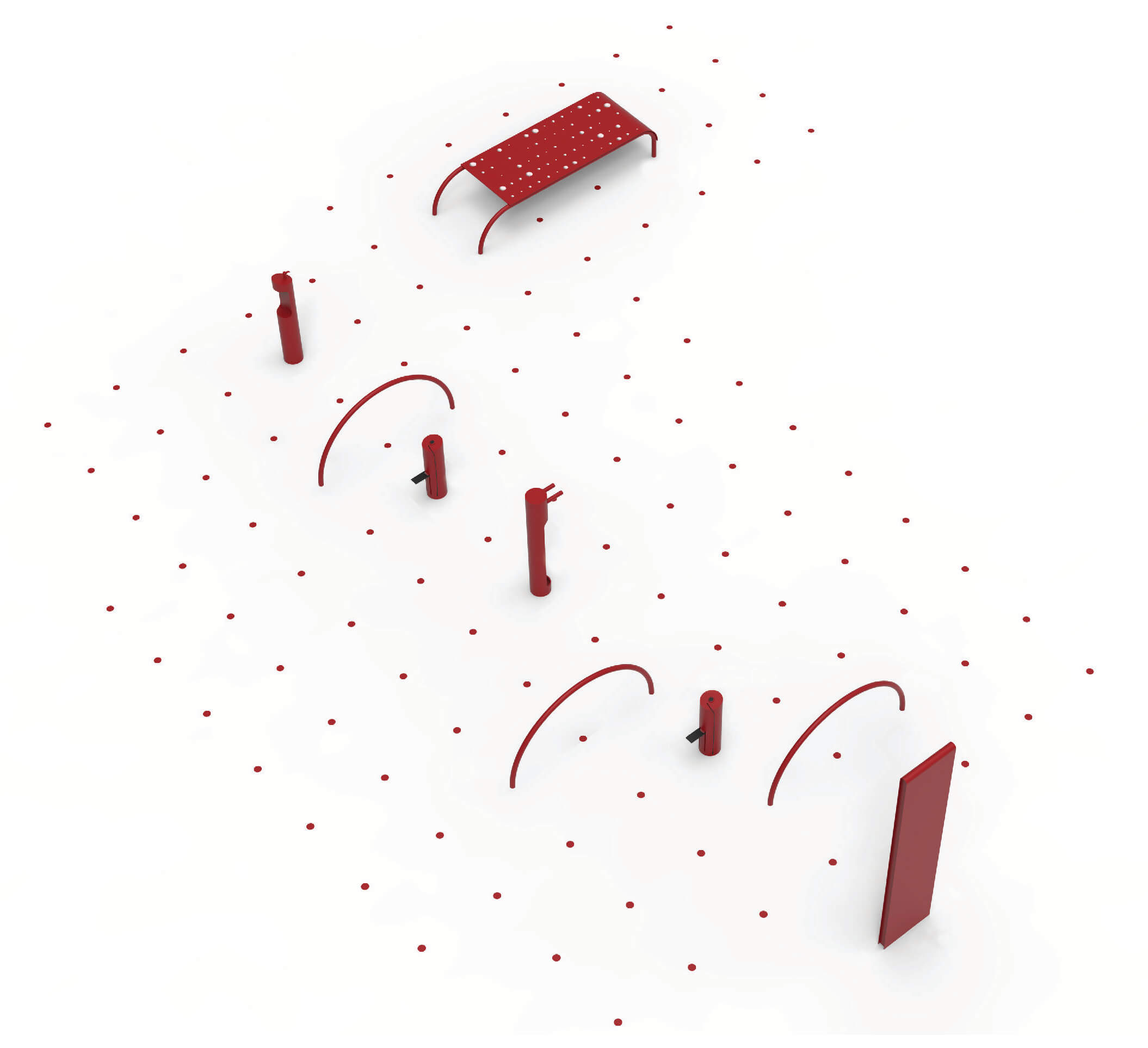
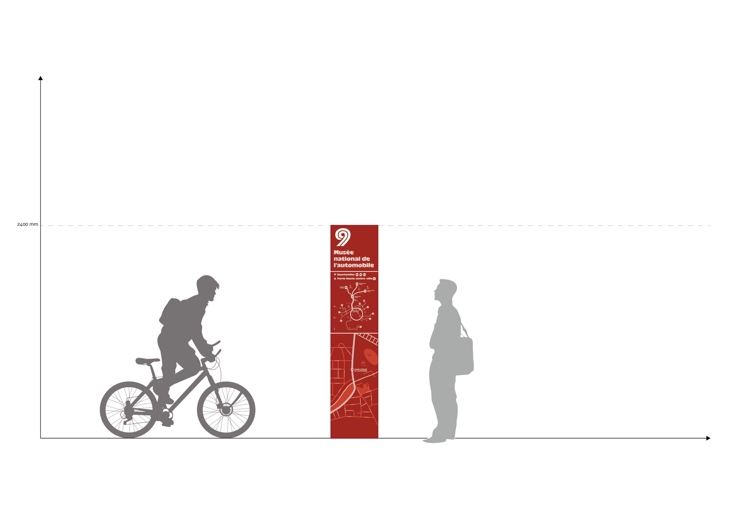
In keeping with this same spirit of loops and circulation, the signage furniture is deployed along the paths. It comes in “stop” modules and “station” modules. The “stop” furniture, designed in powder-coated aluminum, displays the network map, the line number, and the station name. It informs pedestrians and cyclists about nearby points of interest and walking distances. The station modules are constructed using a set of components made from bent tubes of various shapes and sizes, capable of accommodating all types of bicycles and meeting different maintenance or repair needs. These modules can be combined as desired and arranged according to needs and available space. Each station features a set of tools that expand the services available to users.
Design Team — Benjamin Ribeau, David Thoumazeau, Chloé Herbillon, Morgane Pontis, and Fadil Elmansour Typographic
Design — Bureau Brut
Landscape Architects — Sortons du bois