2015
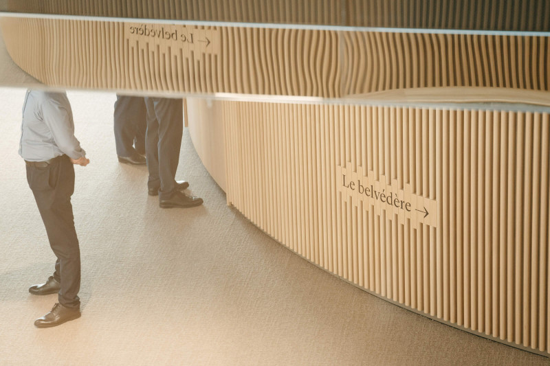
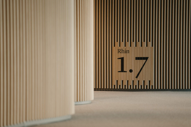
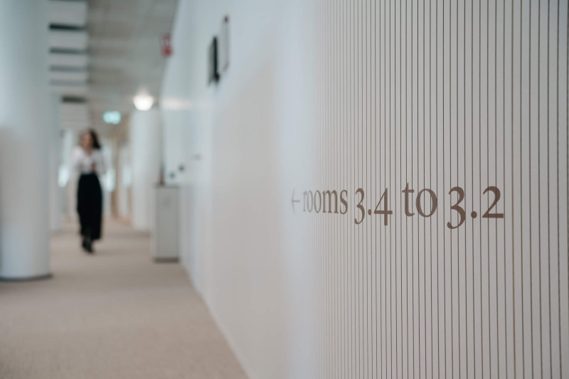
Bordeaux Metropolis — Visual Identity
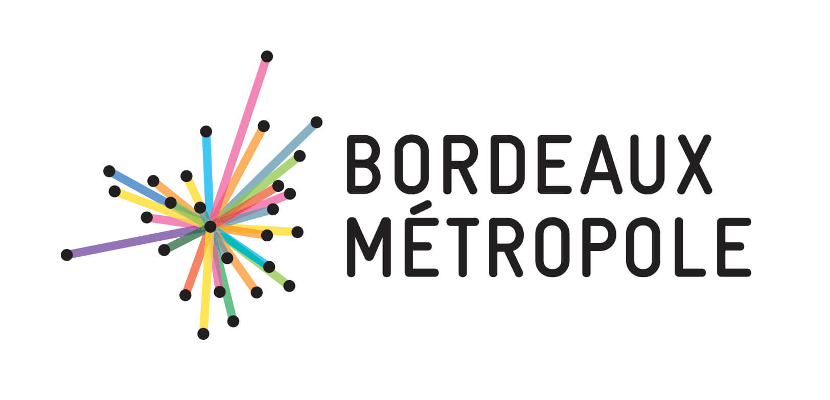
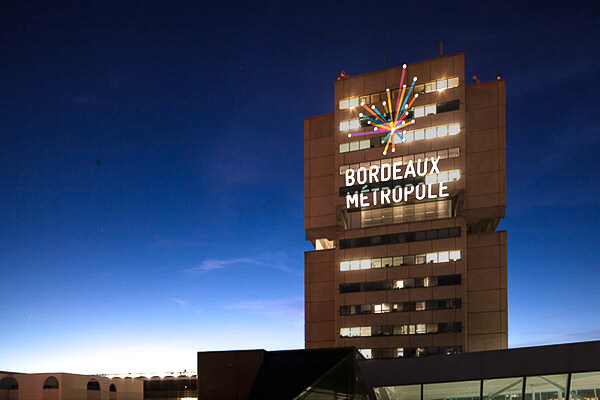
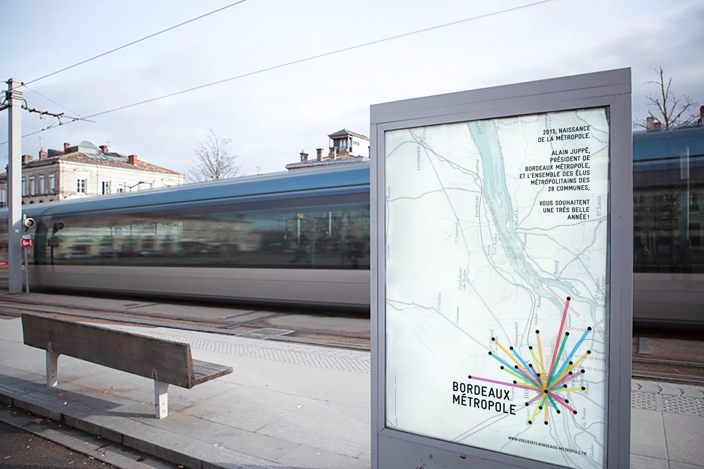
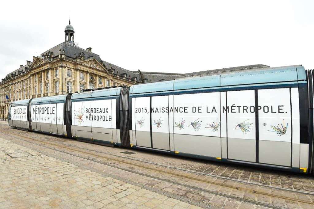
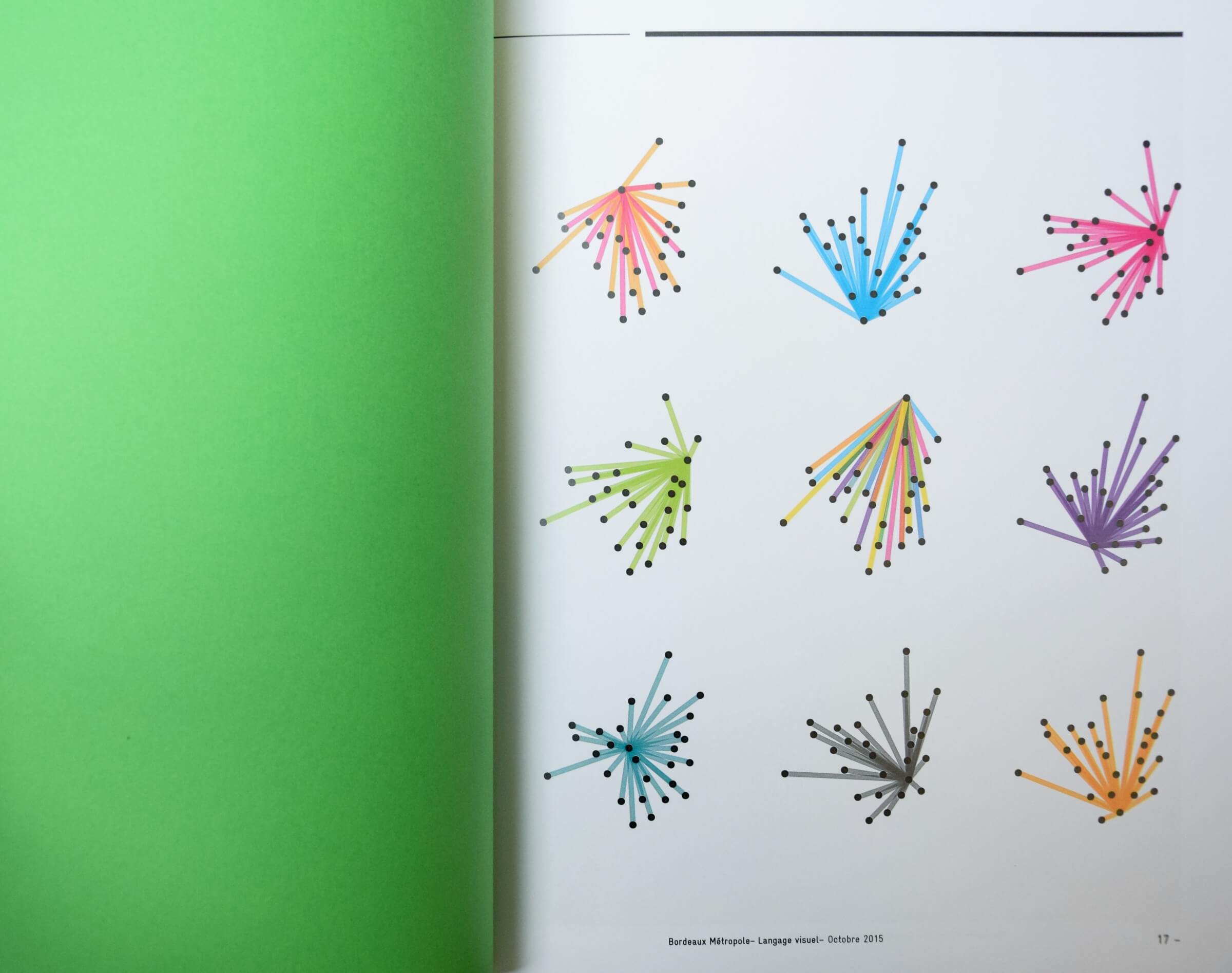
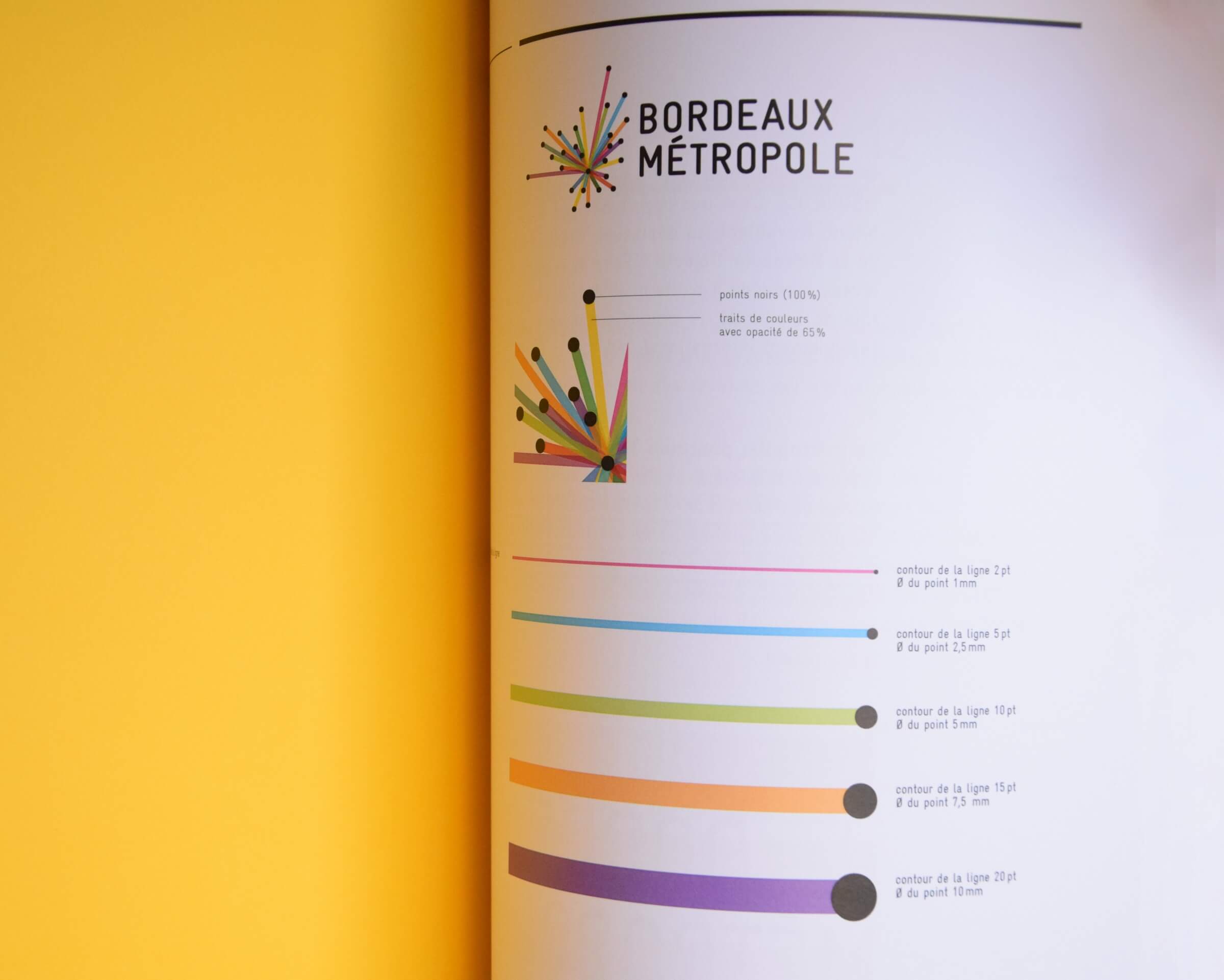
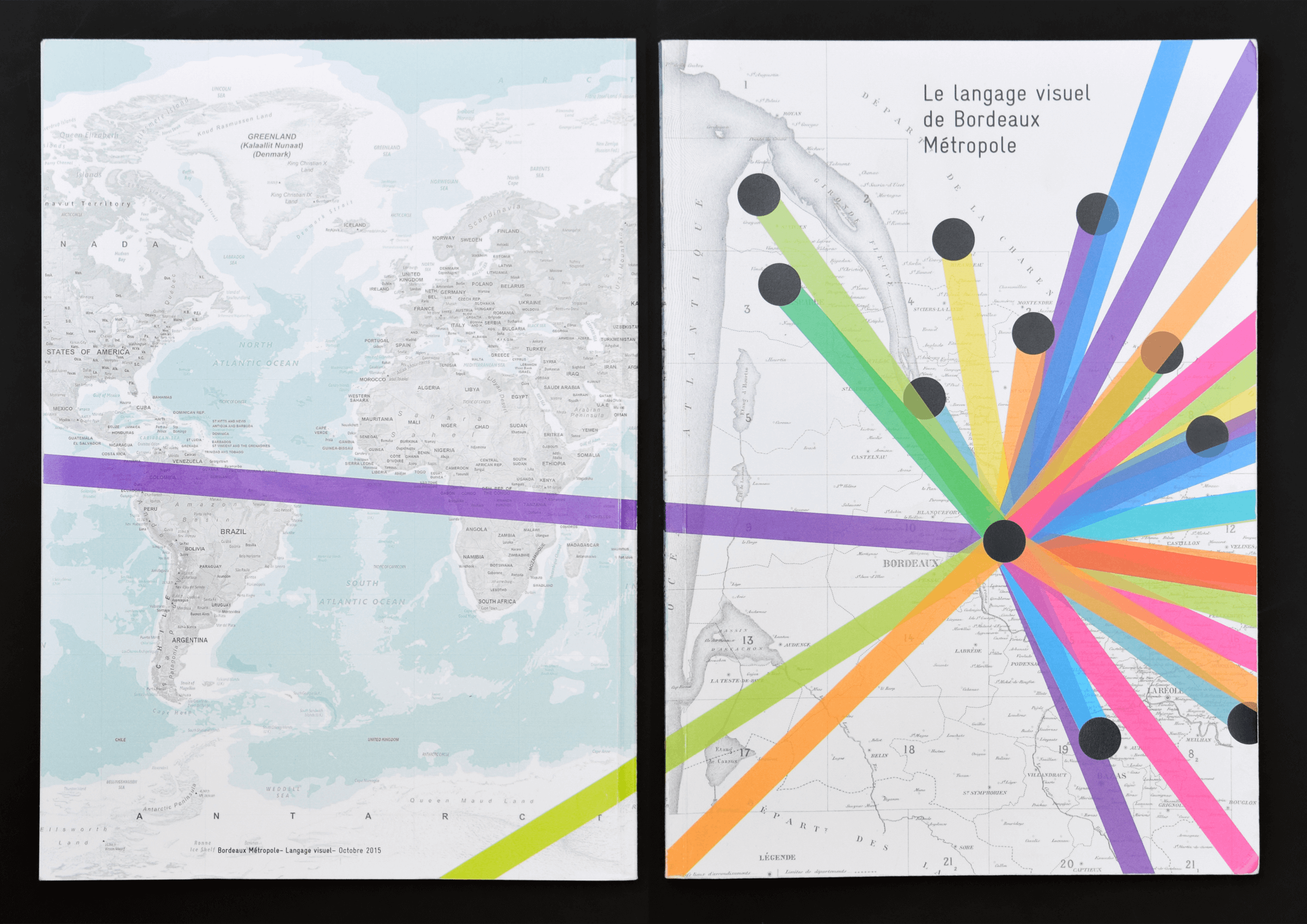
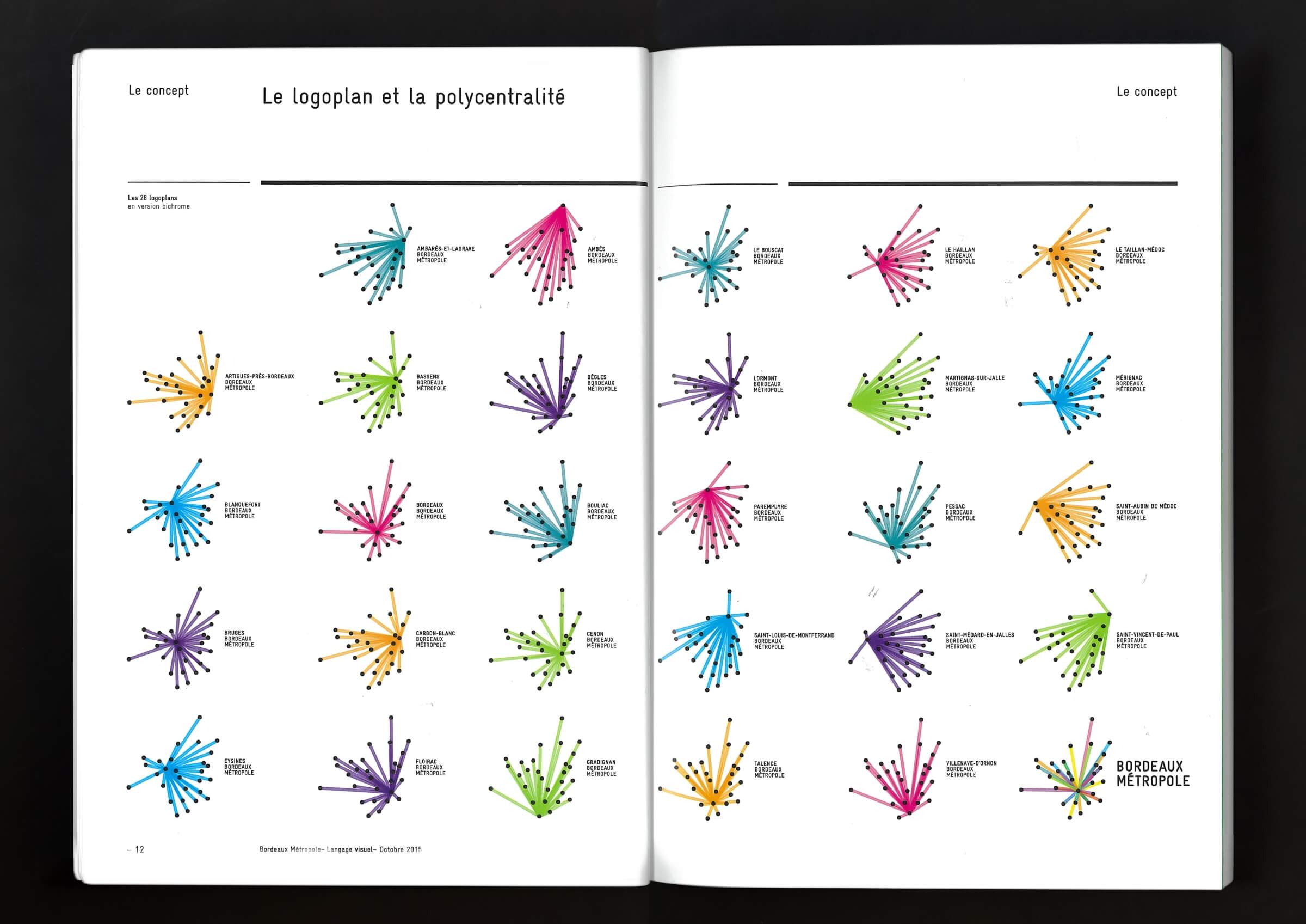
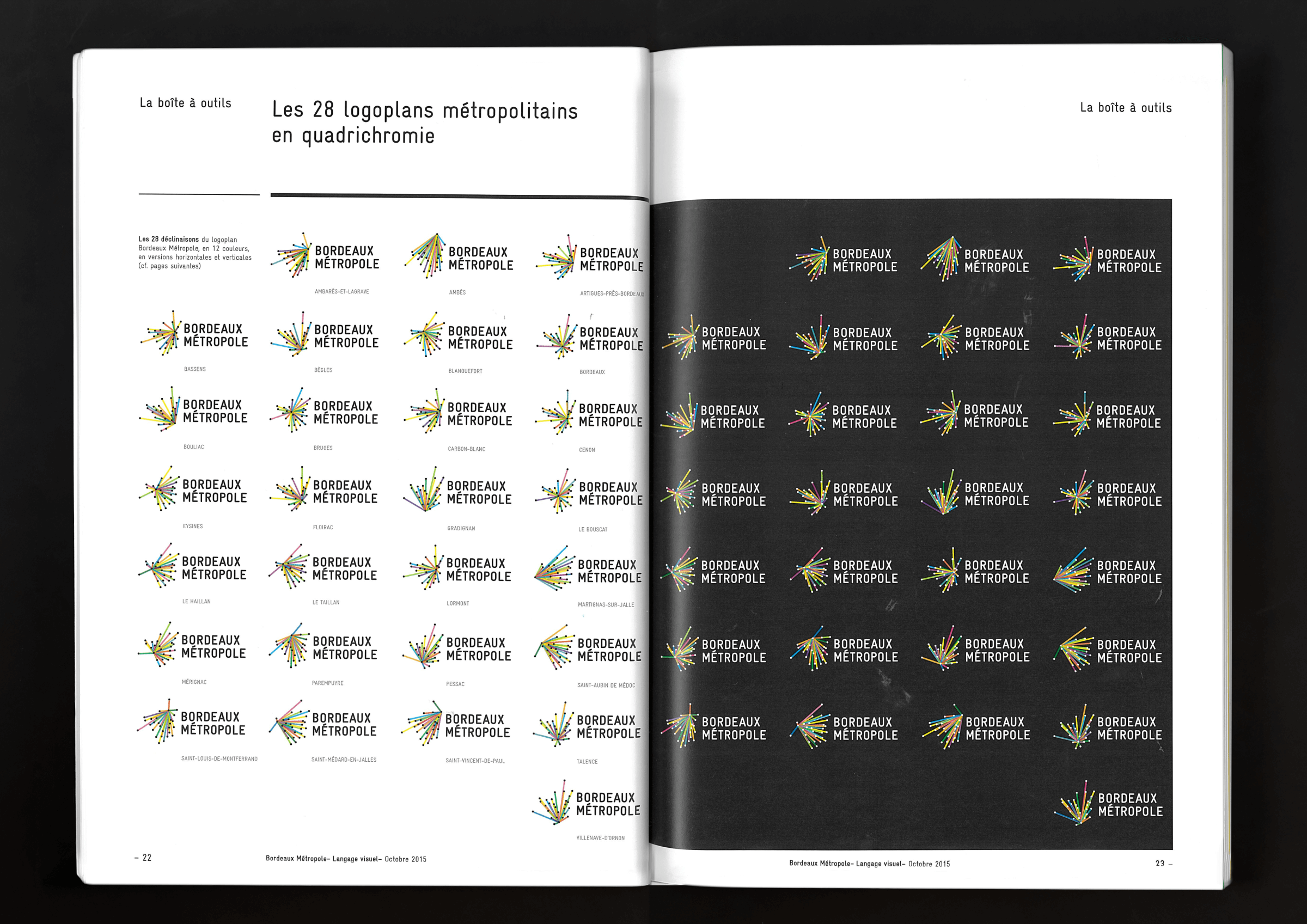
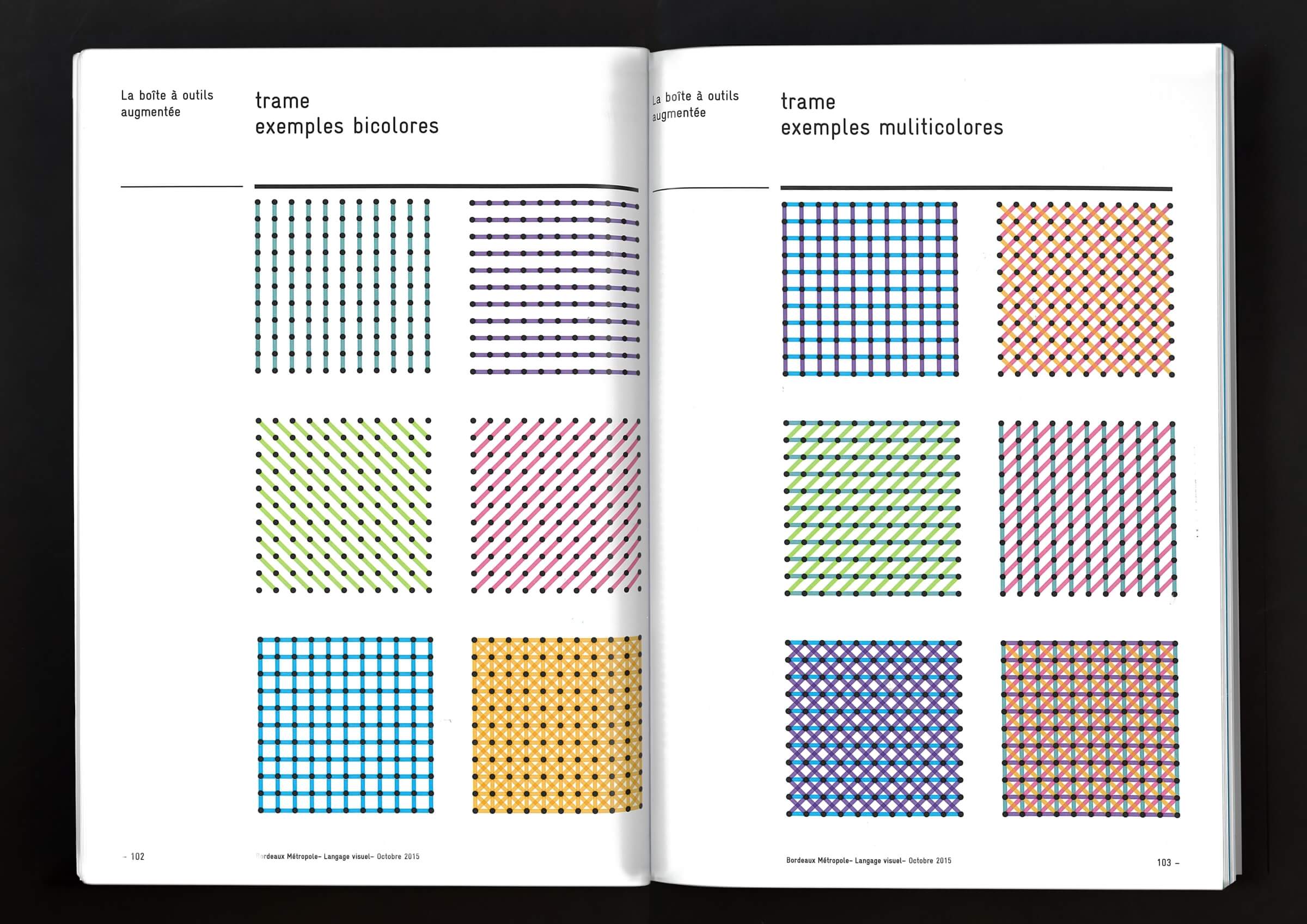
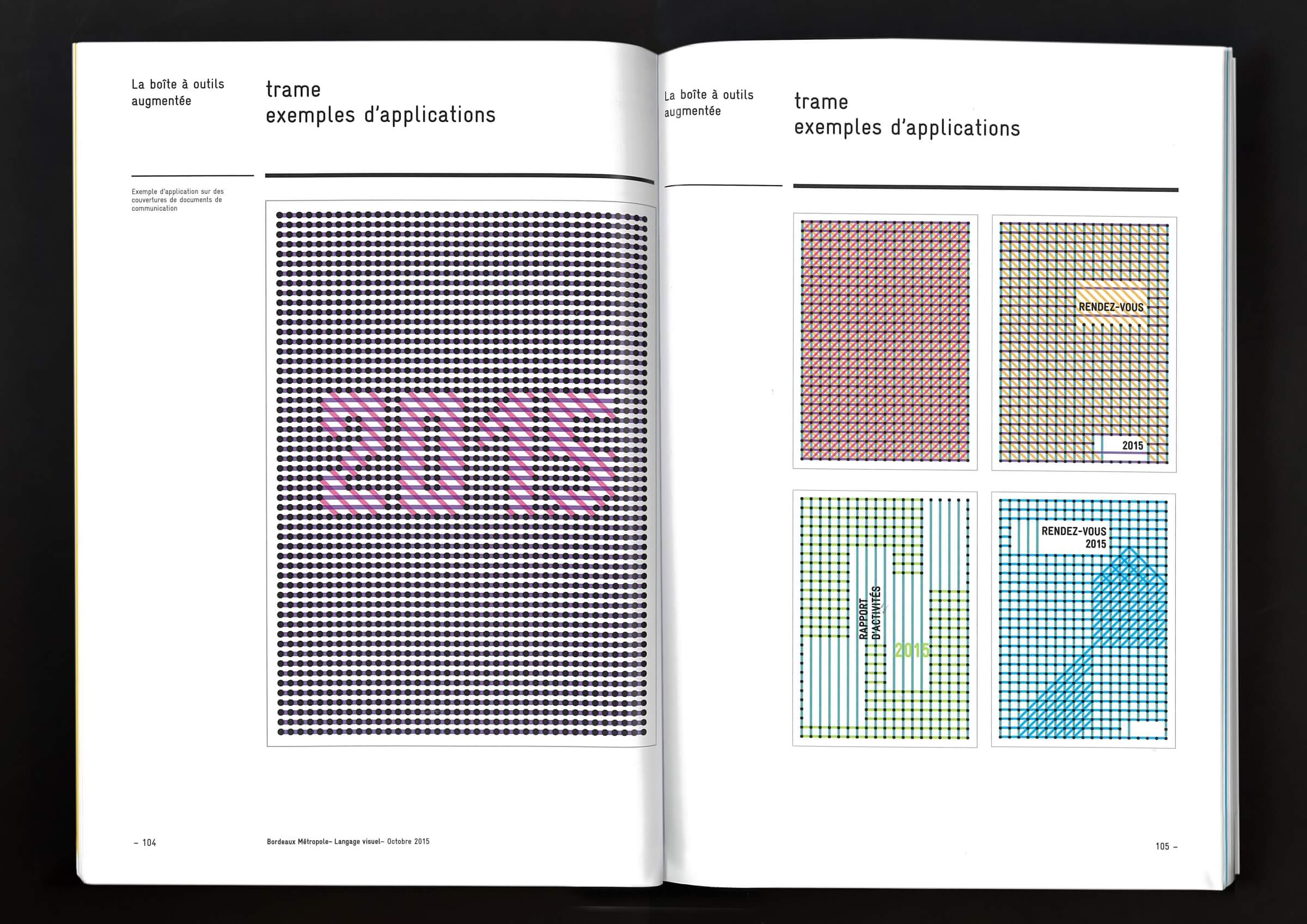
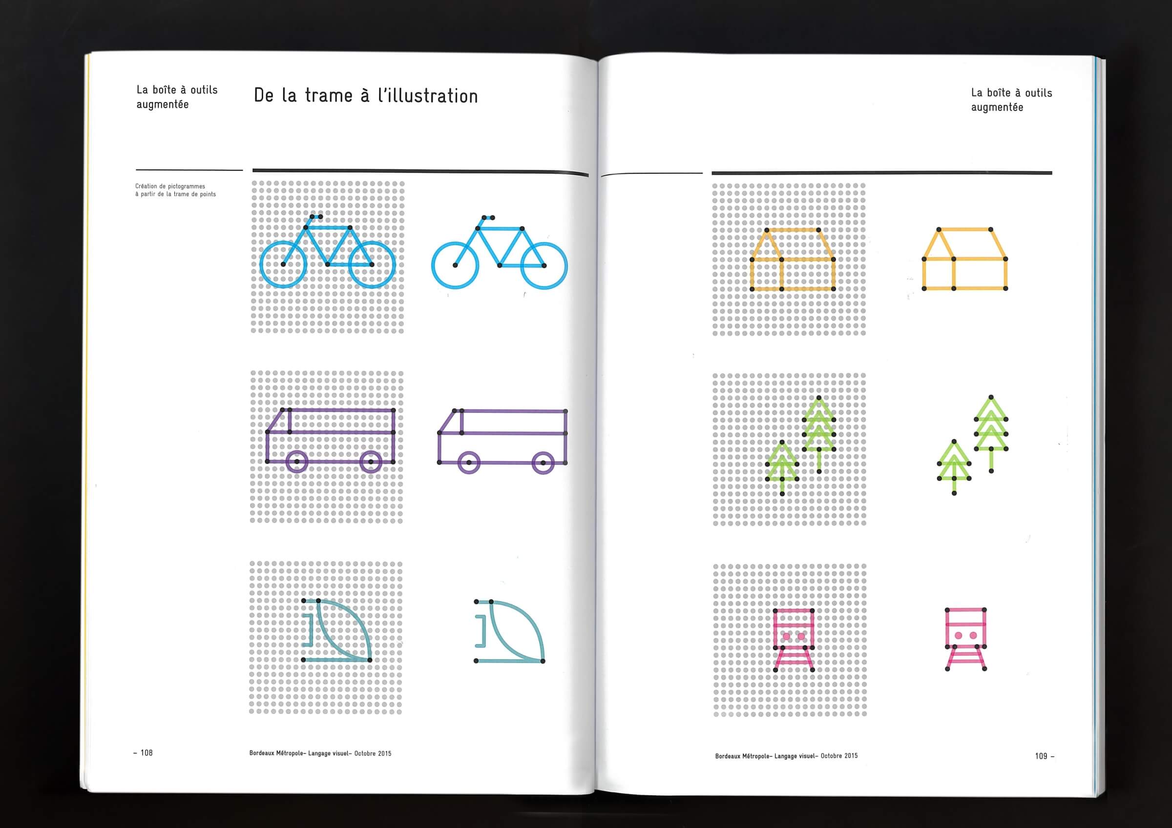
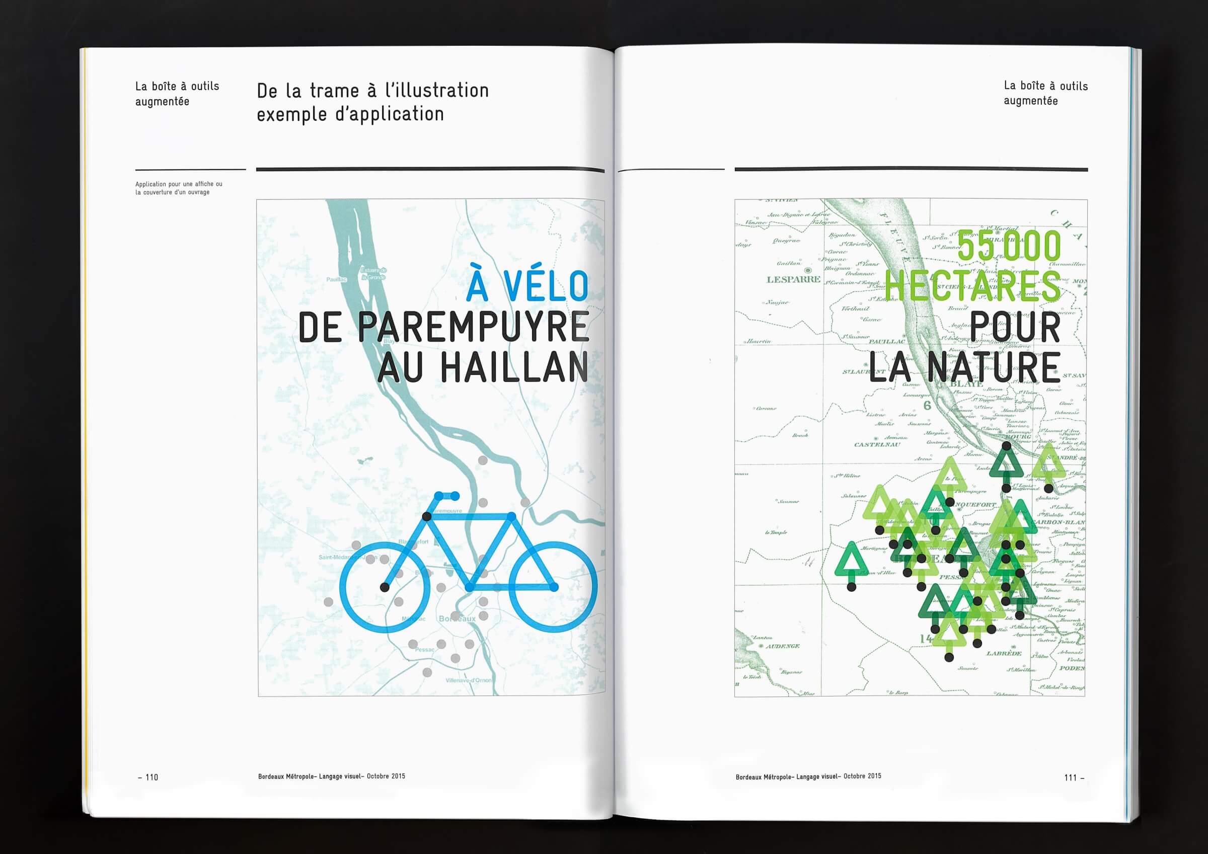
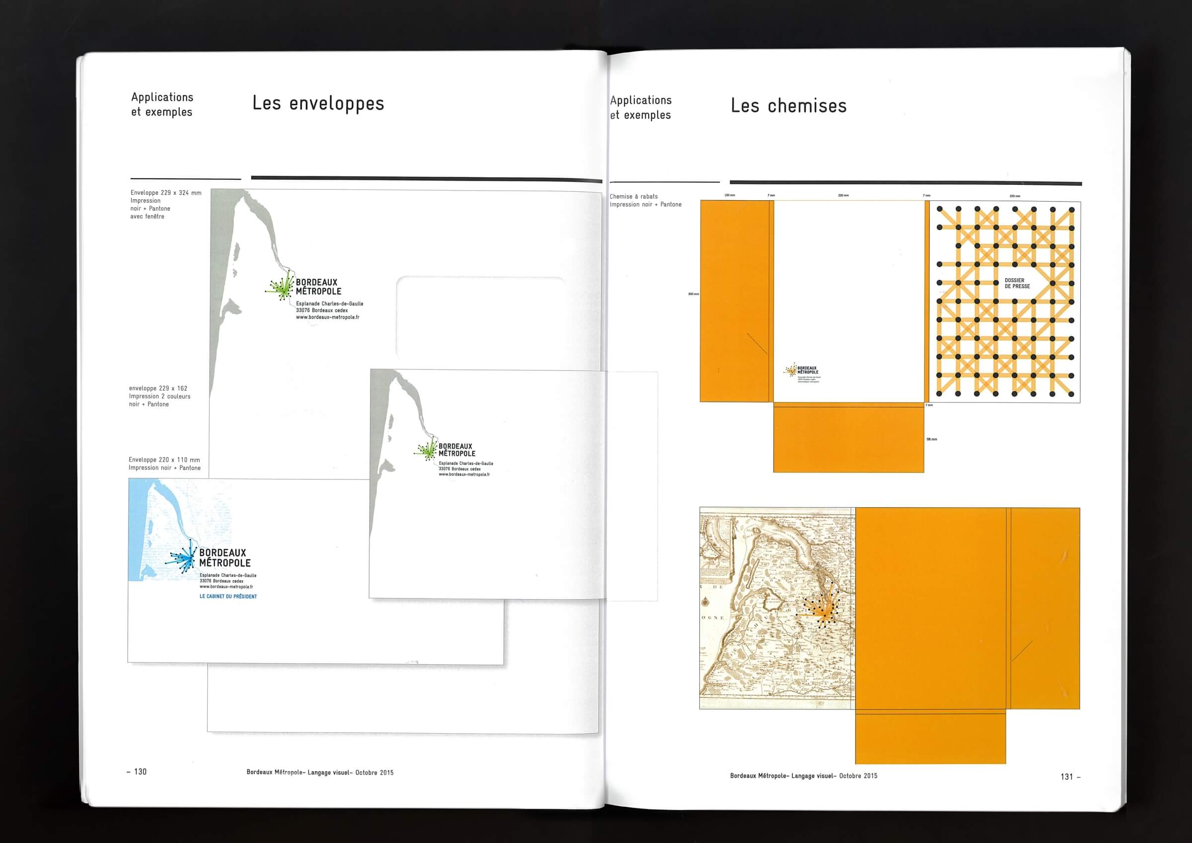
In 2014, the Law on the Modernization of Local Public Action and the Strengthening of Metropolitan Areas approved the creation of the Greater Paris Metropolitan Area, along with about ten others in France. A new entity means a new identity. Intégral Ruedi Baur and Kubik won the bid to create this graphic charter for Bordeaux Métropole and are the creators of a modular system that highlights the 28 municipalities of the metropolitan area. Each black dot corresponds to the geographical location of the municipalities, and together they form an abstract representation of the territory. Colored lines then connect the points to a common center, though this center varies randomly depending on the municipality being promoted. These sets are called “logoplans.” The idea behind this system is to enable “the recognition of information, making it readable and accessible.” Each political territory exists within a democratic space connected to others, much like Russian nesting dolls. The graphic identity is strong because it embodies the different municipalities, demonstrates their importance, while associating them with the city of Bordeaux. The second distinguishing feature is that the reference logo, with Bordeaux at its epicenter, encompasses the full range of colors. The 28 variations, on the other hand, offer a palette reduced to just a few shades. This approach highlights the entire territory surrounding Bordeaux and “makes these connections clear, suggesting that it would be possible to develop a sort of ‘harmony of identifying symbols’ for the public institutions of a French region.”
Design team — Vera Baur, Ruedi Baur, Chantal Grossen, and Benjamin Ribeau