
2014
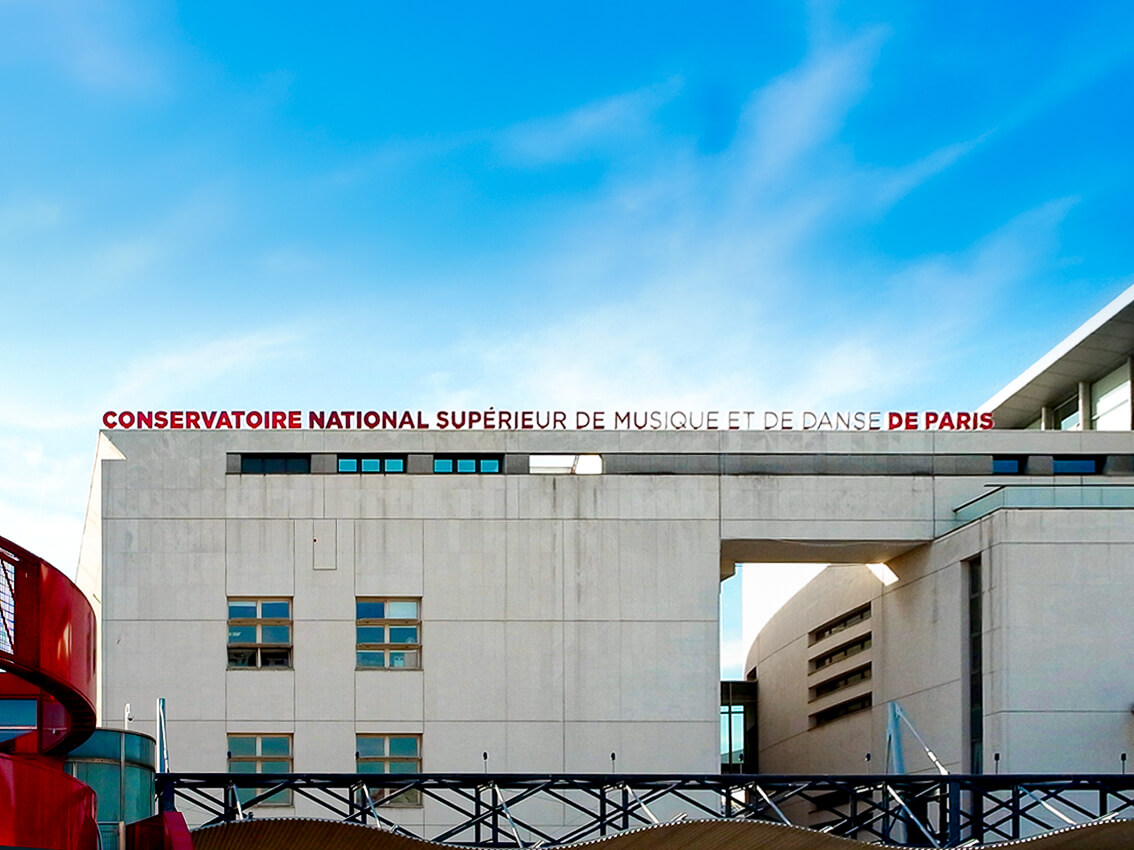
Paris National Conservatory of Music and Dance
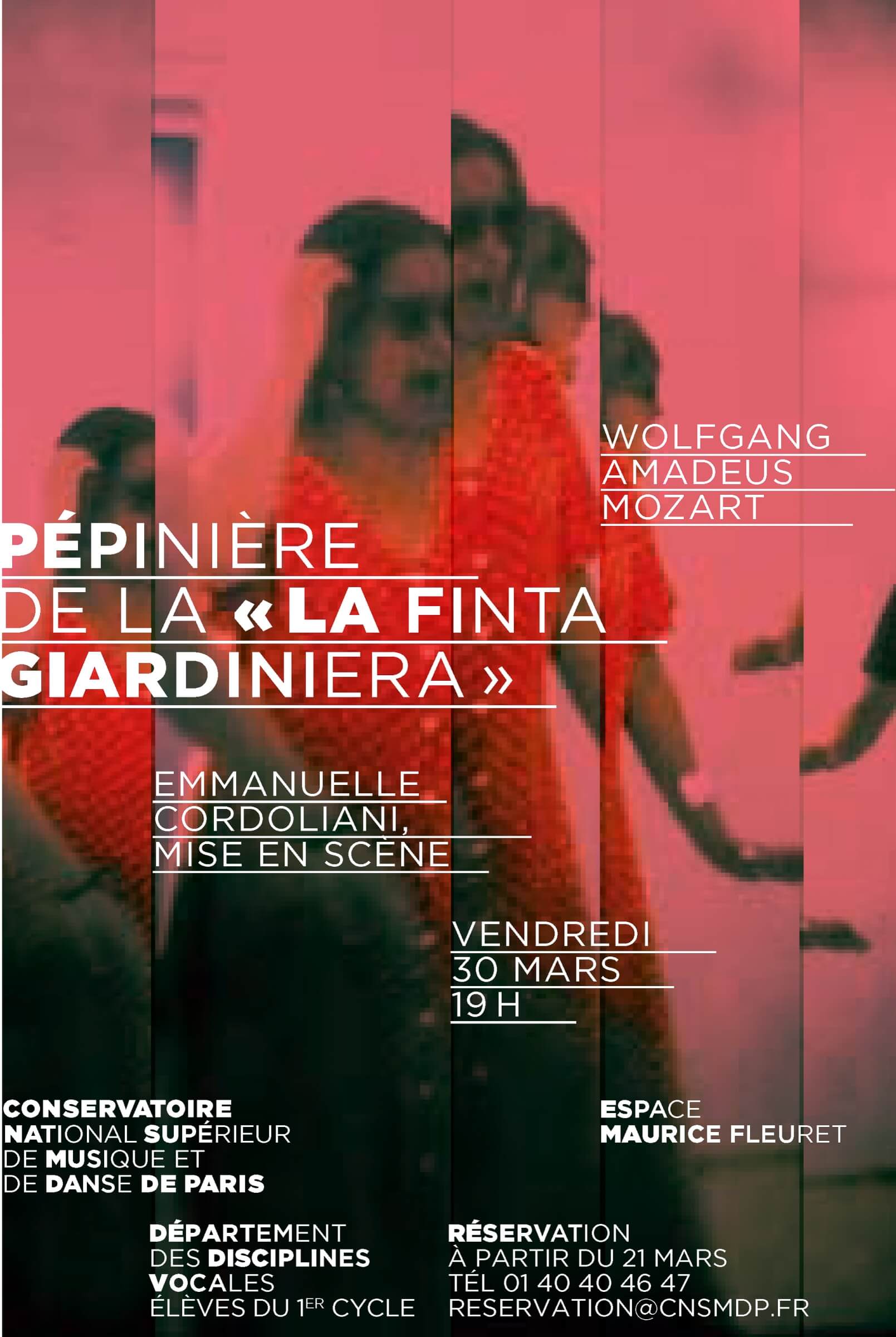
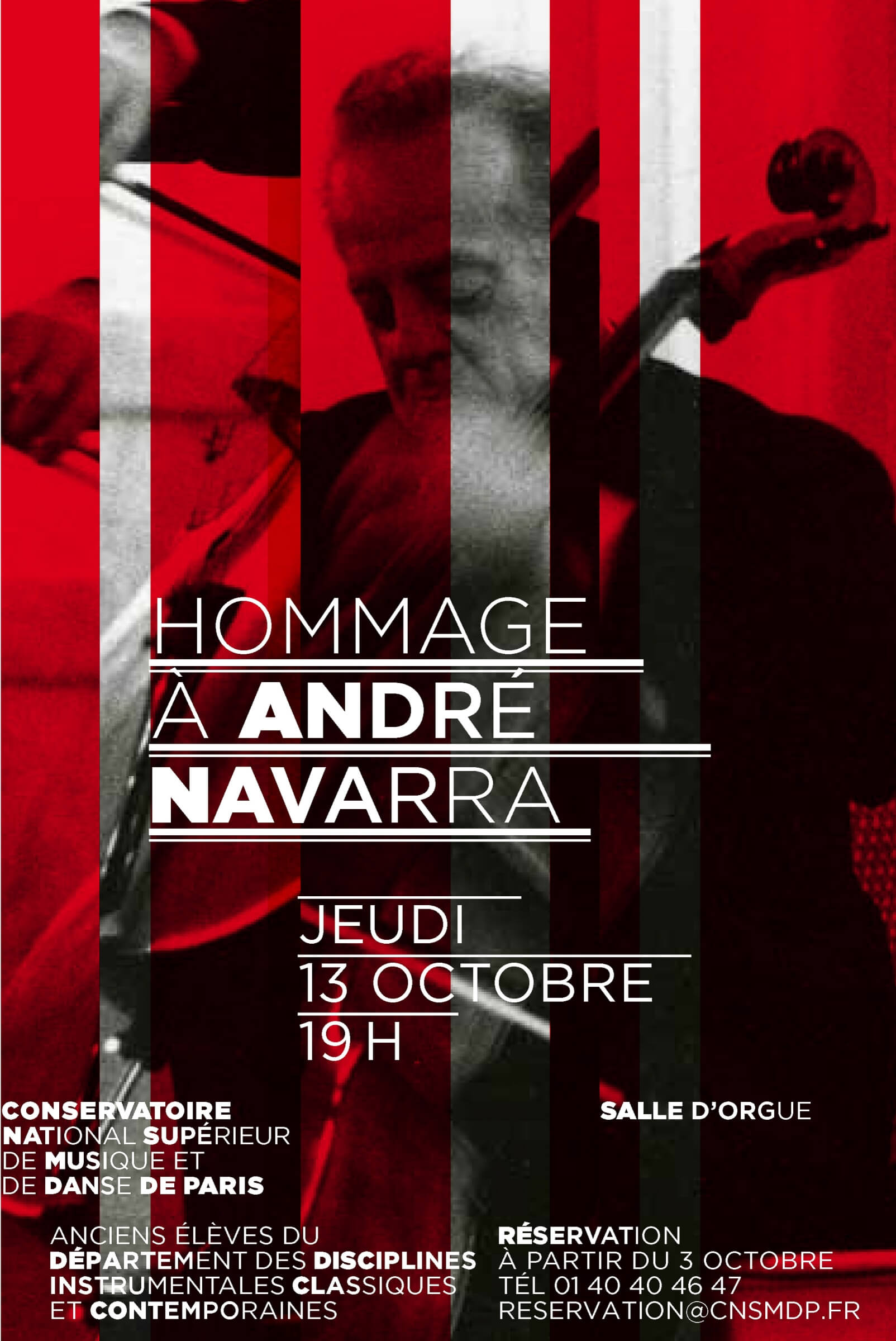
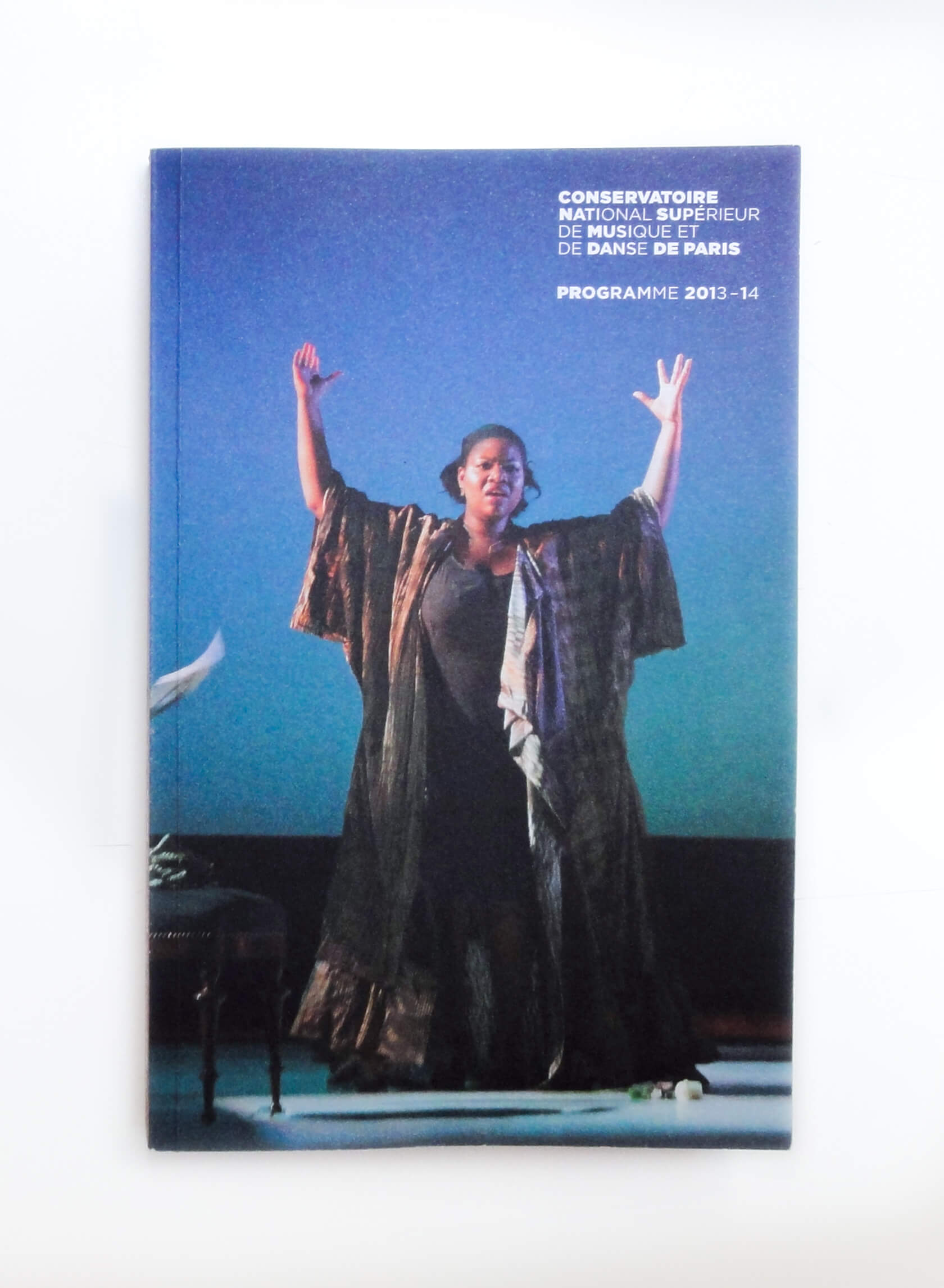
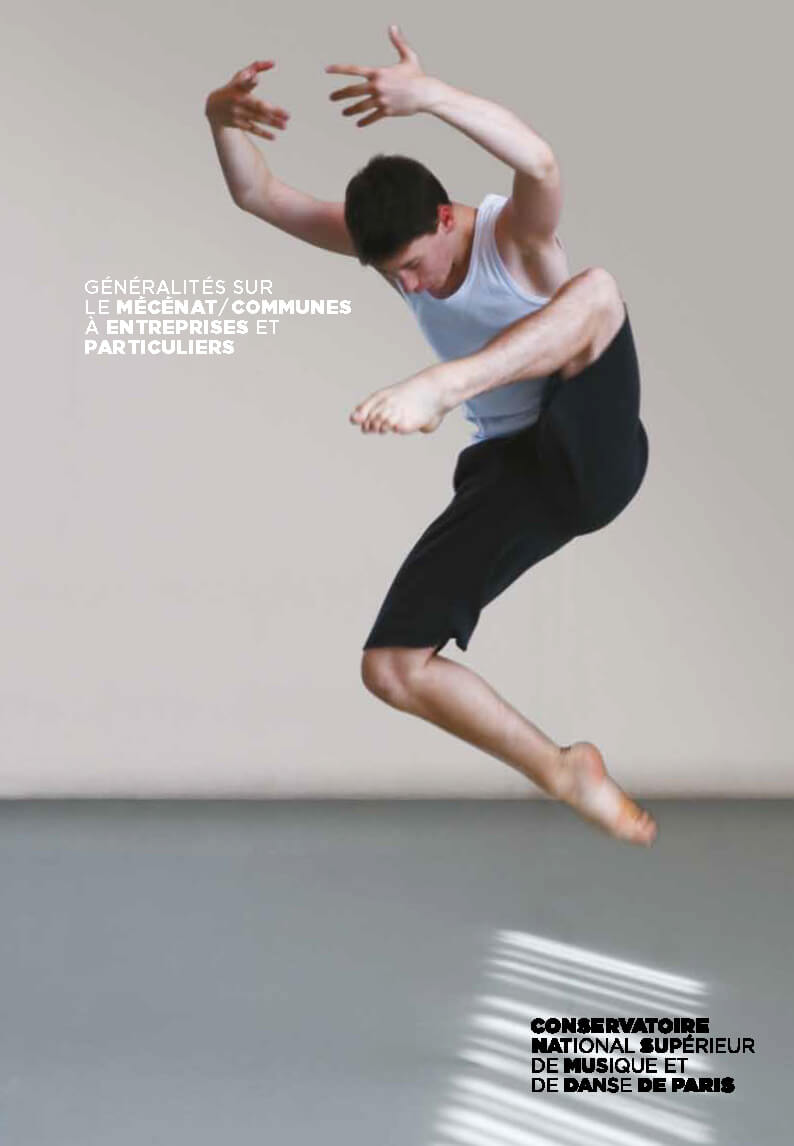
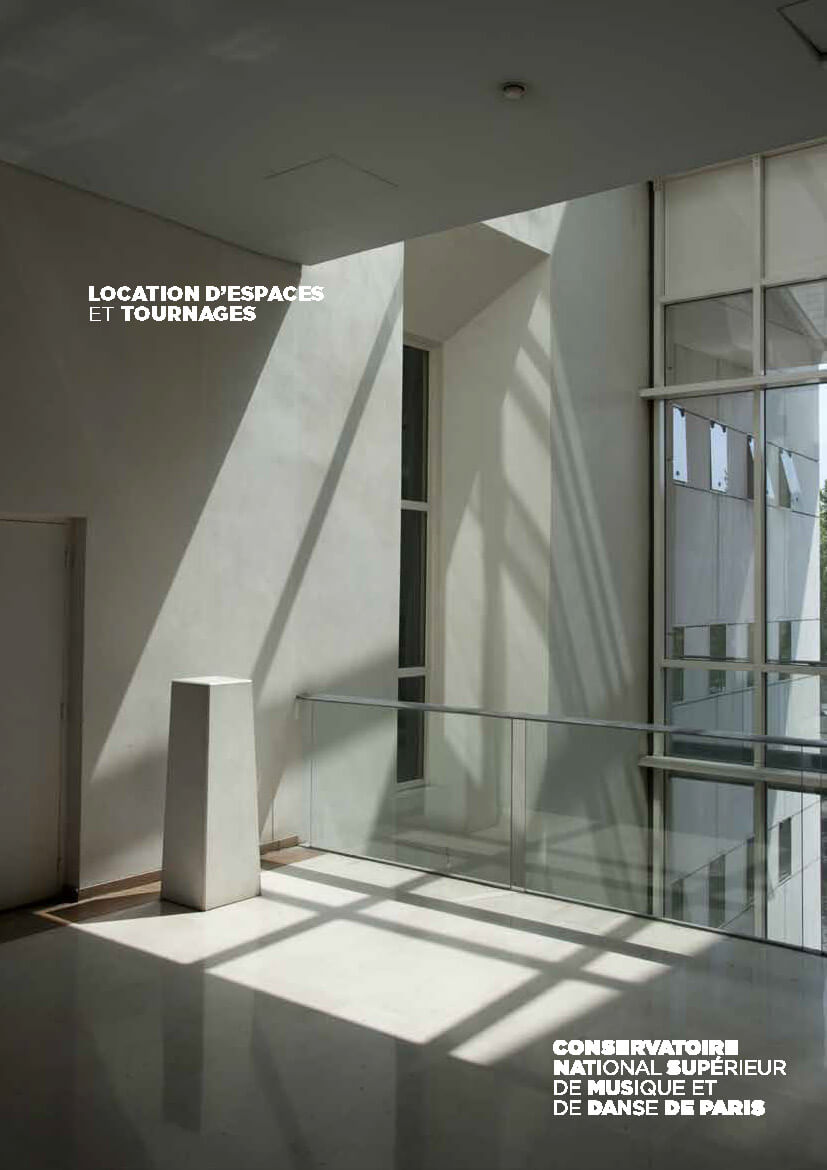
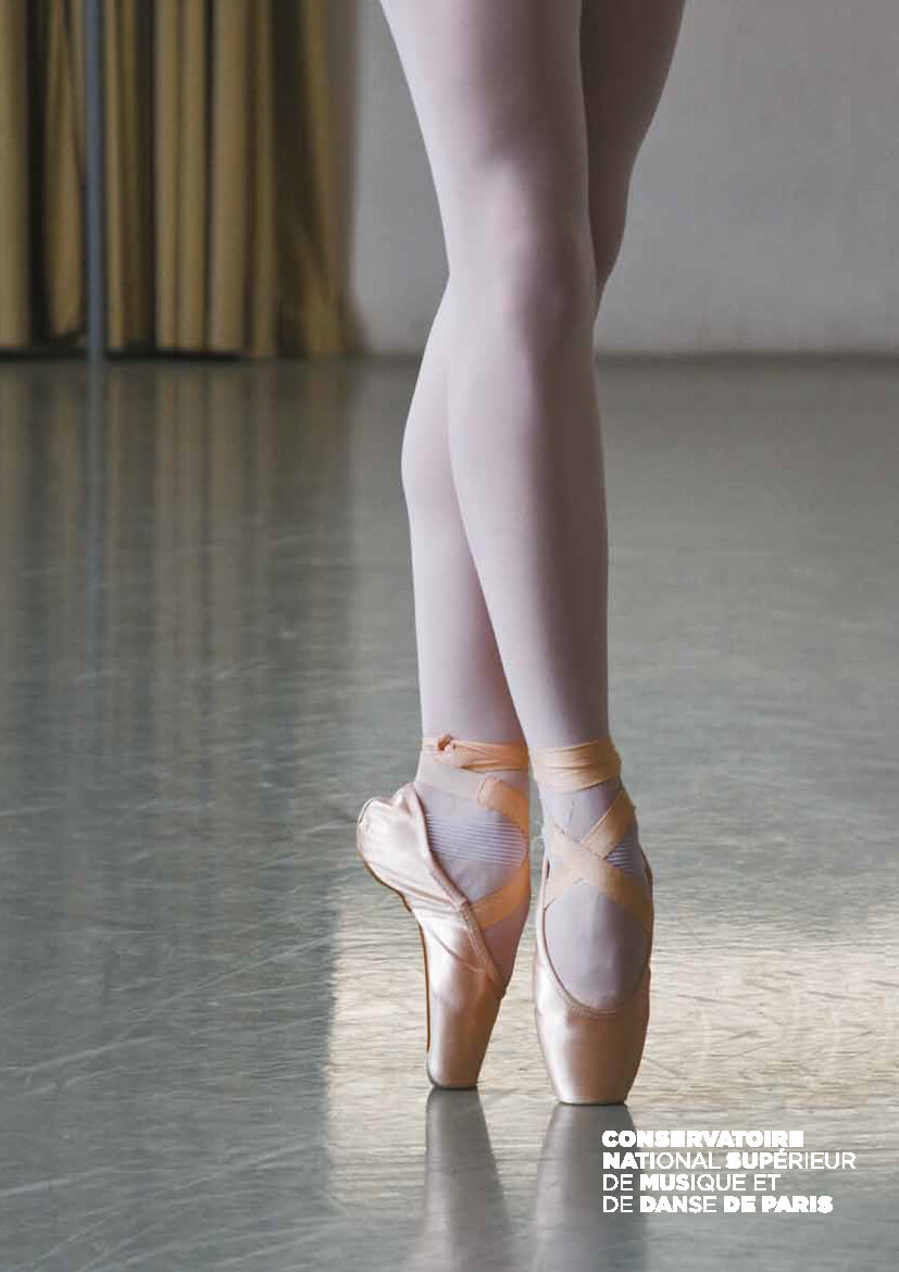
Like a large ocean liner with beige facades, the Paris Conservatory building appears rather nondescript. Situated right next to Parc de la Villette, the Conservatory seems set back, as if withdrawn into itself. It does not truly blend into the park’s vibrant atmosphere, alongside the Cité de la Musique, the Grande Halle, and the Théâtre Paris-Villette... The first goal was therefore to make the existing natural connection with the Cité de la Musique visible and to create a link between the Paris Conservatory and Parc de la Villette. The aim was to integrate it into the area’s visual identity while developing a distinct identity of its own. The second important goal was to convey the Conservatory’s personality, to reveal all its riches, resources, and activities, and to express its inner life. The visual identity system created is based on the Gotham typeface, a color palette (bright red, garnet red, and beige), and a way of composing text and imagery so that they evoke sound, music, and the rhythmic movement of bodies.
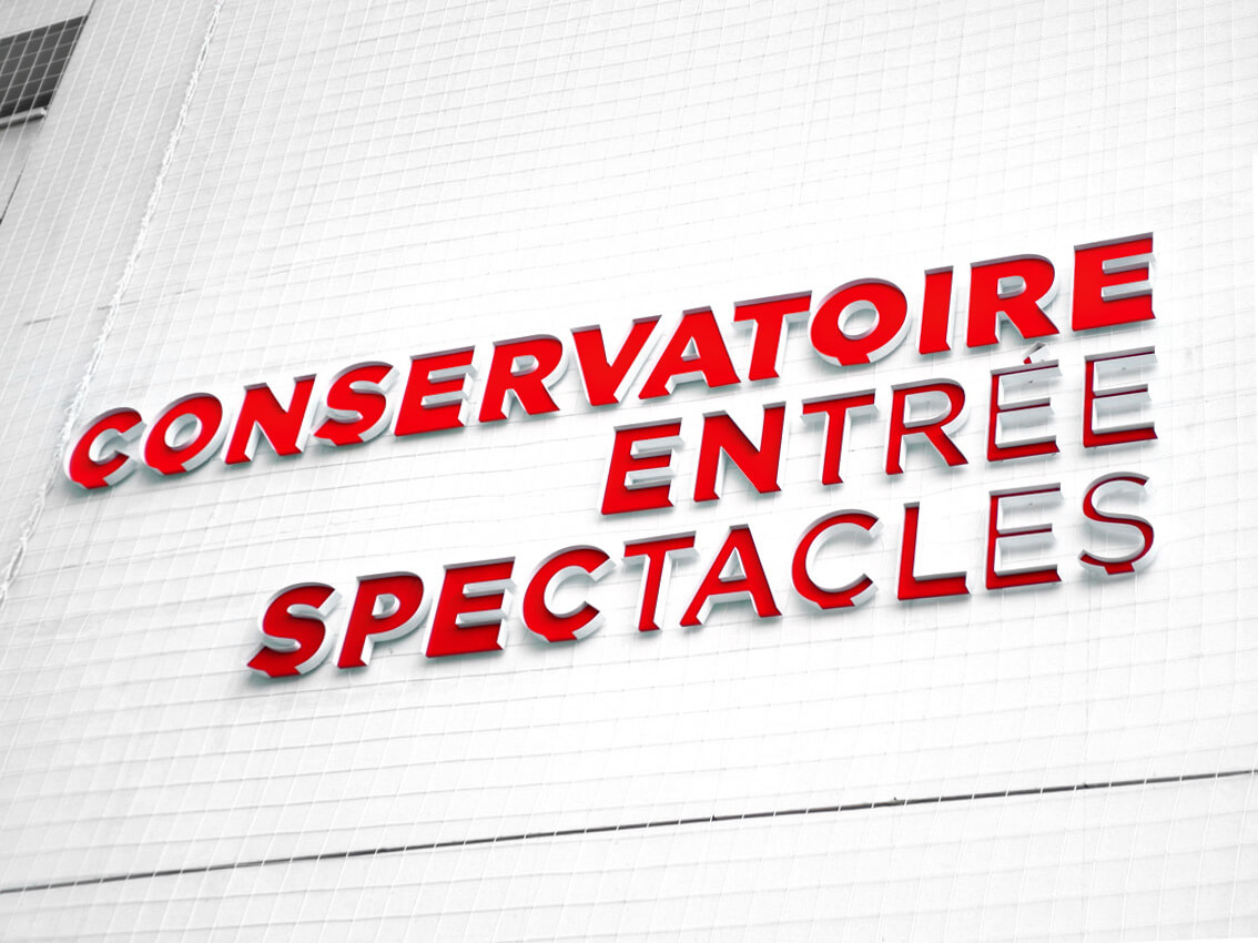
The Conservatoire’s logotype is the primary identifying element. The words CONSERVATOIRE and DE PARIS frame the full title. Their presence is always visually more prominent than the other text. The use of different font weights creates typographic rhythms. Words and phrases are arranged in a gradient effect, with smooth transitions between very bold and lighter characters, evoking the rhythms of music and dance.
Design — Ruedi Baur